Heather James Fine Artは、当ギャラリーで最も新しいアート作品のセレクションを紹介します。フリーダ・カーロ、アルフレッド・シスレーなどの名作や アンセル・アダムス印象派、近代、戦後、現代美術のトップクラスの作品のほんの一部ですが、Heather Jamesで現在販売している作品です。 ご連絡と、お客様のコレクションを完成させるために、一緒に考えていきます。


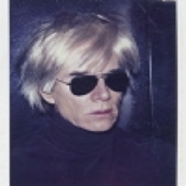
_tn44859.jpg "ANDY WARHOL-Untitled (Flowers)")


PAUL SIGNAC

グラント・ウッド
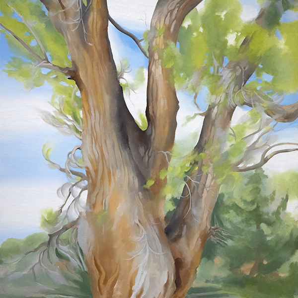
,_new_mexico_tn40147.jpg "GEORGIA O'KEEFFE-Cottonwood Tree (Near Abiquiu), New Mexico")
ジョージア・オキーフ

ディエゴ・リベラ

アンドリュー・ワイス&N.C.ワイス

ウィレム・デ・クーニング

アレクサンダー・カルダー

N.C. ワイス
_tn45742.jpg "SIR WINSTON CHURCHILL-On the Rance, Near St. Malo (C 520)")
サー・ウィンストン・チャーチル

アルフレッド・シスレー

ヴィンセントヴァンゴッホ

アレクサンダー・カルダー

エミール・ノルデ

ゲルハルト・リヒター

トム・ヴェッセルマン
_tn45734.jpg "SIR WINSTON CHURCHILL-Marrakech with a Camel (C 453)")
サー・ウィンストン・チャーチル
_tn45731.jpg "SIR WINSTON CHURCHILL-Riviera Coast Scene (C 295)")
サー・ウィンストン・チャーチル
_tn45741.jpg "SIR WINSTON CHURCHILL-By Lake Lugano (C 413)")
サー・ウィンストン・チャーチル
_tn43950.jpg "WINSLOW HOMER-In the Wheatfield (Girl Standing in a Wheat Field)")
ウィンスロー・ホーマー

N.C. ワイス
_tn45739.b.jpg "SIR WINSTON CHURCHILL-View Over Cassis Port (C 333)")
サー・ウィンストン・チャーチル

ショーン・スカリー

マルク・シャガール
_tn45733.jpg "SIR WINSTON CHURCHILL-The Bay of Eze (C 490)")
サー・ウィンストン・チャーチル
_tn40169.jpg "MARSDEN HARTLEY-Bach Preludes et Fugues No. 1 (Musical Theme)")
マースデンハートリー

トム・ヴェッセルマン

フレデリック・カール・フリーゼケ

テオ・ヴァン・ライゼルベルグ
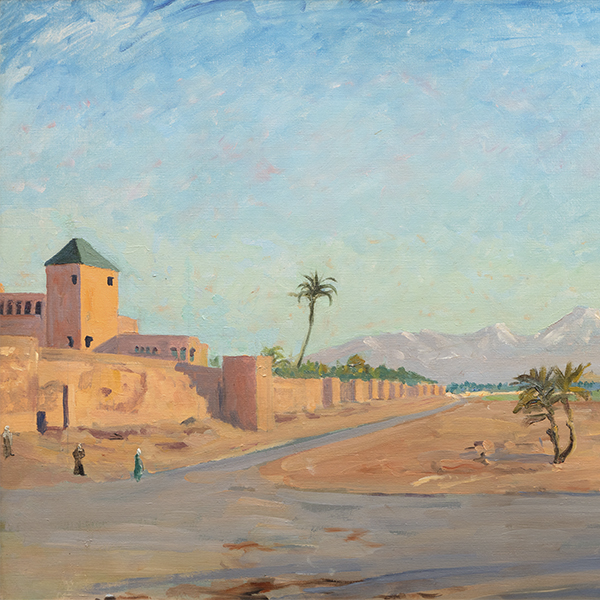
![Painted while staying at Dunrobin Castle, the estate of the Duke of Sutherland, Churchill chose to set his easel behind a tree where he likely thought of it as a framing device, adding a layer of depth, creating a stronger sense of foreground, middle ground, and background, enhancing the three-dimensionality of the picture. Churchill painted at both Dunrobin as well as the Duke’s Sutton Place estate, later the home of John Paul Getty.<br><br>As Mary Soames describes it in her book, Winston Churchill, His Life as a Painter, “1921 had been a year of heavy personal tidings” for Churchill and his family, as he lost both his mother, Jennie Cornwallis-West, and his beloved child, Marigold, aged nearly four. In a letter to his wife Clementine, Churchill wrote, “… Many tender thoughts, my darling one of you and yr sweet kittens. Alas I keep on feeling the hurt of the Duckadilly [Marigold’s pet name].” That Churchill chose to stay with the Duke and Duchess at Dunrobin just after Marigold’s death speaks to their close friendship and his fondness for the area, including Loch Choire. It is no surprise that Churchill gifted the painting to the Duke of Sutherland](/Art_Images/Small/sir_winston_churchill_view_of_loch_choire_(c_51)_tn45743.jpg "SIR WINSTON CHURCHILL-View of Loch Choire (C 51)")
サー・ウィンストン・チャーチル

ラリー・リバーズ
_tn45732.jpg "SIR WINSTON CHURCHILL-Oranges and Lemons (C 455)")
サー・ウィンストン・チャーチル
_tn27035.jpg "ROBERT INDIANA-AMOR (Red Yellow)")
ロバート・インディアナ
_tn45736.jpg "SIR WINSTON CHURCHILL-Coastal Town on the Riviera (Double-Sided C 111 & 535)")
サー・ウィンストン・チャーチル
![Churchill counted as both a friend and political ally, Phillip Sassoon – one of Britain's great hosts, cousin of famed poet Siegfried Sassoon, and the man upon whom Noël Coward crowned "a phenomenon that will never recur”. Sassoon and his sister Sybil were among Winston and Clementine’s great friends. As described by Lady Soames in her book, “Philip Sassoon was a man of charm and distinction, and he dispensed princely hospitality to a brilliant and varied circle of friends at his two country houses, Port Lympne and Trent Park. He made a remarkable collection of works of art. Winston received much help and encouragement from Sassoon, and painted many pictures of both his house and gardens. One of the ways in which Winston taught himself to paint was by copying pictures he admired. With his large and varied collection, Sir Philip was able to be of help in this way, too, and Winston studied and copied quite a number of his friend’s pictures. Sassoon was a friend and patron of John Singer Sargent, and owned many of his works. Winston admired several of these, and found them highly instructive; in 1926, [less than two years before this painting was created] Philip Sassoon wrote Winston this note, which accompanied a generous present and a helpful loan:<br><br>My dear Winston,<br><br>You have often admired the picture of John Lewis Brown of the two horsemen that hung at Trent, so I am sending it to you with my best wishes in the hope that you find a corner for it at Chartwell. I am also sending th little Sargent picture wh you asked for. He painted it when he was 18!”<br><br>One is struck by Sassoon’s generosity, and can see in later works how his close study of Sargent influenced Churchill.](/Art_Images/Small/sir_winston_churchill_the_library_of_sir_philip_sassoon's_house_at_lympne_(c_19)_tn45745.jpg "SIR WINSTON CHURCHILL-The Library of Sir Philip Sassoon's House at Lympne (C 19)")
サー・ウィンストン・チャーチル

サロモン・バン・リュイスダール

ヤン・ヨセフスゾーン・ヴァン・ゴエン