25年多来,我们画廊的使命是提供丰富的、个性化的、可获得的美术服务。我们的科莫湖顾问,由苏-金领导,是一系列国际扩张的最新举措,使我们能够更好地与客户联系。

-詹姆斯-卡罗纳,希瑟-詹姆斯美术公司的共同创始人和共同拥有者

苏2

SUE KIM

美术顾问
加州旧金山和意大利科莫湖

Sue Kim为Heather James Fine Art带来了超过30年的多样化艺术和奢侈品经验。她曾在旧金山、纽约、香港和新加坡等多个城市的美术、摄影、室内和产品设计、建筑、房地产和酒店领域工作。她能说意大利语和法语会话。苏在哥伦比亚大学巴纳德学院获得东亚艺术史学士学位,并在帕森斯设计学院获得室内设计应用科学副博士学位。

苏在旧金山和科莫湖之间分配她的时间。

我对一切意大利事物的热情始于在哥伦比亚大学巴纳德学院学习艺术史时,同时在纽约市结识了一群令人兴奋的米其林星级酒店业的年轻意大利人,他们至今仍是我的朋友。

我给自己的毕业礼物是去拉文纳参观4个月,那里是意大利第一个拜占庭式的首都,到处都是我刚刚研究过的著名的中世纪马赛克。我沉浸在文化的方方面面,并开始用语言交谈,以至于我确信,我在前世就是意大利人!"。

许多年后的2002年,我有特别的机会帮助酒店设计师亚当-蒂哈尼在米兰家具展(Salone Internazionale del Mobile)上策划GrandHotelSalone,这是一个4000平方米的全功能精品酒店的复制品,结合了理查德-迈尔等世界级建筑师的 "未来酒店房间 "设计,每一个都与意大利领先的制造商如B&B Italia配对。

因此,现在在2022年,在科莫湖建立Heather James Fine Art的第一个意大利顾问公司,可以近距离接触整个欧洲,对于这个欧洲爱好者和艺术爱好者来说,是一个梦想成真的机会。

-Sue Kim

HEATHER JAMES FINE ART - LAKE COMO 是欧洲客户的宝贵资源,为大量的财产提供了广泛的支持和帮助。在Heather James美术专家的帮助下,我们的美术顾问能够协助您收购、退让或评估艺术品。

我们提供广泛的基于客户的服务,包括艺术品收购和销售、收藏管理、评估、物流管理和金融服务。

在新闻中

服务

希瑟詹姆斯美术提供广泛的基于客户的服务,满足您的特定艺术收藏需求。我们的运营团队包括专业的艺术处理人员、完整的注册部门和物流团队,在艺术运输、安装和收藏管理方面拥有丰富的经验。凭借白手套服务和个性化护理,我们的团队竭尽全力确保为客户提供卓越的艺术服务。

  • 家庭服务
  • 服务-杰西卡1
  • Svc_hirst
  • 服务-布赖恩1
  • 斯弗奇沃霍尔
  • 调理
  • 斯卡夫斯卡普尔

了解我们

画廊

顾问

特色艺术

<div><font face=Lato size=3 color=black>Clyfford Still occupies a monumental position in the history of modern art, often heralded as the earliest pure abstract painter to work on an expansive scale. By the early 1940s, Still had already arrived at a radically abstract visual language that transcended the aesthetic frameworks of his peers, rejecting representational imagery and producing canvases that were immense in size and conceptual ambition. Pollock famously confessed that “Still makes the rest of us look academic,” and Rothko once kept a Still painting in his bedroom as a guiding inspiration. His work was, as critic Clement Greenberg remarked, “estranging and upsetting” in its genuine originality, a raw and elemental confrontation of form and color that defied conventional expectations.<br><br></font></div><br><br><div><font face=Lato size=3 color=black>For viewers familiar with Still’s oeuvre, his paintings typically evoke a powerful physicality: vast canvases covered in richly textured layers of pigment—earthy blacks, ochres, siennas, and cadmiums—applied with a trowel-like rigor that recalls weathered geological formations. These thickly encrusted surfaces often alternate with more thinly painted passages, all juxtaposed against large swaths of bare canvas that lend his compositions a sense of immense scale and open-ended possibility. This aesthetic, rooted in the grandeur of raw and elemental presence, often manifests as jagged, opaque forms whose stark contrasts convey a primal energy.<br><br></font></div><br><br><div><font face=Lato size=3 color=black><em>“PH-589”,</em> on the other hand, marks a transition in Still’s career, where his already profound engagement with abstraction began to evolve toward greater spareness and a deeper exploration of the expressive potential of voids and open space. Painted in 1959, the expected density of his earlier surfaces gives way to a lighter touch and a more restrained use of paint. Against largely unpainted ground, two jagged shapes of continental significance hang suspended, their edges torn and irregular, as if wrested from the canvas itself. The bare canvas, which had served as a compositional counterpoint in Still’s earlier works, now asserts itself as a dominant feature, heightening the power of the painted forms while introducing an ethereal sense of light and space.<br><br></font></div><br><br><div><font face=Lato size=3 color=black>This shift was both aesthetic and philosophical. By the late 1950s, Still had grown increasingly disenchanted with the art world, distancing himself from its commercial and critical structures<em>. “PH-589”</em> is an anticipatory event before his move to rural Maryland in 1961 that coincided with a period of introspection and formal refinement when Still began to strip his compositions down to their essential elements. As Still explained, he sought to fuse color, texture, and form into “a living spirit,” transcending their materiality to evoke the human capacity for transcendence.</font></div><br><br><div><font face=Lato size=3 color=black><br><br>This painting signals the burgeoning openness of Still’s later works, where the interplay of painted forms and unpainted ground would become a defining characteristic. By the 1960s and 1970s, Still’s palette grew lighter, his gestures sparser, and his use of emptiness more deliberate, creating compositions that were at once monumental and ephemeral. Yet the seeds of that evolution are already present here in the restrained yet powerful interplay of color and space. His revolutionary approach to abstraction—both in scale and in spirit—provided a foundation upon which the Abstract Expressionists built their legacy. At the same time, his work resists easy interpretation, demanding instead an unmediated confrontation with its raw, elemental presence. With its terse eloquence and rhythmic vitality, this painting is both a culmination of Still’s early achievements and a momentous portent of his later innovations.</font></div>

CLYFFORD STILL

Cottonwood Tree (Near Abiquiu), New Mexico (1943) by celebrated American artist Georgia O’Keeffe is exemplary of the airier, more naturalistic style that the desert inspired in her. O’Keeffe had great affinity for the distinctive beauty of the Southwest, and made her home there among the spindly trees, dramatic vistas, and bleached animal skulls that she so frequently painted. O’Keeffe took up residence at Ghost Ranch, a dude ranch twelve miles outside of the village of Abiquiú in northern New Mexico and painted this cottonwood tree around there. The softer style befitting this subject is a departure from her bold architectural landscapes and jewel-toned flowers.<br><br>The cottonwood tree is abstracted into soft patches of verdant greens through which more delineated branches are seen, spiraling in space against pockets of blue sky. The modeling of the trunk and delicate energy in the leaves carry forward past experimentations with the regional trees of the Northeast that had captivated O’Keeffe years earlier: maples, chestnuts, cedars, and poplars, among others. Two dramatic canvases from 1924, Autumn Trees, The Maple and The Chestnut Grey, are early instances of lyrical and resolute centrality, respectively. As seen in these early tree paintings, O’Keeffe exaggerated the sensibility of her subject with color and form.<br><br>In her 1974 book, O’Keeffe explained: “The meaning of a word— to me— is not as exact as the meaning of a color. Color and shapes make a more definite statement than words.” Her exacting, expressive color intrigued. The Precisionist painter Charles Demuth described how, in O’Keeffe’s work, “each color almost regains the fun it must have felt within itself on forming the first rainbow” (As quoted in C. Eldridge, Georgia O’Keeffe, New York, 1991, p. 33). As well, congruities between forms knit together her oeuvre. Subjects like hills and petals undulate alike, while antlers, trees, and tributaries correspond in their branching morphology.<br><br>The sinewy contours and gradated hues characteristic of O’Keeffe find an incredible range across decades of her tree paintings. In New Mexico, O’Keeffe returned to the cottonwood motif many times, and the seasonality of this desert tree inspired many forms. The vernal thrill of new growth was channeled into spiraling compositions like Spring Tree No.1 (1945). Then, cottonwood trees turned a vivid autumnal yellow provided a breathtaking compliment to the blue backdrop of Mount Pedernal. The ossified curves of Dead Cottonweed Tree (1943) contain dramatic pools of light and dark, providing a foil to the warm, breathing quality of this painting, Cottonwood Tree (Near Abiquiu). The aural quality of this feathered cottonwood compels a feeling guided by O’Keeffe’s use of form of color.

GEORGIA O'KEEFFE

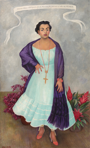
<br>In Diego Rivera’s portrait of Enriqueta Dávila, the artist asserts a Mexicanidad, a quality of Mexican-ness, in the work along with his strong feelings towards the sitter. Moreover, this painting is unique amongst his portraiture in its use of symbolism, giving us a strong if opaque picture of the relationship between artist and sitter.<br><br>Enriqueta, a descendent of the prominent Goldbaum family, was married to the theater entrepreneur, José María Dávila. The two were close friends with Rivera, and the artist initially requested to paint Enriqueta’s portrait. Enriqueta found the request unconventional and relented on the condition that Rivera paints her daughter, Enriqueta “Quetita”. Rivera captures the spirit of the mother through the use of duality in different sections of the painting, from the floorboards to her hands, and even the flowers. Why the split in the horizon of the floorboard? Why the prominent cross while Enriqueta’s family is Jewish? Even her pose is interesting, showcasing a woman in control of her own power, highlighted by her hand on her hip which Rivera referred to as a claw, further complicating our understanding of her stature.<br><br>This use of flowers, along with her “rebozo” or shawl, asserts a Mexican identity. Rivera was adept at including and centering flowers in his works which became a kind of signature device. The flowers show bromeliads and roselles; the former is epiphytic and the latter known as flor de jamaica and often used in hibiscus tea and aguas frescas. There is a tension then between these two flowers, emphasizing the complicated relationship between Enriqueta and Rivera. On the one hand, Rivera demonstrates both his and the sitter’s Mexican identity despite the foreign root of Enriqueta’s family but there may be more pointed meaning revealing Rivera’s feelings to the subject. The flowers, as they often do in still life paintings, may also refer to the fleeting nature of life and beauty. The portrait for her daughter shares some similarities from the use of shawl and flowers, but through simple changes in gestures and type and placement of flowers, Rivera illuminates a stronger personality in Enriqueta and a more dynamic relationship as filtered through his lens.<br><br>A closer examination of even her clothing reveals profound meaning. Instead of a dress more in line for a socialite, Rivera has Enriqueta in a regional dress from Jalisco, emphasizing both of their Mexican identities. On the other hand, her coral jewelry, repeated in the color of her shoes, hints at multiple meanings from foreignness and exoticism to protection and vitality. From Ancient Egypt to Classical Rome to today, coral has been used for jewelry and to have been believed to have properties both real and symbolic. Coral jewelry is seen in Renaissance paintings indicating the vitality and purity of woman or as a protective amulet for infants. It is also used as a reminder, when paired with the infant Jesus, of his future sacrifice. Diego’s use of coral recalls these Renaissance portraits, supported by the plain background of the painting and the ribbon indicating the maker and date similar to Old Master works.<br><br>When combined in the portrait of Enriqueta, we get a layered and tense building of symbolism. Rivera both emphasizes her Mexican identity but also her foreign roots. He symbolizes her beauty and vitality but look closely at half of her face and it is as if Rivera has painted his own features onto hers. The richness of symbolism hints at the complex relationship between artist and sitter.

迪戈·里韦拉

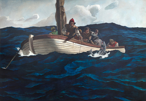
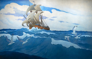
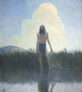
根据布兰迪温河艺术博物馆编制的目录,《清教徒鳕鱼》的初稿是 N. C. 怀斯在 1945 年 10 月去世前完成的。该条目记录了草图的图像、艺术家的题词及其标题《Puritan Cod Fishers》,目录将其描述为 "备用"。无论是哪种情况,这幅大型画布都是一件独一无二的作品,安德鲁-怀斯后来回忆说,这幅画完全是由他亲手绘制的,是父亲的设计和构图与出色的儿子的执行合作的成果。对安德鲁来说,这一定是一次感触颇深的情感体验。鉴于父亲对细节和真实性的关注,这艘小帆船的线条代表了十六世纪使用的藠头。另一方面,安德鲁很可能比他父亲更深地描绘了躁动不安的大海的色调,这一选择恰如其分地突出了任务的危险性。

Andrew Wyeth & N. C. Wyeth

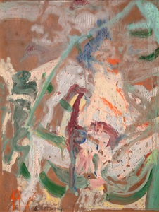
威廉-德-库宁--《划船的女人》--纸上油画,铺在石膏板上--47 1/2 x 36 1/4英寸。

威廉·德库宁

<div>The stands are: 32 H x 19-3/4 W x 19-3/4 D in.  Rat: 27 7/8 x 12 7/8 x 20 7/8 in. Ox: 29 1/8 x 20 1/8 x 16 7/8 in. Tiger: 25 7/8 x 14 7/8 x 16 7/8 in. Rabbit: 27 7/8 x 9 7/8 x 18 7/8 in. Dragon: 35 7/8 x 18 1/8 x 25 7/8 in. Snake: 27 7/8 x 14 1/8 x 6 3/4 in. Horse: 29 1/8 x 12 1/4 x 22 in. Ram: 25 1/4 x 20 7/8 x 16 1/8 in. Monkey: 27 1/8 x 12 7/8 x 14 7/8 in. Rooster: 24 x 9 x 16 7/8 in. Dog: 25 1/4 x 14 7/8 x 18 7/8 in. Boar: 27 1/8 x 16 1/8 x 20 7/8 in.  World-renowned Chinese contemporary artist Ai Weiwei is a sculptor, installation artist, architectural designer, curator, and social and cultural critic who has been exhibiting his work internationally since the late 1990s. His artistic practice is inextricably linked with cultural engagement and willingly crosses barriers between different media—cultural, artistic, and social. It was perhaps his detention from 2011 until August 2015 by the Chinese government that brought his views to the greatest audience. Ai Weiwei now lives in Germany and continues to create new works and uses his significant international profile to promote artistic and personal freedom.  These twelve sculptures depict the animals associated with the traditional Chinese zodiac. Ai Weiwei’s cycle references a European rendering of the zodiac animals designed by the Italian Jesuit Giuseppe Castiglione. The original sculptures were built in the eighteenth century for an elaborate water-clock fountain at the Yuanming Yuan (Old Summer Palace), which was ransacked in 1860. By recreating the lost and displaced statues, Ai Weiwei engages issues of looting, repatriation, and cultural heritage while expanding upon ongoing themes in his work concerning the “fake” and “copy” in relation to the original.  Ai Weiwei now works in Berlin, Germany.</div>

艾伟伟

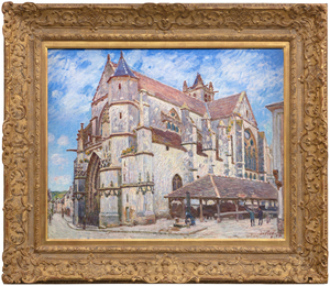
Between Île-de-France and Burgundy and on the edge of the Fontainebleau Forest lies the medieval village of Moret-sur-Loing, established in the 12th century. When Alfred Sisley described its character to Monet in a letter dated 31 August 1881 as “a chocolate-box landscape…” he meant it as a memento of enticement; that its keep, the ramparts, the church, the fortified gates, and the ornate facades nestled along the river were, for a painter, a setting of unmatched charm. An ancient church, always the most striking townscape feature along the Seine Valley, would be a presence in Sisley’s townscape views as it was for Corot, and for Monet at Vétheuil. But unlike Monet whose thirty views of Rouen Cathedral were executed so he could trace the play of light and shadow across the cathedral façade and capture the ephemeral nature of moment-to-moment changes of light and atmosphere, Sisley set out to affirm the permanent nature of the church of Notre-Dame at Moret-sur-Loing.  Monet’s sole concern was air and light, and Sisley’s appears to be an homage keepsake. The painting exudes respect for the original architects and builders of a structure so impregnable and resolute, it stood then as it did in those medieval times, and which for us, stands today, as it will, for time immemorial.<br><br>Nevertheless, Sisley strived to show the changing appearance of the motif through a series of atmospheric changes. He gave the works titles such as “In Sunshine”, “Under Frost”, and “In Rain” and exhibited them as a group at the Salon du Champ-de-Mars in 1894, factors that suggest he thought of them as serial interpretations. Nevertheless, unlike Monet’s work, l’église de Moret, le Soir reveals that Sisley chose to display the motif within a spatial context that accentuates its compositional attributes — the plunging perspective of the narrow street at left, the strong diagonal recession of the building lines as a counterbalance to the right, and the imposing weight of the stony building above the line of sight.

阿尔弗雷德·西斯利

<div><font face=Lato size=3 color=black>From the earliest days of painting during the nineteenth century, which was precipitated by the advent of Impressionism, Renoir established a reputation as the finest portrait painter among the emerging landscapists. Works such as Lise with a Parasol (1867) demonstrated his ability to capture the essence of his subjects with a distinctive flair, setting him apart from his peers. Inspired by a transformative trip to Italy in 1882, Renoir shifted his approach, emphasizing modeling and contours with smooth, blended handling, integrating a new found rigor and clarity reminiscent of the old masters. Often referred to as Renoir’s “Ingres period,” he retained the reputation of the painter best suited to manage the traditional process of recording a sitter's likeness with the distinctive flair and vibrancy of an Impressionist. </font></div><br><br><div><font face=Lato size=3> </font></div><br><br><div><font face=Lato size=3 color=black>By 1890, Renoir’s style evolved again. He thinned his pigments to achieve a jewel-like translucence, infusing his works with a tender, ethereal quality. This final phase reflects the physical limitations of encroaching rheumatoid arthritis but also a deeper, more reflective approach to his subjects, capturing their inner light and character with subtle, luminous strokes. </font></div><br><br><div><font face=Lato size=3> </font></div><br><br><div><font face=Lato size=3 color=black>No longer obliged to rely upon society portrait commissions, by 1900, Renoir began to focus on portraits and studies of family, close friends, and neighbors. “Fillette à l’orange”, painted in 1911, extends our appreciation of his very personal, intimate style and reputation for imbuing his portraits of children with all the affectionate charm he could muster. It avoids the softer, generalized approach that prompted his son Jean’s remark that “we are all Renoir’s children, ”idealized versions of beauty and sensuality expressed in universal rather than with physiognomic specifics. We may never know her identity, but her likeness is vivid because Renoir concentrates on her face and expression. Nevertheless, the interplay of light and color highlights her features and brings to life the tender and affectionate nature characteristic of Renoir’s later portraits. An orange as an accessory is often included in portraiture as a symbol of fertility. Yet, here, it seems to serve as a formal element for the artist to demonstrate his skill at displaying its size, shape, and heft in this young girl's hand.</font></div>

皮埃尔-阿穆尔·雷诺尔

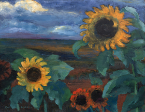
Trained as a woodcarver, Emil Nolde was almost 30 years old before he made his first paintings. The early paintings resembled his drawings and woodcuts: grotesque figures with bold lines and strong contrasts. The style was new, and it inspired the nascent movement Die Brücke (The Bridge), whose members invited Nolde to join them in 1906.  But, it was not until the garden became his locus operandi by 1915 that he built upon his mastery of contrasting luminosities to focus on color as the supreme means of expression.  Later, Nolde claimed “color is strength, strength is life,” and he could not have better characterized why his flower paintings reinvigorate our perception of color.<br><br>Much of the strength of Nolde’s dramatic, Wagnerian-like color sensibilities is the effect of staging primary colors, such as the deep reds and golden yellows of Sonnenblumen, Abend II, against a somber palette. The contrast highlights and deepens the luminosity of the flowers, not just visually, but emotionally as well. In 1937, when Nolde’s art was rejected, confiscated, and defiled, his paintings were paraded as “degenerate art” throughout Nazi Germany in dimly lit galleries. Despite that treatment, Nolde’s status as a degenerate artist gave his art more breathing space because he seized the opportunity to produce more than 1,300 watercolors, which he called “unpainted pictures.” No novice in handling watercolor, his free-flowing style of painting had been a hallmark of his highly-charge, transparent washes since 1918. Sonnenblumen, Abend II, painted in 1944, is a rare wartime oil. He let his imagination run wild with this work, and his utilization of wet-on-wet techniques heightened the drama of each petal.<br><br>Nolde’s intense preoccupation with color and flowers, particularly sunflowers, reflects his continuing devotion to van Gogh.  He was aware of van Gogh as early as 1899 and, during the 1920s and early 1930s, visited several exhibitions of the Dutch artist’s work.  They shared a profound love of nature. Nolde’s dedication to expression and the symbolic use of color found fullness in the sunflower subject, and it became a personal symbol for him, as it did for Van Gogh.

EMIL NOLDE

19世纪70年代初,温斯洛-霍默经常在位于纽约州哈德逊河和卡茨基尔山之间的一个小农庄附近绘制乡村生活场景,该小农庄因其出色的麦田而世代闻名。今天,赫尔利因激发了荷马最伟大的作品之一--1872年夏天绘制的《鞭子的Snap》而更为著名。在其他许多受该地区启发的画作中,《站在麦田里的女孩》感情丰富,但没有过度感伤。它与1866年在法国画的一幅题为《在麦田里》的研究报告以及次年他回到美国后画的另一幅报告直接相关。但荷马无疑会对这幅作品感到最自豪。这是一幅肖像画,一幅服装研究画,一幅具有欧洲田园画伟大传统的风俗画,也是一幅戏剧性的逆光、大气的巡回画,浸透在迅速消逝的阴暗时刻的光线中,并带有羊脂玉般的花香和麦穗的点缀。1874年,荷马送了四幅画给国家设计学院的展览。其中一幅名为 "女孩"。难道不是这一幅吗?

温斯洛荷马

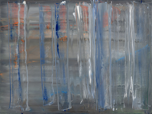
Widely recognized as one of the most consequential artists of our time, Gerhard Richters career now rivals that of Picasso's in terms of productivity and genius. The multi-faceted subject matter, ranging from slightly out-of-focus photographic oil paintings to Kelly-esque grid paintings to his "squeegee" works, Richter never settles for repeating the same thought- but is constantly evolving his vision. Richter has been honored by significant retrospective exhibitions, including the pivotal 2002 show,  "Gerhard Richter: Forty Years of Painting," at the Museum of Modern Art, New York.  <br><br>"Abstraktes Bild 758-2" (1992) comes from a purely abstract period in Richter's work- where the message is conveyed using a truly physical painting style, where applied paint layers are distorted with a wooden "Squeegee" tool. Essentially, Richter is sculpting the layers of paint, revealing the underlayers and their unique color combinations; there is a degree of "art by chance". If the painting does not work, Richter will move on- a method pioneered by Jackson Pollock decades earlier.  <br><br>Richter is included in prominent museums and collections worldwide, including the Tate, London, The Museum of Modern Art, New York, and the San Francisco Museum of Modern Art, among many others.

格哈德·里希特

<div>In the mid-1920s, Rufino Tamayo embarked on the crucial development phase as a sophisticated, contemporary colorist. In New York, he encountered the groundbreaking works of Picasso, Braque, and Giorgio de Chirico, along with the enduring impact of Cubism. Exploring painterly and plastic values through subjects sourced from street scenes, popular culture, and the fabric of daily life, his unique approach to color and form began to take shape. It was a pivotal shift toward cosmopolitan aesthetics, setting him apart from the nationalist fervor championed by the politically charged narratives of the Mexican Muralist movement.  By focusing on the vitality of popular culture, he captured the essential Mexican identity that prioritized universal artistic values over explicit social and political commentary. The approach underscored his commitment to redefining Mexican art on the global stage and highlighted his innovative contributions to the modernist dialogue. </div><br><br><div> </div><br><br><div>Like Cézanne, Tamayo elevated the still life genre to some of its most beautifully simple expressions. Yet high sophistication underlies the ease with which Tamayo melds vibrant Mexican motifs with the avant-garde influences of the School of Paris. As "Naturaleza Muerta" of 1935 reveals, Tamayo refused to lapse into the mere decoration that often characterizes the contemporary School of Paris art with which his work draws comparisons. Instead, his arrangement of watermelons, bottles, a coffee pot, and sundry items staged within a sobering, earthbound tonality and indeterminant, shallow space recalls Tamayo's early interest in Surrealism. An overlayed square matrix underscores the contrast between the organic subjects of the painting and the abstract, intellectualized structure imposed upon them, deepening the interpretation of the artist's exploration of visual perception and representation. In this way, the grid serves to navigate between the visible world and the underlying structures that inform our understanding of it, inviting viewers to consider the interplay between reality and abstraction, sensation and analysis.</div>

鲁菲诺·塔马约

No artist bridged the gap between European Modernism and American Abstract Expressionism the same way Hans Hofmann did. The reason is simple. He was trained in Parisian academies prior to World War I and was friendly with Henri Matisse, Pablo Picasso, Georges Braque, and, most significantly, Robert and Sonia Delaunay. Conversely, his endeavors as a teacher and later, as a mature artist in full command of his abilities were stimulated — made possible even — by the exhilarating New York milieu that gave rise to Abstract Expressionism. So perhaps it is not surprising that unlike most of the Abstract Expressionists who pursued a single iconographic look — Rothko’s soft-edged rectangles, Franz Klein’s enlarged calligraphic strokes, Clyfford Still’s dark, ragged shapes — Hofmann was constantly reaching for different and contradictory effects. That meant his paintings were wildly varied and that they carved a wide swath toward the most exciting avenues available to contemporary abstraction. Hofmann proved to be a gallant experimenter, refusing to settle on a single style for long.<br><br>The Climb was painted in 1960 at a time when most American painters were pushing abstraction in new directions. Not surprisingly, as an outlier, it does not evoke Hofmann’s usual “push and pull’ technique. But it is very much a painting of its time, marked by a sensuousness and a deft, painterly touch. It suggests what Irving Sandler characterized as Hofmann’s hedonistic touch, an optimistic celebration of the lyrical abstraction that overcame the burning darkness of painting in the 40s and trumped even the lighter palette of Pollock or Pousette-Dart that emerged later. While the passages of The Climb are brushed rather than poured or stained, it reflects the delicate lyricism of his former student, Helen Frankenthaler who, since 1952 had experimented with floating areas of color, absorbed into the canvas with watercolor-like ease. She, in turn, had inspired a generation of Color Field painters including Morris Louis and Kenneth Noland. On the other hand, these short bands and prismatic slurries recall those halcyon days in Paris when Hofmann worked through color theory with his good friend Robert Delaunay and thought a lot about prisms. Hofmann not only retained elements of Synthetic Cubism, but the lessons he learned from the Fauves and the artists who verily invented abstraction, Wassily Kandinsky, Kasimir Malevich, Frantisek Kupka, and Piet Mondrian to name a few of the key players. The Climb is a glorious expression of a painter drawing from both the past and the present, painting in a playful, but not frivolous manner fully informed and prepared to express his abilities as a painter, simply, and with great conviction.<br><br>As New York City became the avant-garde’s global hub in the 1940s, radical, new approaches to art, such as action painting and abstraction, took root among the informally grouped New York School painters. By 1950, Abstract Expressionism was well underway, but the movement was often overlooked by institutions. When the Metropolitan Museum of Art announced its plan to exhibit a survey of contemporary American painting, many of the New York School painters felt there was a bias against more “progressive” art in the museum’s selection process, prompting them to draft an open letter protesting the show.<br><br>The letter garnered attention, and Life magazine published an article on the protest in January 1951, “The Irascible Group of Advanced Artists Led Fight Against Show.” To accompany the article, Nina Lee photographed 15 of the 18 painters who signed the letter, including Hans Hofmann, Willem de Kooning, Adolph Gottlieb, Ad Reinhardt, Richard Pousette-Dart, William Baziotes, Jackson Pollock, Clyford Still, Robert Motherwell, Barnett Newman, and Mark Rothko. Today, this article is considered a turning point in the prominence of Abstract Expressionism, and the artists involved are often referred to as the “Irascibles.”

汉斯·霍夫曼

KENNETH NOLAND - Passage - 布面丙烯 - 69 1/2 x 140 1/2 英寸。

肯尼思·诺兰

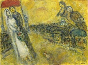
马克-夏加尔的世界不能被我们附加在它身上的标签所包含或限制。它是一个由图像和意义组成的世界,形成了自己绚丽的神秘话语。Les Mariés sous le baldaquin(《天幕下的新郎和新娘》)是在艺术家进入90岁时开始的,这个人经历了悲剧和争斗,但他从未忘记生命中的狂欢时刻。在这里,一个俄罗斯乡村婚礼的梦幻般的乐趣,以及其安排好的与会者,以如此快乐的机智和欢快的纯真带给我们,让人无法抗拒其魅力。使用油彩和不透明的水性水粉相结合的金色调乳剂,夏加尔一贯的积极主义的温暖、幸福和乐观被包裹在发光的光芒中,暗示着金箔宗教圣像或文艺复兴早期绘画的影响,试图传递神圣的光或精神启蒙的印象。使用油画和水粉画的组合可能是一种挑战。但在这里,在《Les Mariés sous le baldaquin》中,夏加尔用它来赋予这个场景一种超凡脱俗的品质,几乎就像它刚刚从他的脑海中显现出来。它的纹理细腻,给人的印象是光是从作品本身发出来的,并给漂浮在空中的人物带来一种幽灵般的品质。

马克·查加尔

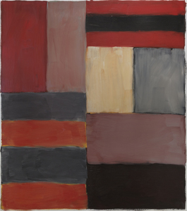
The frame of reference for Irish American Sean Scully’s signature blocks and stripes is vast. From Malevich’s central premise that geometry can provide the means for universal understanding to Rothko’s impassioned approach to color and rendering of the dramatic sublime, Scully learned how to condense the splendor of the natural world into simple modes of color, light, and composition. Born in Dublin in 1945 and London-raised, Scully was well-schooled in figurative drawing when he decided to catch the spirit of his lodestar, Henri Matisse, by visiting Morocco in 1969. He was captivated by the dazzling tessellated mosaics and richly dyed fabrics and began to paint grids and stipes of color. Subsequent adventures provided further inspiration as the play of intense light on the reflective surfaces of Mayan ruins and the ancient slabs of stone at Stonehenge brought the sensation of light, space, and geometric movement to Scully’s paintings. The ability to trace the impact of Scully’s travels throughout his paintings reaffirms the value of abstract art as a touchstone for real-life experience.<br><br><br>Painted in rich, deep hues and layered, nuanced surfaces, Grey Red is both poetic and full of muscular formalism. Scully appropriately refers to these elemental forms as ‘bricks,’ suggesting the formal calculations of an architect. As he explained, “these relationships that I see in the street doorways, in windows between buildings, and in the traces of structures that were once full of life, I take for my work. I use these colors and forms and put them together in a way that perhaps reminds you of something, though you’re not sure of that” (David Carrier, Sean Scully, 2004, pg. 98). His approach is organic, less formulaic; intuitive painter’s choices are layering one color upon another so that contrasting hues and colors vibrate with subliminal energy. Diebenkorn comes to mind in his pursuit of radiant light. But here, the radiant bands of terracotta red, gray, taupe, and black of Grey Red resonate with deep, smoldering energy and evoke far more affecting passion than you would think it could impart. As his good friend, Bono wrote, “Sean approaches the canvas like a kickboxer, a plasterer, a builder. The quality of painting screams of a life being lived.”

塞恩·斯卡利

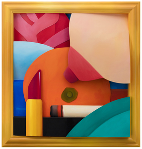
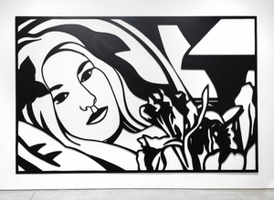
Tom Wesselmann will undoubtedly be remembered for associating his erotic themes with the colors of the American flag. But Wesselmann had considerable gifts as a draftsman, and the line was his principal preoccupation, first as a cartoonist and later as an ardent admirer of Matisse. That he also pioneered a method of turning drawings into laser-cut steel wall reliefs proved a revelation. He began to focus ever more on drawing for the sake of drawing, enchanted that the new medium could be lifted and held: “It really is like being able to pick up a delicate line drawing from the paper.”<br><br>The Steel Drawings caused both excitement and confusion in the art world. After acquiring one of the ground-breaking works in 1985, the Whitney Museum of American Art wrote Wesselmann wondering if it should be cataloged as a drawing or a sculpture. The work had caused such a stir that when Eric Fischl visited Wesselmann at his studio and saw steel-cut works for the first time, he remembered feeling jealous. He wanted to try it but dared not. It was clear: ‘Tom owned the technique completely.’<br><br>Wesselmann owed much of that technique to his year-long collaboration with metalwork fabricator Alfred Lippincott. Together, in 1984 they honed a method for cutting the steel with a laser that provided the precision he needed to show the spontaneity of his sketches. Wesselmann called it ‘the best year of my life’, elated at the results that he never fully achieved with aluminum that required each shape be hand-cut.  “I anticipated how exciting it would be for me to get a drawing back in steel. I could hold it in my hands. I could pick it up by the lines…it was so exciting…a kind of near ecstasy, anyway, but there’s really been something about the new work that grabbed me.”<br><br>Bedroom Brunette with Irises is a Steel Drawing masterwork that despite its uber-generous scale, utilizes tight cropping to provide an unimposing intimacy while maintaining a free and spontaneous quality. The figure’s outstretched arms and limbs and body intertwine with the petals and the interior elements providing a flowing investigative foray of black lines and white ‘drop out’ shapes provided by the wall. It recalls Matisse and any number of his reclining odalisque paintings. Wesselmann often tested monochromatic values to discover the extent to which color would transform his hybrid objects into newly developed Steel Drawing works and, in this case, continued with a color steel-cut version of the composition Bedroom Blonde with Irises (1987) and later still, in 1993 with a large-scale drawing in charcoal and pastel on paper.

托姆·韦塞尔曼

ALBERT BIERSTADT - 金门 - 布面油画 - 27 3/8 x 38 3/4 英寸。

阿尔伯特-比尔斯塔特

<div><font face=Lato size=3 color=black>Irving Norman conceived and created <em>The Human Condition</em> at a time when he must have reflected deeply on the totality of his life. Given its grand scale and cinematic treatment, it impresses as a profound culmination of his artistic journey, synthesizing decades of themes, insights, and experiences into a single monumental work. A man of great humility and an artist of uncommon skill, he translated a horrendous war experience into impactful allegories of unforgettable, often visceral imagery. He worked in solitude with relentless forbearance in a veritable vacuum without fame or financial security. Looking to the past, acutely aware of present trends, he knew, given the human predicament, he was forecasting the future. As one New York Times reviewer mused in 2008, "In light of current circumstances, Mr. Norman's dystopian vision may strike some…as eerily pertinent," an observation that recalled recent events.<br><br></font></div><br><br><div><font face=Lato size=3 color=black>Irving Norman's figures, manipulated by their environment and physical space, are of a style that exaggerates the malleability of the human form to underscore their vulnerability and subjugation. This literal and symbolic elasticity suggests that these figures are stretched, compressed, or twisted by the forces of their environment, emphasizing their lack of autonomy and the oppressive systems that govern their existence. While these figures reflect vulnerability, Norman's structural choice in <em>The Human Condition</em> creates a stark juxtaposition that shifts attention toward the central tableau. A commanding female figure, rising above the calamitous failures and atrocities of the past, is joined by a man, forming a symbolic "couple,” suggesting the unity and shared responsibility of a new vision. Their hands, magnified and upturned, present these children as a vision offering hope and renewal for the future. The gesture, combined with the futuristic clothing of the diminutive figures, reinforces the idea of an alternative path—a brighter, forward-looking humanity. The central tableau acts as a metaphorical offering, inviting the viewer to consider a future untouched by the weight of darkness from which these figures emerge.<br><br></font></div><br><br><div><font face=Lato size=3 color=black>Here, Norman underscores a hopeful, if not optimistic, vision for generations ahead. The structural decision suggests a deliberate shift in focus: the darker scenes relegated to the sides represent the burdens, past and present. At the same time, the central figures embody the potential for a future shaped by resilience and renewal. This juxtaposition distinguishes <em>The Human Condition</em> as a reflection of Norman's later years, where a tempered hope emerges to claim the high ground over the war-mongering, abject corruption, frantic pleasure-seeking, and the dehumanizing effects of modern society.<br><br></font></div><br><br><div><font face=Lato size=3 color=black>Throughout his long career, Norman stood tall in his convictions; he turned, faced the large, empty canvases, and designed and painted complex, densely populated scenes. As for recognition, he rationalized the situation—fame or fortune risked the unsullied nature of an artist's quest. Ultimately, <em>The Human Condition</em> is a summation of Norman's life and work and a call to action, urging us to examine our complicity in the systems he so vividly depicted. Through meticulous craftsmanship and allegorical intensity, it is a museum-worthy masterwork that continues to resonate, its themes as pertinent today as they were when Norman painstakingly brought his vision to life.</font></div>

欧文·诺曼

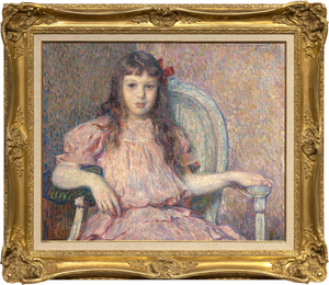
Théo van Rysselberghe的《Sylvie Lacombe肖像》画于1906年,是他那个时代最精致、最稳定的肖像画家之一的经典杰作。色彩和谐,笔触有力,适合其材料任务,她的身体和面容真实而露骨。坐着的人是他的好朋友,画家乔治-拉孔布的女儿,他与高更有着密切的联系,并且是Les Nabis的成员,与艺术家博纳尔、丹尼斯和维雅等人一起。我们现在知道了Sylvie Lacombe,因为Van Rysselberghe非常擅长渲染微妙的面部表情,通过仔细观察和关注细节,提供了对她内心世界的见解。他选择了一种直接的凝视,她的眼睛对着你的眼睛,无论我们与画作的物理关系如何,主体和观众之间都有一种不可避免的盟约。在画这幅肖像时,范-赖斯伯格已经基本放弃了点彩画法。但他继续运用色彩理论准则,用红色的色调--粉色和淡紫色--来衬托绿色,创造出一个和谐的互补色调,他在其中加入了一个强烈的点睛之笔--一个强烈饱和的红色蝴蝶结,不对称地放在她的头边。

泰奥-范-雷塞尔贝格