


我们在棕榈沙漠的画廊位于加利福尼亚州棕榈泉地区,毗邻埃尔帕塞奥的热门购物和用餐区。我们的客户欣赏我们选择的战后、现代和当代艺术。冬季的灿烂天气吸引着来自世界各地的游客参观我们美丽的沙漠,并参观我们的画廊。外面的多山沙漠景观为等待里面的视觉盛宴提供了完美的风景背景。
45188波托拉大道
棕榈沙漠, CA 92260
(760) 346-8926
时间:
周一至周六 9am-5pm
展览
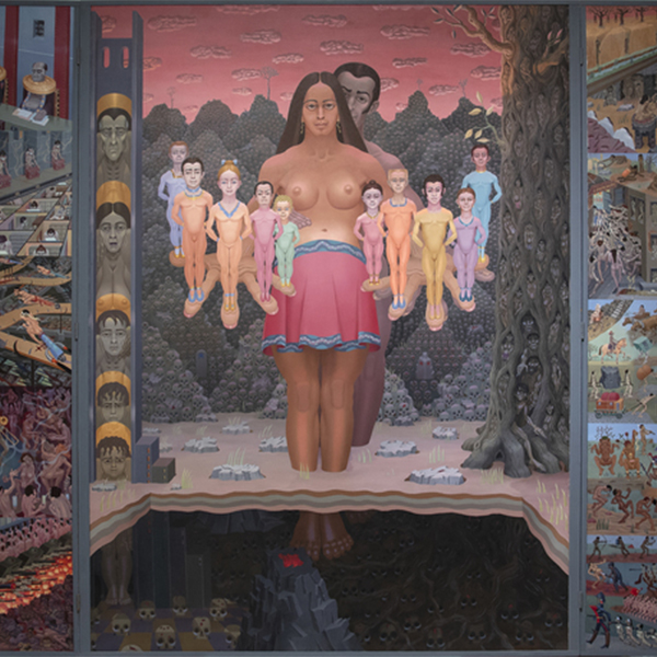
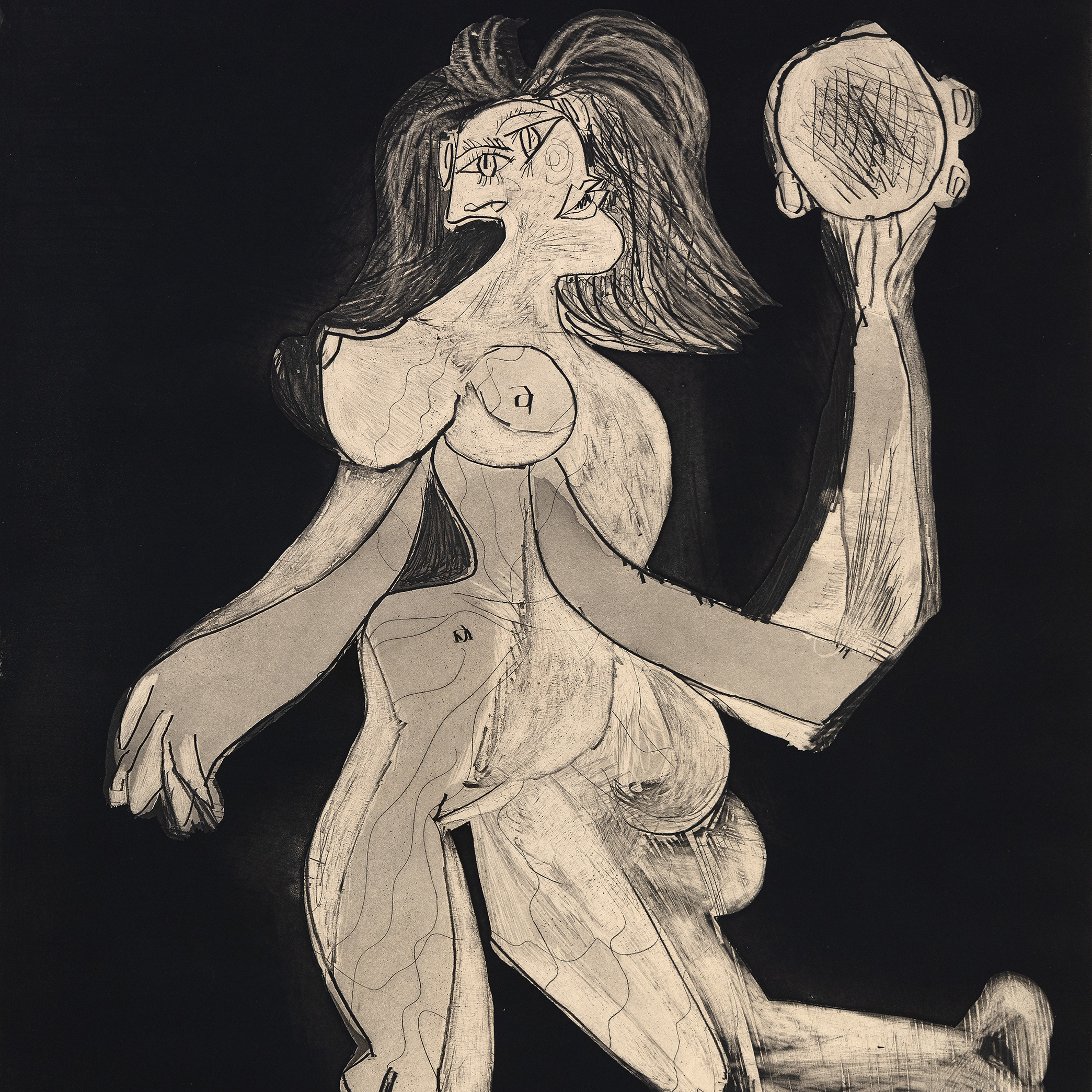
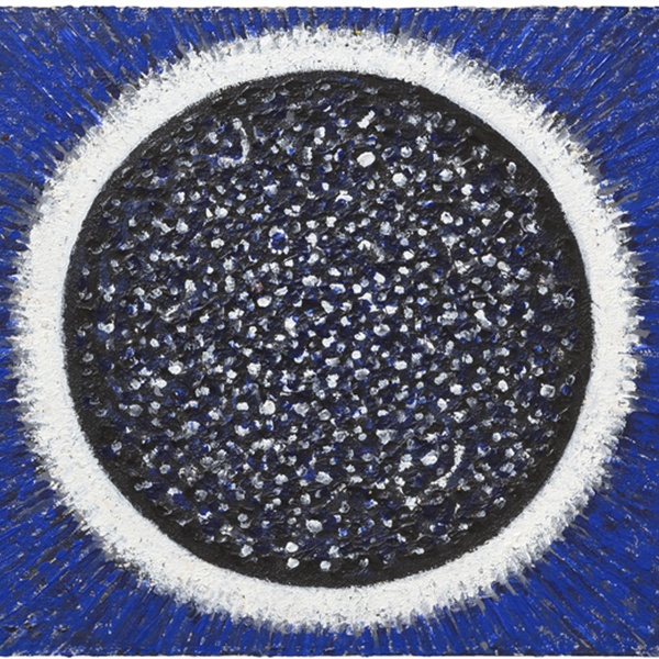
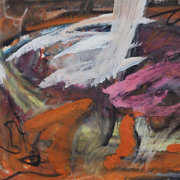
图稿

Andrew Wyeth & N. C. Wyeth

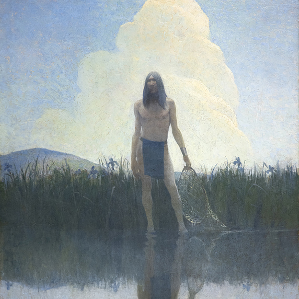
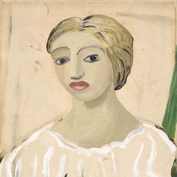
北卡罗来纳州

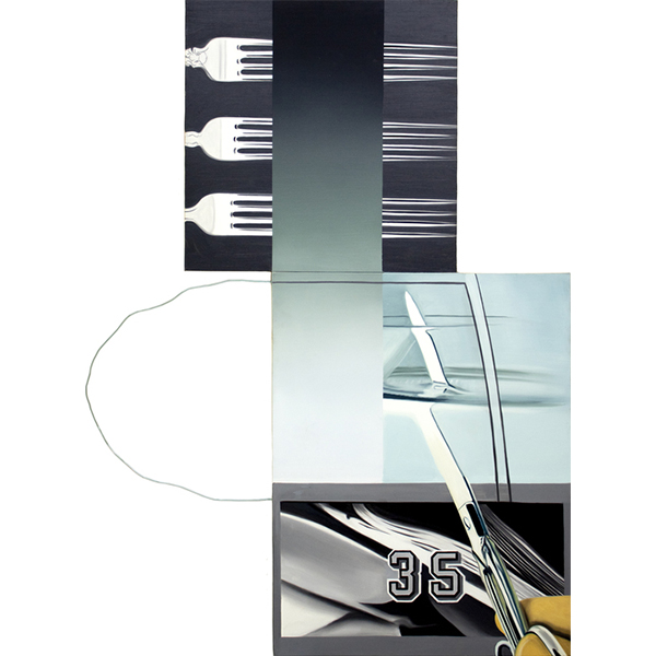
托姆·韦塞尔曼

托姆·韦塞尔曼
_tn27035.jpg "ROBERT INDIANA-AMOR (Red Yellow)")
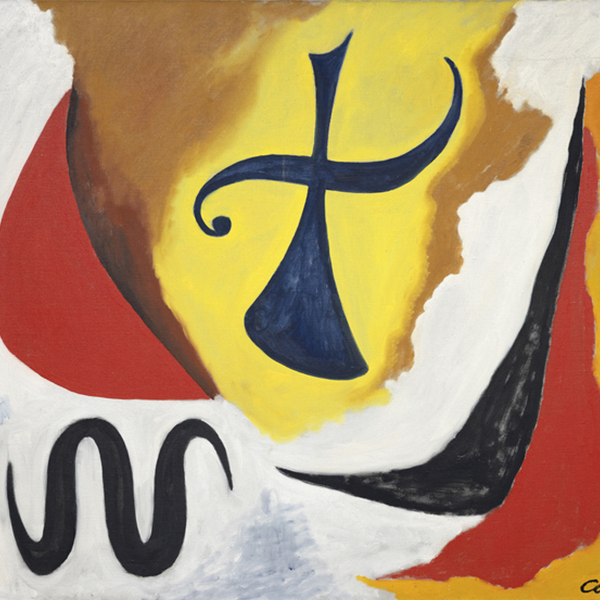
罗伯特·印第安纳

梅尔·拉莫斯

卡塔琳娜·格罗斯

泰奥-范-雷塞尔贝格
_tn27843.jpg "ELAINE DE KOONING-Untitled (Totem Pole)")
伊莱恩·德·库宁

HERB ALPERT

HERB ALPERT

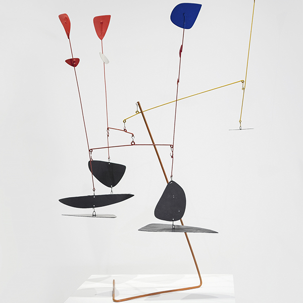
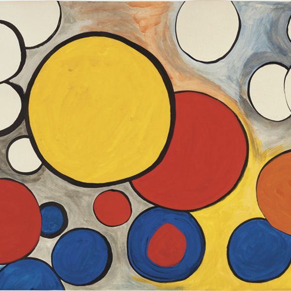
亚历山大·卡尔德

欧文·诺曼

亚历山大·卡尔德

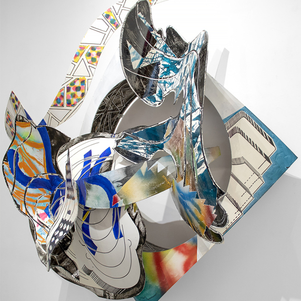
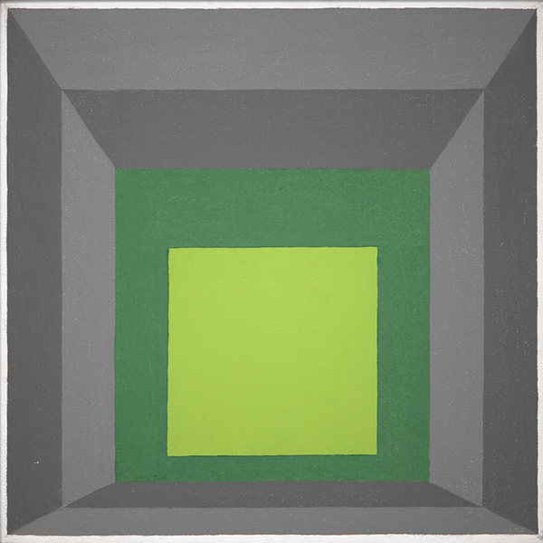
弗兰克·斯特拉

德博拉·巴特菲尔德

曼纽尔·内里

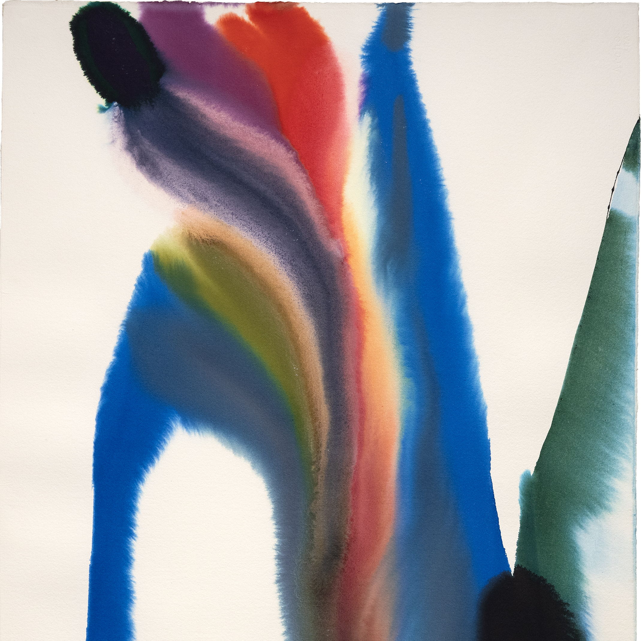
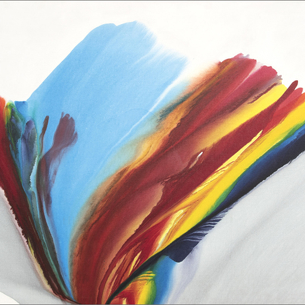
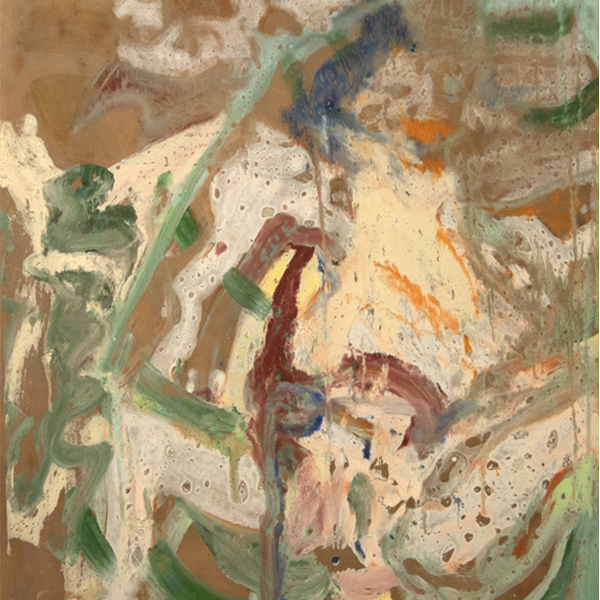
保罗·詹金斯

曼纽尔·内里

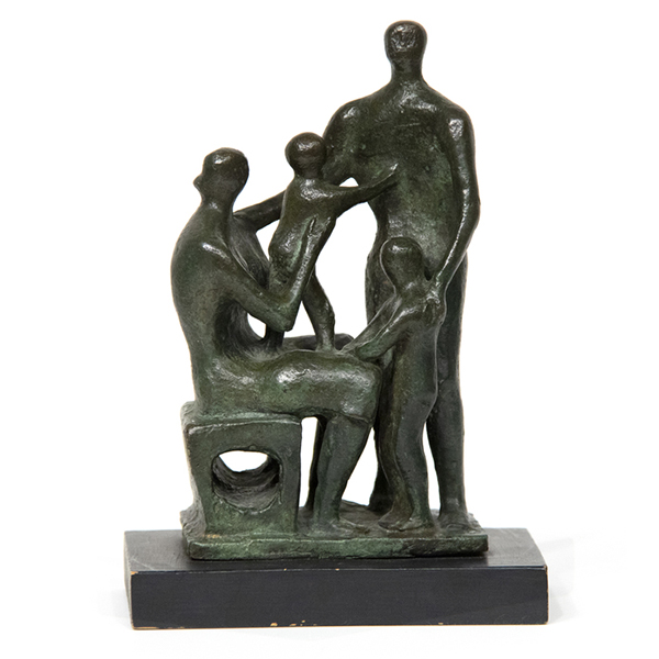
欧文·诺曼

基基-史密斯

泰奥-范-雷塞尔贝格
_tn28596.jpg "DEBORAH BUTTERFIELD-Untitled (Horse)")
德博拉·巴特菲尔德

曼纽尔·内里

JOSEPH STELLA

HERB ALPERT

欧文·诺曼

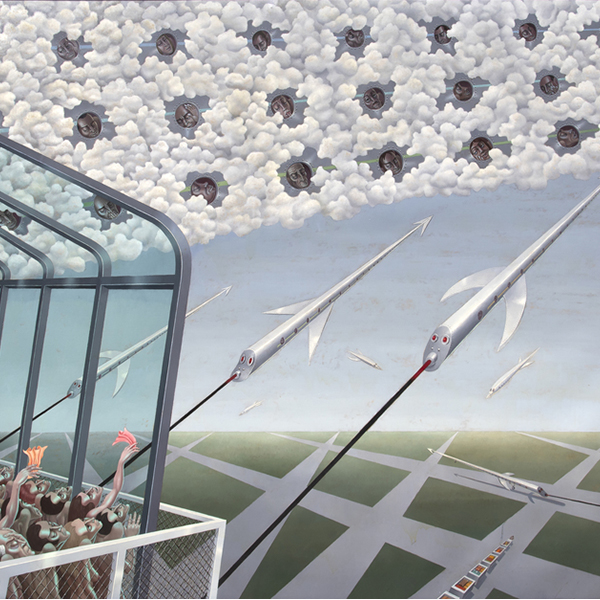
苏博德·古普塔

马克·奎因

欧文·诺曼

查尔斯·阿诺迪

韦恩·蒂博

萨洛蒙-范-赖斯达尔

马克斯·佩莱尼

欧文·诺曼

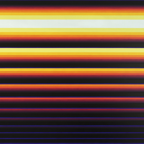
VALERIE JAUDON

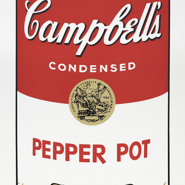
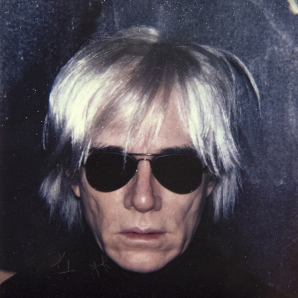
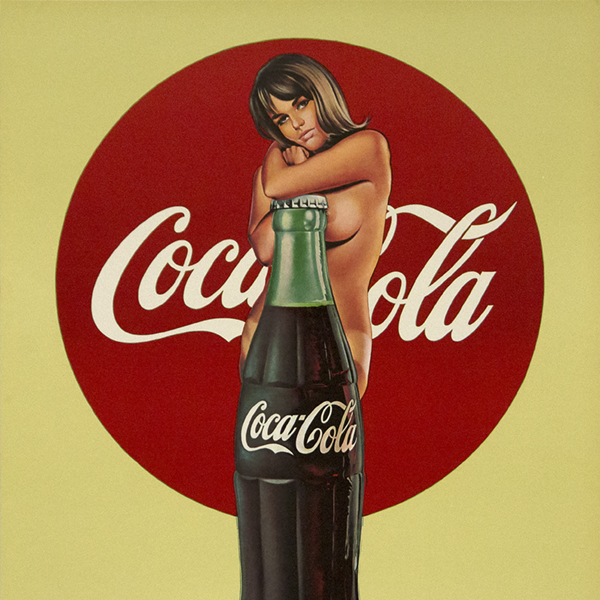
安迪·沃霍尔
_tn16764.b.jpg "HARRY BERTOIA-Untitled (Suspended Willow)")
哈里·贝托亚
_tn40803.jpg "JOANNA POUSETTE-DART-Untitled (Red Desert Study)")
乔安娜·普塞特-达特

塞特·考夫曼

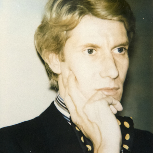
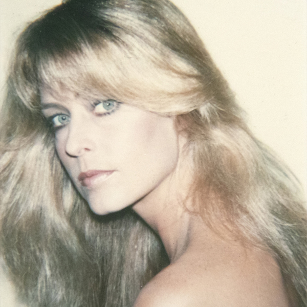
安迪·沃霍尔

罗伯特·纳特金
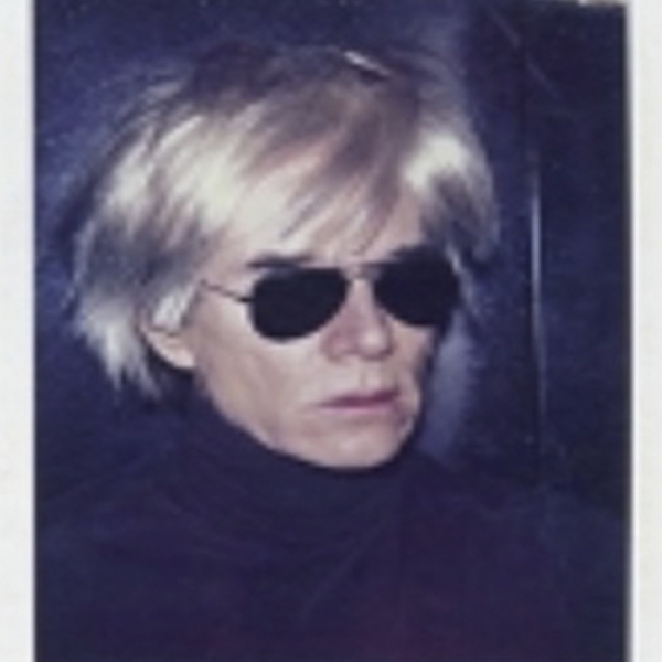
_tn36185.jpg "ANDY WARHOL-Self-Portrait with Camera (diptych)")
安迪·沃霍尔

莫里斯·阿肯纳齐
_tn37425.jpg "ANDY WARHOL-The Shadow (from Myths)")
安迪·沃霍尔

安迪·沃霍尔

安迪·沃霍尔

马克斯·佩莱尼

马克斯·佩莱尼

马克斯·佩莱尼

马克斯·佩莱尼

马克斯·佩莱尼
在新闻中

新闻

Gibson, Dunn & Crutcher 安装公司
Chip Tom 和 Heather James Fine Art 拥有多年策展博物馆展览和创建企业收藏的经验,是 Gibson, Dunn & Crutcher LLP 的最佳拍档。
更多


按
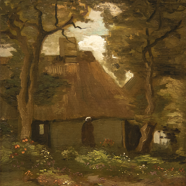
希瑟-詹姆斯向 "凡高在美国 "借出主要的凡高作品
2022年9月30日
希瑟-詹姆斯将梵高在1888年画的 "普罗旺斯的收获 "借给底特律艺术学院的 "梵高在哪里",这幅画的灵感来自于法国阿尔的风景和色彩。


视频

2022年5月与吉姆-卡罗纳的艺术拍卖季回顾
Heather James Fine Art所有人James Carona与美术助理Jenna Grotelueschen讨论2022年5月的艺术拍卖季。
更多...


目录

Heather James Fine Art - 关于我们
Heather James Fine Art已经经营了超过25年,展示了跨越时间段和流派的重要作品,包括当代、现代、印象派、美国、拉美和古代大师。
更多...

服务


了解我们
特色艺术

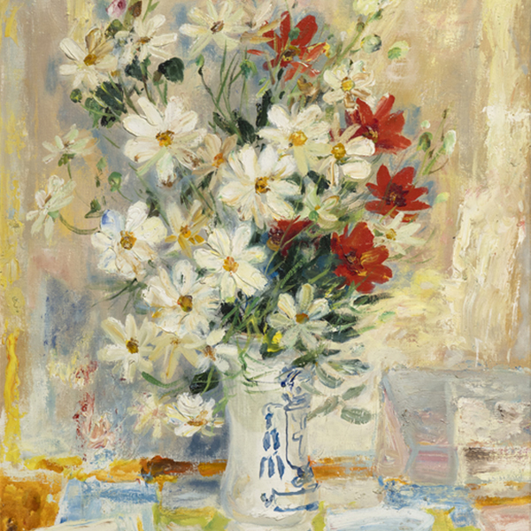
PAUL SIGNAC

格兰特-伍德
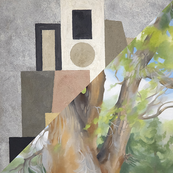
,_new_mexico_tn40147.jpg "GEORGIA O'KEEFFE-Cottonwood Tree (Near Abiquiu), New Mexico")
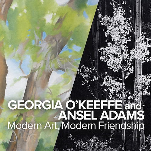
GEORGIA O'KEEFFE

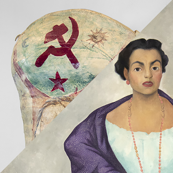
迪戈·里韦拉

威廉·德库宁
Andrew Wyeth & N. C. Wyeth

亚历山大·卡尔德
北卡罗来纳州

阿尔弗雷德·西斯利
_tn45742.jpg "SIR WINSTON CHURCHILL-On the Rance, Near St. Malo (C520)")
温斯顿·丘吉尔爵士

EMIL NOLDE

亚历山大·卡尔德
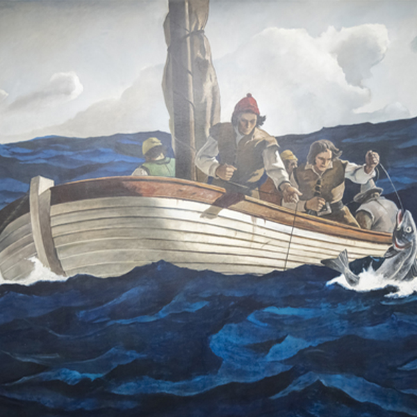
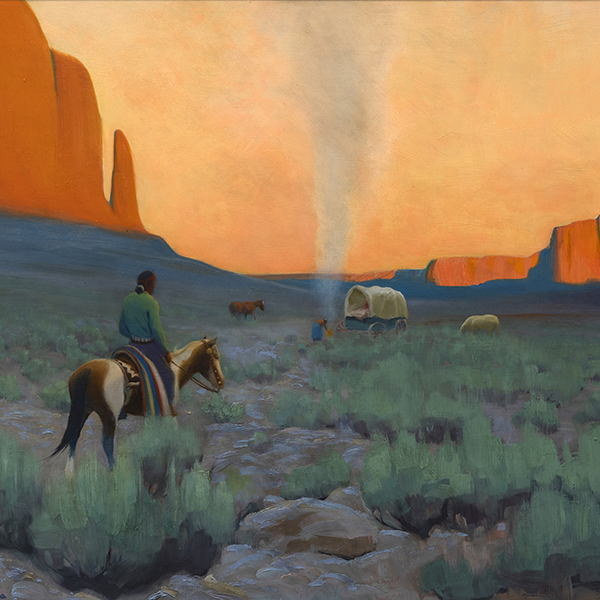
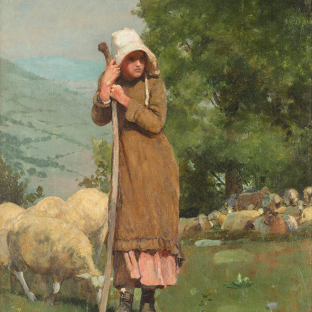
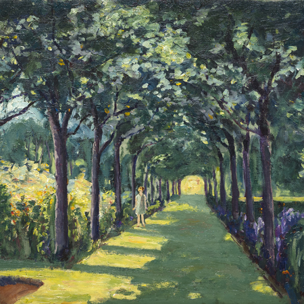
_tn43950.jpg "WINSLOW HOMER-In the Wheatfield (Girl Standing in a Wheat Field)")
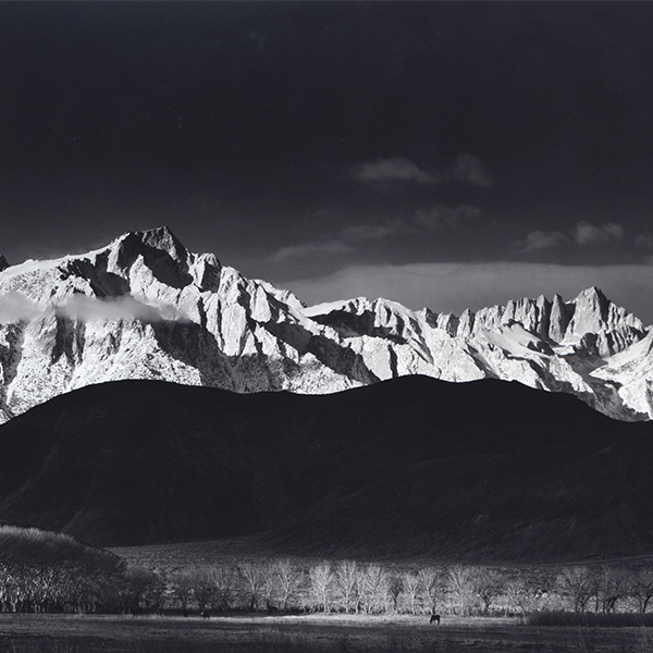
温斯洛荷马
_tn45739.b.jpg "SIR WINSTON CHURCHILL-View Over Cassis Port (C 333)")
温斯顿·丘吉尔爵士

格哈德·里希特
托姆·韦塞尔曼
_tn45741.jpg "SIR WINSTON CHURCHILL-By Lake Lugano (C413)")
温斯顿·丘吉尔爵士
_tn45731.jpg "SIR WINSTON CHURCHILL-Riviera Coast Scene (C 295)")
温斯顿·丘吉尔爵士
_tn45733.jpg "SIR WINSTON CHURCHILL-The Bay of Eze (C 490)")
温斯顿·丘吉尔爵士

塞恩·斯卡利

马克·查加尔
_tn40169.jpg "MARSDEN HARTLEY-Bach Preludes et Fugues No. 1 (Musical Theme)")
马斯登-哈特利
托姆·韦塞尔曼
_tn45732.jpg "SIR WINSTON CHURCHILL-Oranges and Lemons (C 455)")
温斯顿·丘吉尔爵士
罗伯特·印第安纳

拉里·里弗斯
_tn45736.jpg "SIR WINSTON CHURCHILL-Coastal Town on the Riviera (Double-Sided C111 & 535)")
温斯顿·丘吉尔爵士
_tn45745.b.jpg "SIR WINSTON CHURCHILL-The Library of Sir Philip Sassoon's House at Lympne (C19)")
温斯顿·丘吉尔爵士
泰奥-范-雷塞尔贝格
萨洛蒙-范-赖斯达尔
