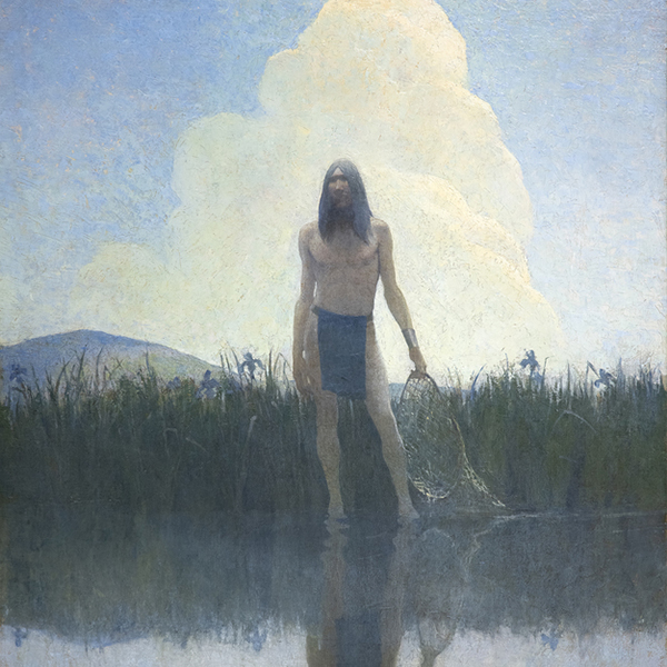
מדבר פאלם
תערוכותעבודות עבודה על שירותי חדשות הקשורים לצפייה


הגלריה שלנו במדבר פאלם ממוקמת במיקום מרכזי באזור פאלם ספרינגס בקליפורניה, בסמוך לאזור הקניות והאוכל הפופולרי של אל פאסאו. קהל הלקוחות שלנו מעריך את הבחירה שלנו באמנות שלאחר המלחמה, מודרנית ועכשווית. מזג האוויר המדהים בחודשי החורף מושך מבקרים מכל רחבי העולם לראות את המדבר היפה שלנו, ולעצור ליד הגלריה שלנו. הנוף המדברי ההררי שבחוץ מספק את הרקע הנופי המושלם לסעודה הוויזואלית שמחכה בפנים.
שדרות פורטולה 45188
פאלם דזרט, קליפורניה 92260
(760) 346-8926
שעות:
ימים שני עד שבת 9:00 עד 17:00
תערוכות

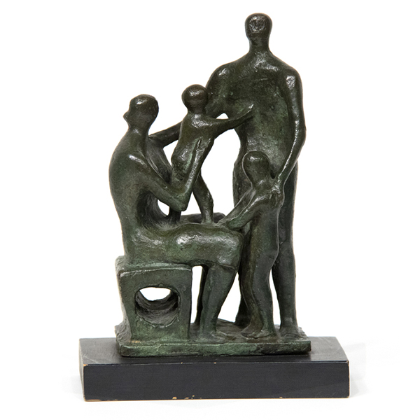
גרפיקה בתצוגה

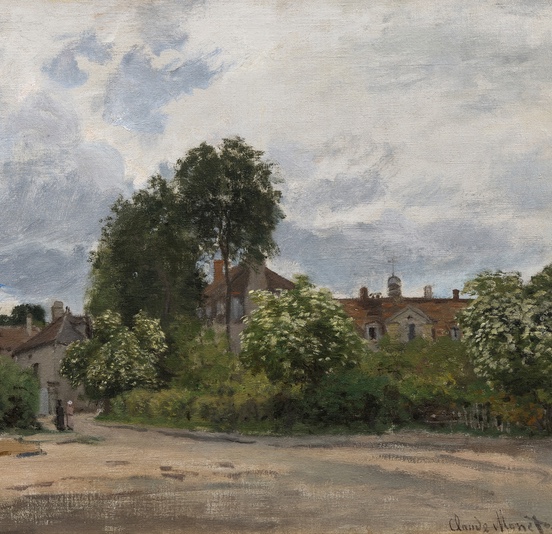
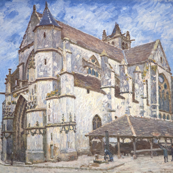
קלוד מונה

קלוד מונה

וילם דה קונינג

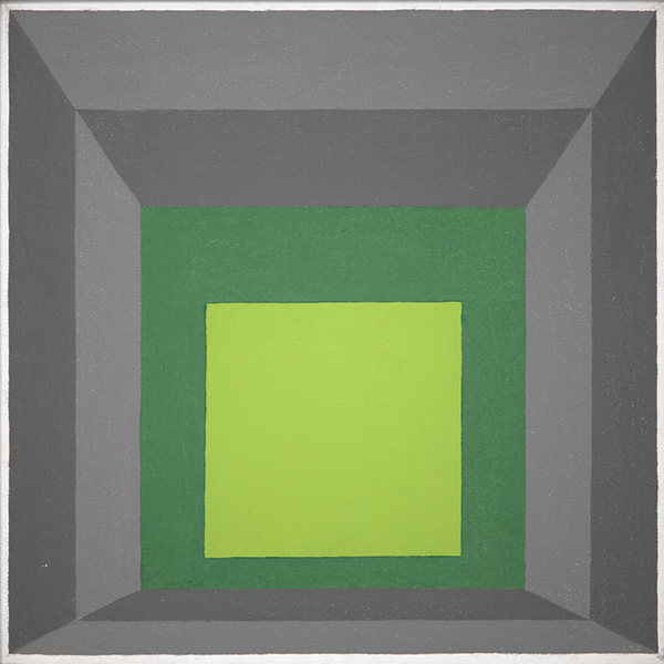
ויין תיאבאוד

צ'יילד סאם

קלוד מונה
_tn48131.jpg "PIERRE BONNARD-La robe de chambre rouge (Marthe Bonnard)")
פייר בונרד

קמיל פיסארו

אלברט בירסטאדט

אלפרד סיסלי

גרהרד ריכטר

ג'וליו צ'זארה פרוקצ'יני

צ'יילד סאם

שון סקאלי

אלפרד סיסלי

ג'ון סינגר סרג'נט

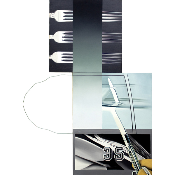
טום ווסלמן

טום ווסלמן

פייר אוגוסט רנואר

ויין תיאבאוד

אולגה דה אמראל

ג'יימס רוזנקוויסט

פול סיניאק

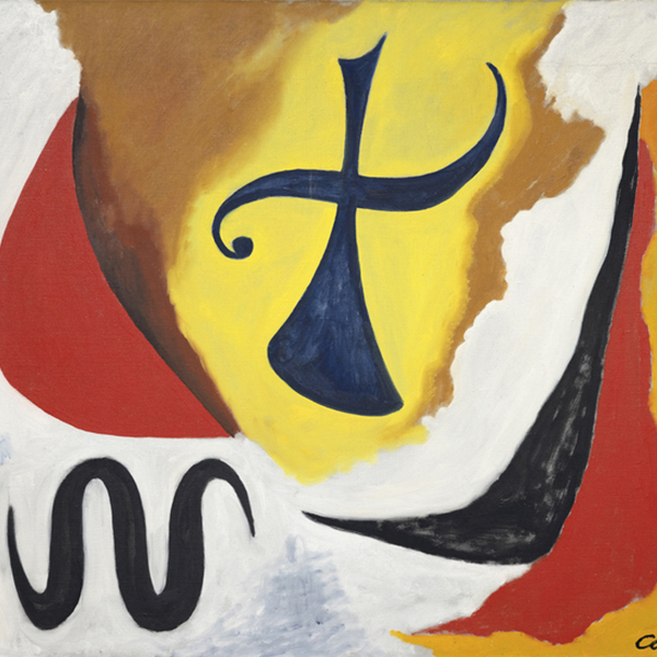
הנס הופמן
_tn27843.jpg "ELAINE DE KOONING-Untitled (Totem Pole)")
איליין דה קונינג

קנת' נולנד

הירושי סנג'ו

ג'ורג' אינס

הרב אלפרט
_tn46214.jpg "HARRY BERTOIA-Untitled (Sounding Sculpture)")
הארי ברטויה

מל ראמוס

קמיל פיסארו
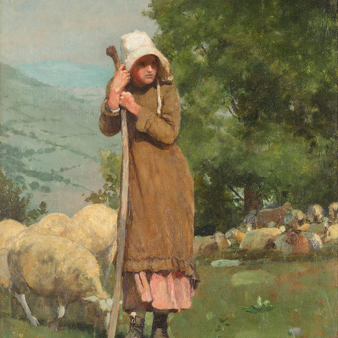
_tn48055.jpg "WINSLOW HOMER-Houghton Farms (Girls Strolling in an Orchard)")
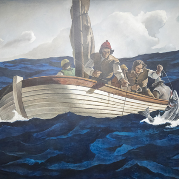
וינסלו הומר

נ.C. וייט

נ.C. וייט
_tn47245.jpg "DAVID TENIERS THE YOUNGER-The Kermesse of Saint George (A Village Festival)")
דיוויד טנירס הצעיר

יוסף קליטש

אנדי וורהול

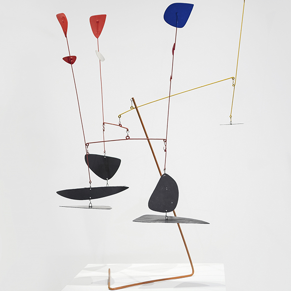
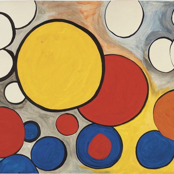
אלכסנדר קלדר

אנדרו וייט

קמיל פיסארו

לי קרסנר

ויליאם מריט צ'ייס

צ'ארלס ג'וזף פרדריק סולאקרויקס

מוריס דה ולאמינק
_tn48062.jpg "FRANK WESTON BENSON-Girl in White (Seated Figure)")
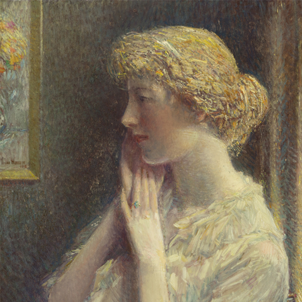
פרנק ווסטון בנסון

מנואל נרי

מריה בלנצ'רד

מריה בלנצ'רד

סינית

וליד בשטי

מוריס דה ולאמינק

ג'יין פיטרסון

דיוויד טנירס הצעיר

פיט מונדריאן

ויליאם מריט צ'ייס

אלפרד תומפסון בריכר

גם קלארק

ליאון אוגוסטין להרמיט

ויליאם וונדט

מ. אוולין מקורמיק

ויליאם וונדט

מוריס דה ולאמינק

ג'יין פיטרסון

ג'ון מרין

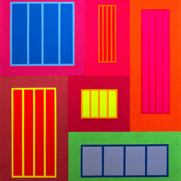
קרל בנג'מין

אדגר אלווין פיין
_tn16764.b.jpg "HARRY BERTOIA-Untitled (Suspended Willow)")
הארי ברטויה
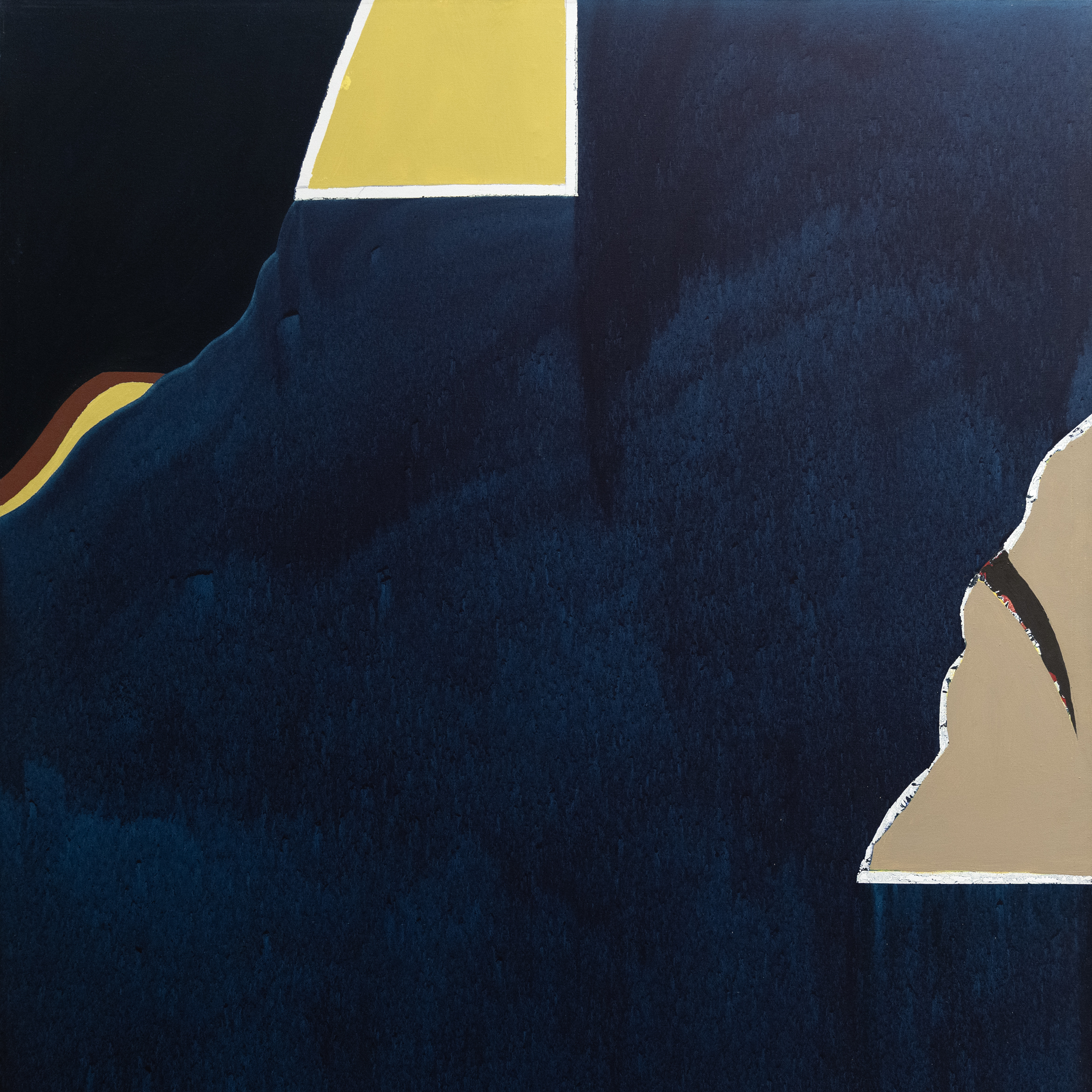
_tn40803.jpg "JOANNA POUSETTE-DART-Untitled (Red Desert Study)")
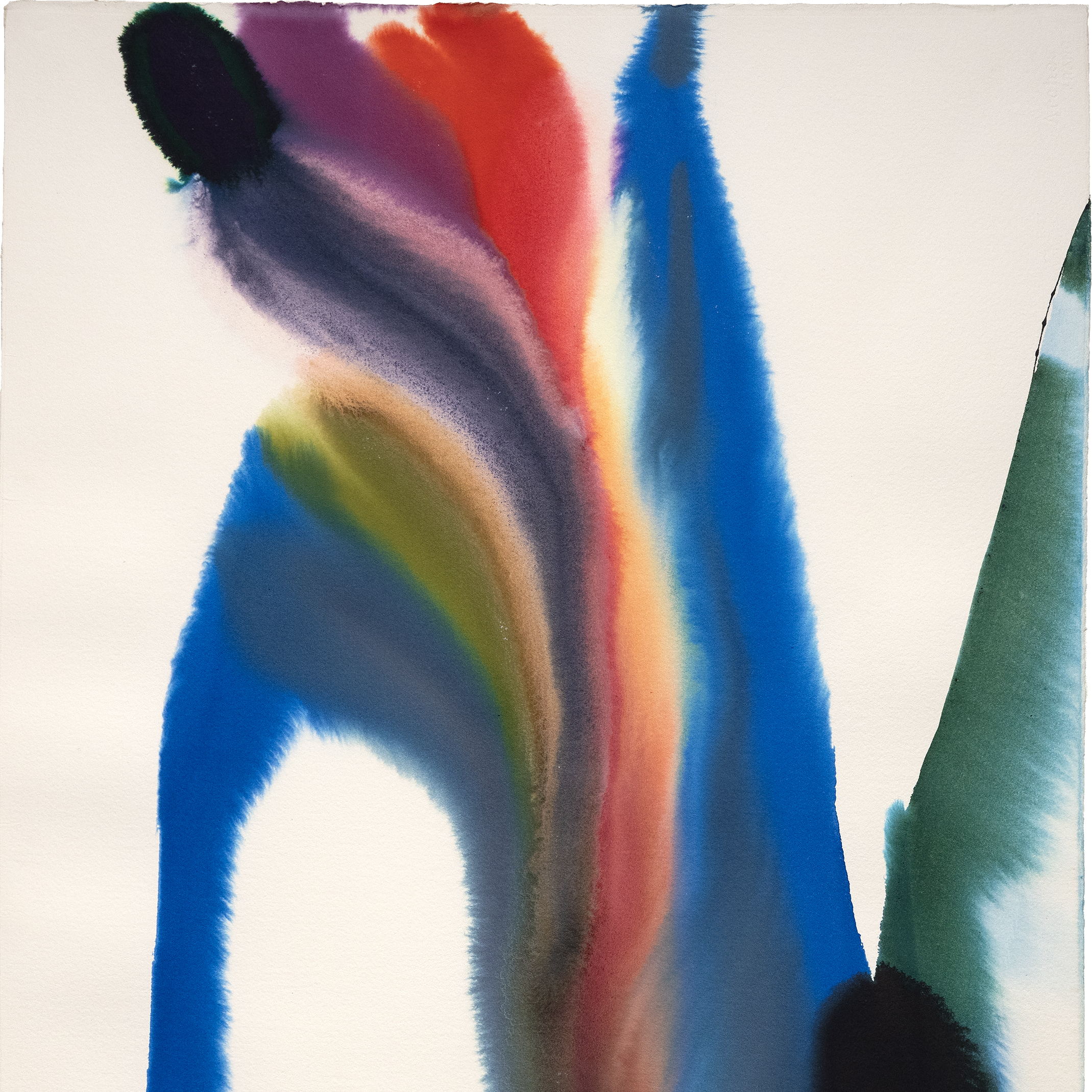
ג'ואנה פוסט-דארט

ז'ול שרה

נ.C. וייט

רוברט נטקין

לאון אוגוסטין להרמיטה

האסל סמית'

טום ווסלמן

ז'אן-פרנסואה רפאלי

טום ווסלמן

רוהל פרדריק הקמן

ז'אן ברוד

אדגר אלווין פיין

אלפרד סטיבנס

איי ווייווי

פליפה קסטנדה

ז'אן מנהיים

ג'יימס מקדוגל הארט

פול גרים
יועצים

מונטנה אלכסנדר
יו"ר, מנהל גלובלי
פאלם דזרט, קליפורניה
מונטנה אלכסנדר היא מנהיגה מכובדת בעולם האמנות הבינלאומי, מכהנת כיו"ר ומנהלת גלובלית של הת'ר ג'יימס. מונטנה, שבסיסה בגלריית הדגל בפאלם דזרט, קליפורניה, מפקחת על כל פעילות החברה ומניעה את החזון הגלובלי שלה. מעברה חזרה לפאלם דזרט מניו יורק סיטי בשנת 2025 מייצג צעד מכוון להעמקת הקשרים בתוך סצנת האמנות המדברית המשגשגת ולהעצמת השפעתה של הת'ר ג'יימס על החוף המערבי.
מאז שהצטרפה להת'ר ג'יימס בשנת 2013, מונטנה מילאה תפקיד מרכזי בהרחבת טווח ההגעה של הגלריה לשוק האמנות המשנית העולמי, עיצוב אסטרטגיה כלל-חברתית וטיפוח קשרים עם רשימה עילית של אספנים - מחברים מרכזיים ברשימת ArtNews 200 ועד פטרוני אמנות מתחילים. עינה החדה ותשוקתה למצוינות הובילו לרכישות משמעותיות של עבודות של אמנים איקוניים כמו לואיז בורז'ואה, אנדי וורהול, אד רושה, קלוד מונה ומארק ברדפורד.
מנהיגותה של מונטנה הייתה מרכזית בהבטחת הרכישה ההיסטורית של אוסף האמנות שלאחר המלחמה והעכשווית מאוסף האמנות התאגידי של חברת ג'נרל אלקטריק - אחד מאוספי התאגידים המשמעותיים ביותר שנכנסו לשוק המשני. היא גם עמדה מאחורי תערוכות שזכו לשבחי המבקרים כמו "המבט הנשי", בהשתתפות סוריאליסטיות נשים כמו פרידה קאלו וליאונורה קרינגטון, ו"ציוריו של סר וינסטון צ'רצ'יל", תערוכה נודדת שפותחה בשיתוף פעולה עם עיזבון משפחתו של צ'רצ'יל.
בעלת תואר ראשון בהיסטוריה של האמנות וניהול עסקי מאוניברסיטת קונטיקט ותעודה לתואר שני בעסקי אמנות ממכון סותביס בניו יורק, מונטנה משלבת קפדנות אקדמית עם מומחיות מעשית. מנהיגותה החזונית ממשיכה לעצב את הת'ר ג'יימס לכוח דומיננטי על במת האמנות העולמית, בעוד שעברה האחרון לפאלם דזרט מסמן פרק חדש ונועז בצמיחתה והשפעתה של הגלריה.

אריק ארטקה
יועץ אמנות יפה
פאלם דזרט, קליפורניה
אריק ארטצ'ה הוא יועץ אמנות יפה בחברת Heather James Fine Art בפאלם דזרט, קליפורניה, ומביא איתו למעלה מ-10 שנות ניסיון במכירות בעבודה עם לקוחות מובילים וחברות Fortune 500. הרקע של אריק כולל תואר ראשון במדעי החברה והיסטוריה ממכללת ווסטמונט ותואר שני בקהילות בנות קיימא וגמישות ממכללת גרין מאונטיין . רצון מתמיד ללמוד ולצמוח הוביל את אריק לעולם האמנות, החל במחקר ותפעול וכעת שיתף פעולה ישירות עם לקוחות כדי למצוא את היצירות המושלמות לאוספים שלהם. מחוץ לגלריה, אריק אוהב לבלות עם משפחתו, לחקור מסעדות חדשות, לצאת לטיולי דרכים ולצלות את הקפה שלו בעצמו.
בחדשות
חדשות

נמכרו לאחרונה עבודות מובילות
חדשות

גיבסון, דאן וקרוצ'ר התקנות
חדשות

למכור את השבב הכחול שלך עובד עם הת'ר ג'יימס
חדשות

הת'ר ג'יימס מוזיאון לאמנות הלוואה
חדשות

קלוד מונה מכר לאחרונה יצירות
חדשות

שוק האמנות מרץ 2023
חדשות

ואן גוך משאיל למכון דטרויט לאמנויות
ללחוץ
הת'ר ג'יימס השאילה את ואן גוך שנכלל ב"ואן גוך באמריקה" מושך קהל
ללחוץ
הת'ר ג'יימס משאילה את מייג'ור ואן גוך ל"ואן גוך באמריקה"
חדשות

חוסן שוק האמנות
חדשות

אמנות כהשקעה
חדשות

התקנה ביתית מפוארת
וידאו

סיכום עונת המכירות הפומביות של אמנות במאי 2022 עם ג'ים קרונה
ללחוץ

אוצר צ'יפ טום עוזר בתוך בית התצוגה אואזיס המדבר
ללחוץ

פרופילים חיים איקוניים HJFA אצר מדבר אואזיס הצג בית
ללחוץ
צ'יפ טום שופט אורח
וידאו

להכיר את הת'ר ג'יימס אמנות
חדשות

חוגגים 25 שנה של הת'ר ג'יימס אמנות
חדשות

הת'ר ג'יימס פותחת את חברת הייעוץ לונדון
קטלוגים

מהפכות באמנות המודרנית
קטלוגים

הת'ר ג'יימס אמנות – אודותינו
וידאו

קבלת הפנים הפותחת של האסל סמית'
שירותים
הת'ר ג'יימס פיין ארט מספקת מגוון רחב של שירותים מבוססי לקוח המתאימים לצרכי איסוף האמנות הספציפיים שלך. צוות התפעול שלנו כולל מטפלים מקצועיים באמנות, מחלקת רשם מלאה וצוות לוגיסטי בעל ניסיון רב בהובלת אמנות, התקנה וניהול אוספים. עם שירות כפפות לבנות וטיפול מותאם אישית, הצוות שלנו עובר את הקילומטר הנוסף כדי להבטיח שירותי אמנות יוצאי דופן עבור לקוחותינו.


הכירו אותנו
גרפיקה מוצגת
,_new_mexico_tn40147.jpg "GEORGIA O'KEEFFE-Cottonwood Tree (Near Abiquiu), New Mexico")
ג'ורג'יה אוקיף
_tn37743.jpg "JOAN MIRO-Tête de femme (déesse)")
ג'ואן מירו

אלפרד סיסלי
וילם דה קונינג
_tn43950.jpg "WINSLOW HOMER-In the Wheatfield (Girl Standing in a Wheat Field)")
וינסלו הומר
ויין תיאבאוד
גרהרד ריכטר
שון סקאלי
טום ווסלמן

אירווינג נורמן
טום ווסלמן
איש קשר