パーム砂漠


パーム砂漠のギャラリーは、エルパセオの人気のショッピング&ダイニングエリアに隣接し、カリフォルニア州のパームスプリングスエリアに位置しています。私たちの顧客は、戦後、現代美術、現代美術の私たちの選択に感謝しています。冬の間の豪華な天候は、私たちの美しい砂漠を見て、私たちのギャラリーに立ち寄るために、世界中からの訪問者を引き付けます。外の山岳砂漠の風景は、内部で待っている視覚的なごちそうに完璧な風光明媚な背景を提供します。
45188 ポルトラ・アベニュー
パーム砂漠, CA 92260
(760) 346-8926
営業時間:
月~土曜9:00~17:00
展示 会

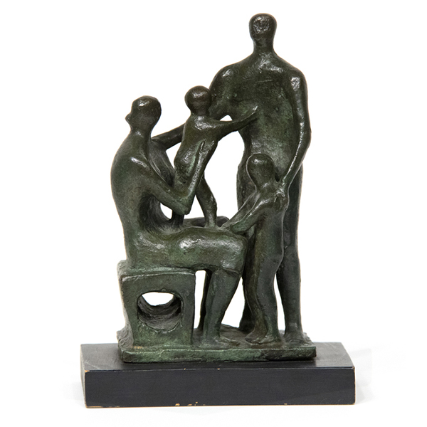
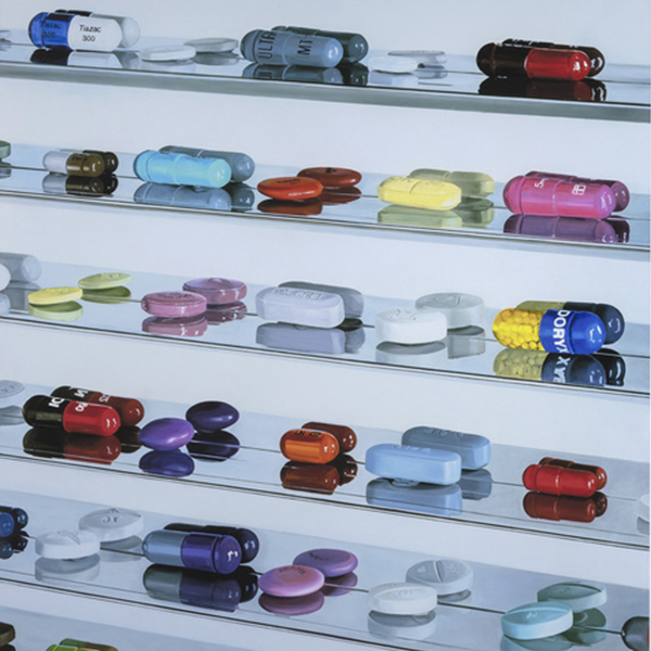
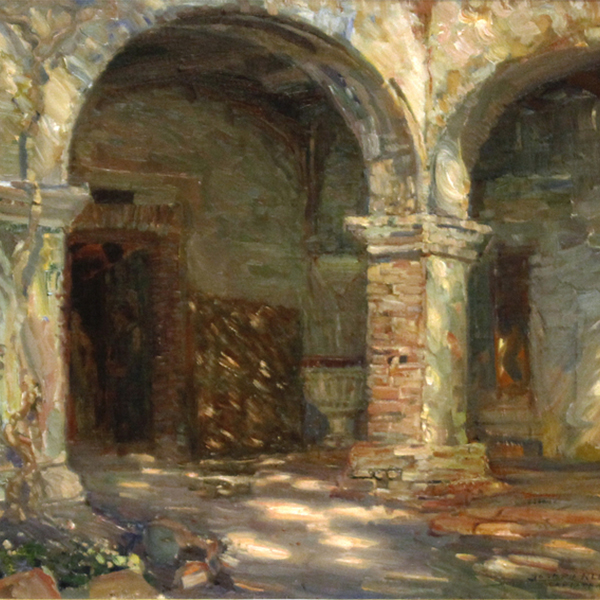
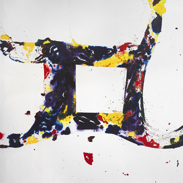
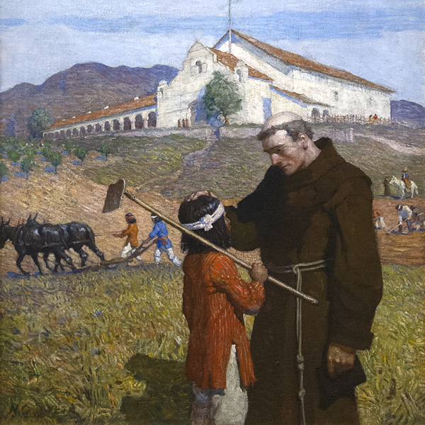
ビュー上のアートワーク

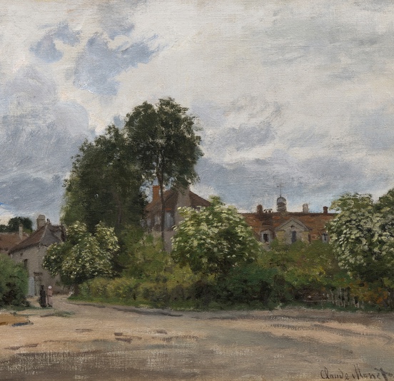
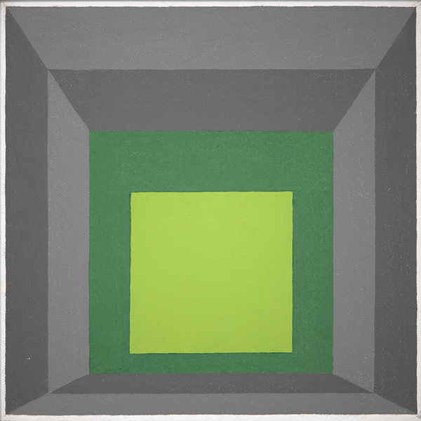
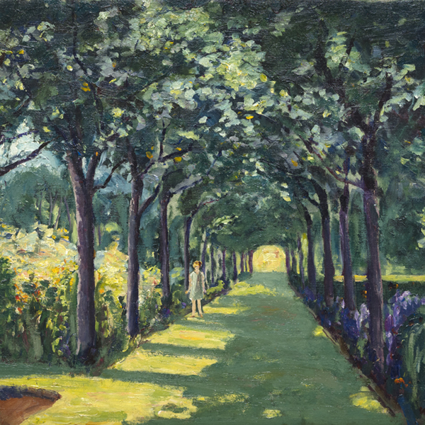
クロードモネ

クロードモネ

ウィレム・デ・クーニング

ウェイン・ティーボー

チャイルド・ハッサム

クロードモネ
_tn48131.jpg "PIERRE BONNARD-La robe de chambre rouge (Marthe Bonnard)")
PIERRE BONNARD(ピエール・ボンナード

カミール・ピサロ

アルバート・ビアスタット

アルフレッド・シスレー

ゲルハルト・リヒター

ジュリオ・チェザーレ・プロカッチーニ

チャイルド・ハッサム

ショーン・スカリー

アルフレッド・シスレー

ジョン・シンガー・サージェント

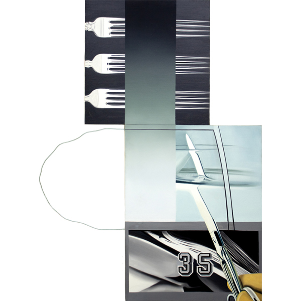
トム・ヴェッセルマン

トム・ヴェッセルマン

ピエール=オーギュス・ルノワール

ウェイン・ティーボー

OLGA DE AMARAL

ジェームズ・ローゼンキスト

PAUL SIGNAC

ハンス・ホフマン
_tn27843.jpg "ELAINE DE KOONING-Untitled (Totem Pole)")
エレーン・デ・クーニング

ケネス・ノーランド

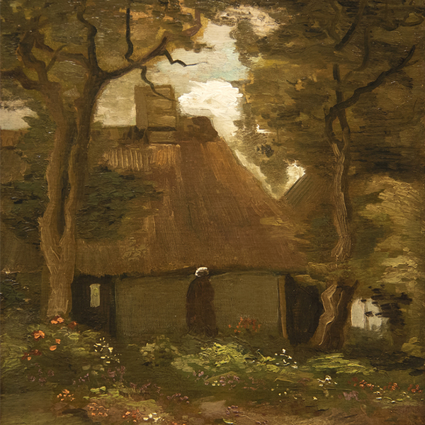
千住博

ジョージ・イネス

ハーブ・アルパート
_tn46214.jpg "HARRY BERTOIA-Untitled (Sounding Sculpture)")
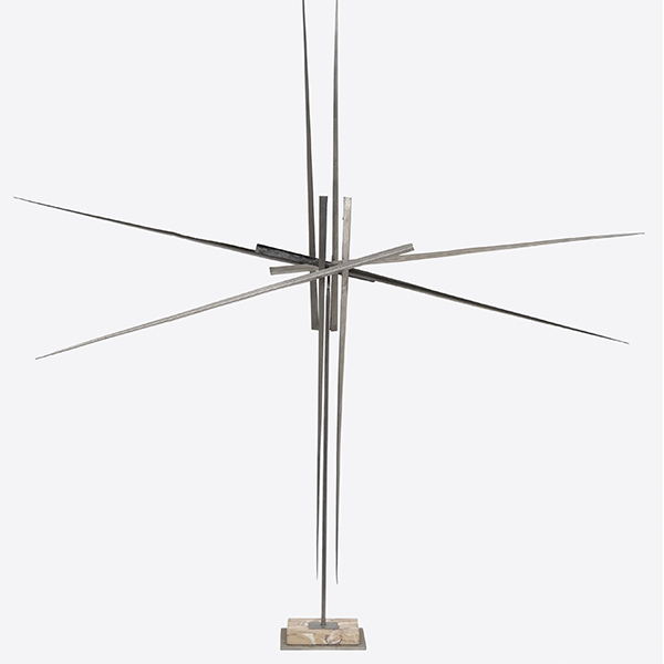
ハリー・ベルトイア

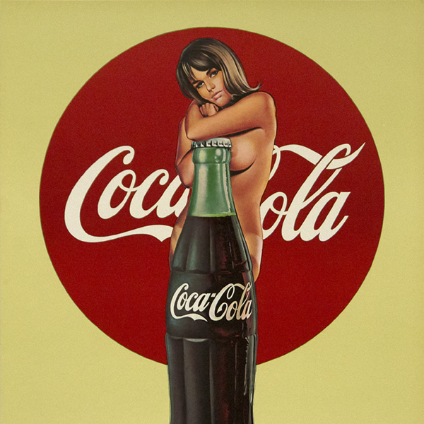
メル・ラモス

カミール・ピサロ
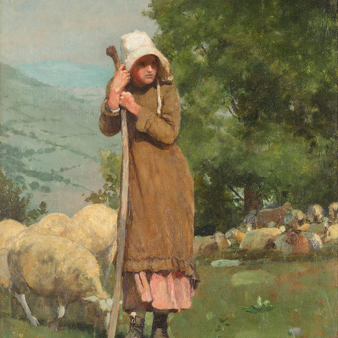
_tn48055.jpg "WINSLOW HOMER-Houghton Farms (Girls Strolling in an Orchard)")
ウィンスロー・ホーマー

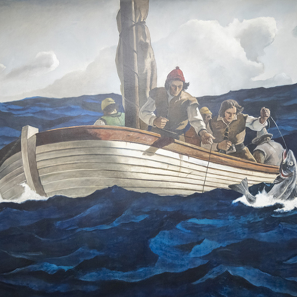
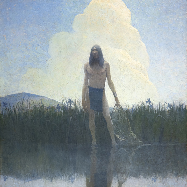
N.C. ワイス

N.C. ワイス
_tn47245.jpg "DAVID TENIERS THE YOUNGER-The Kermesse of Saint George (A Village Festival)")
ダヴィッド・テニールス・ザ・ヤングアー

ジョセフ・クリッチ

アンディ・ウォーホル

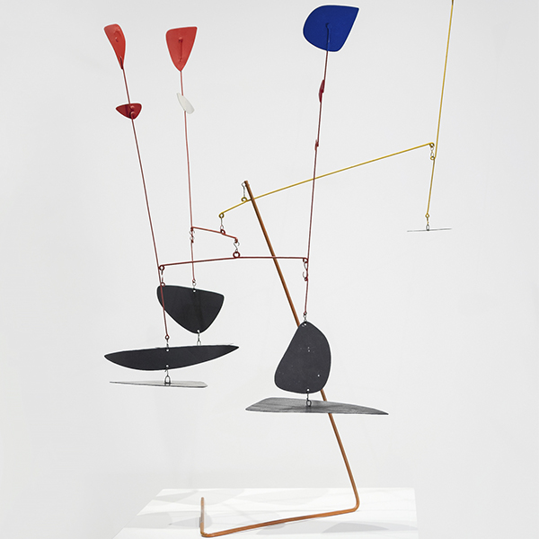
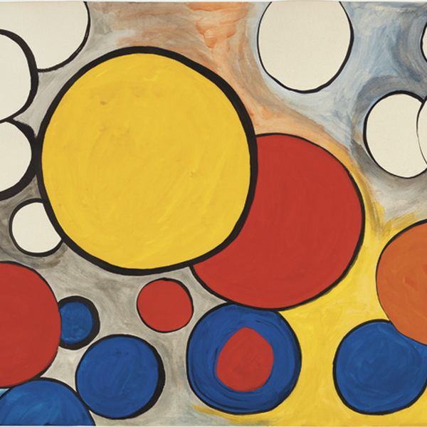
アレクサンダー・カルダー

アンドリュー・ワイス

カミール・ピサロ

リー・クラスナー

ウィリアム・メリット・チェイス

シャルル・ジョゼフ・フレデリック・スーラクロワ

モーリス・デ・ブラミンク
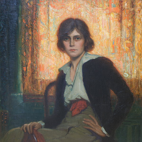
_tn48062.jpg "FRANK WESTON BENSON-Girl in White (Seated Figure)")
フランク・ウェストン・ベンソン

マヌエル・ネリ

マリア・ブランチャード

マリア・ブランチャード

中国語

ワリード・ベシュティ

モーリス・デ・ブラミンク

ジェーン・ピーターソン

ダヴィッド・テニールス・ザ・ヤングアー

ピエ・モンドリアン(PIET MONDRIAN

ウィリアム・メリット・チェイス

アルフレッド・トンプソン・ブリッチャー

ALSONクラーク

レオン・オーギュスタン・ルルミット

ウィリアム・ウェント

M. エヴェリン・マコーミック

ウィリアム・ウェント

モーリス・デ・ブラミンク

ジェーン・ピーターソン

ジョン・マリン

カール・ベンジャミン

エドガー・アルウィン・ペイン
_tn16764.b.jpg "HARRY BERTOIA-Untitled (Suspended Willow)")
ハリー・ベルトイア
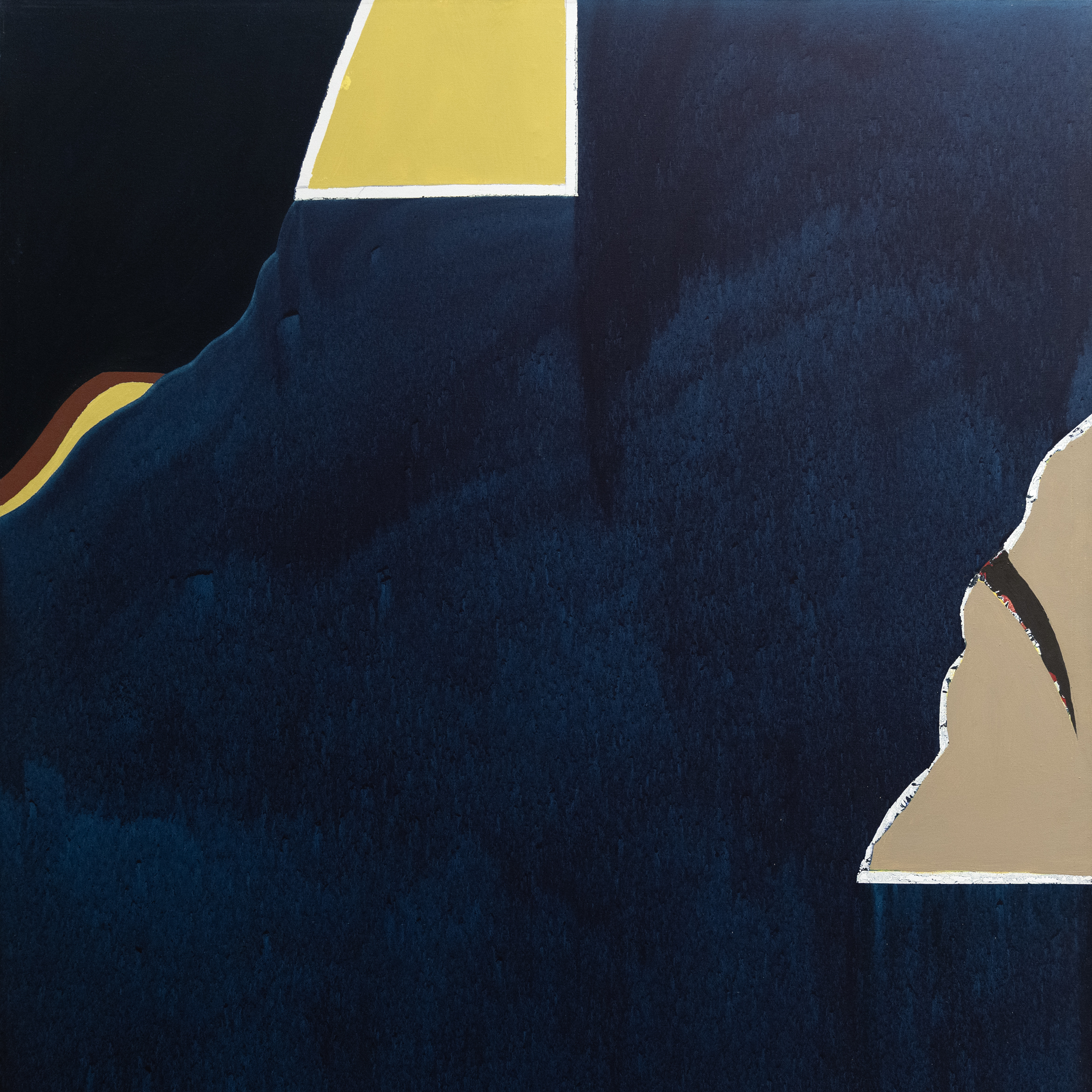
_tn40803.jpg "JOANNA POUSETTE-DART-Untitled (Red Desert Study)")
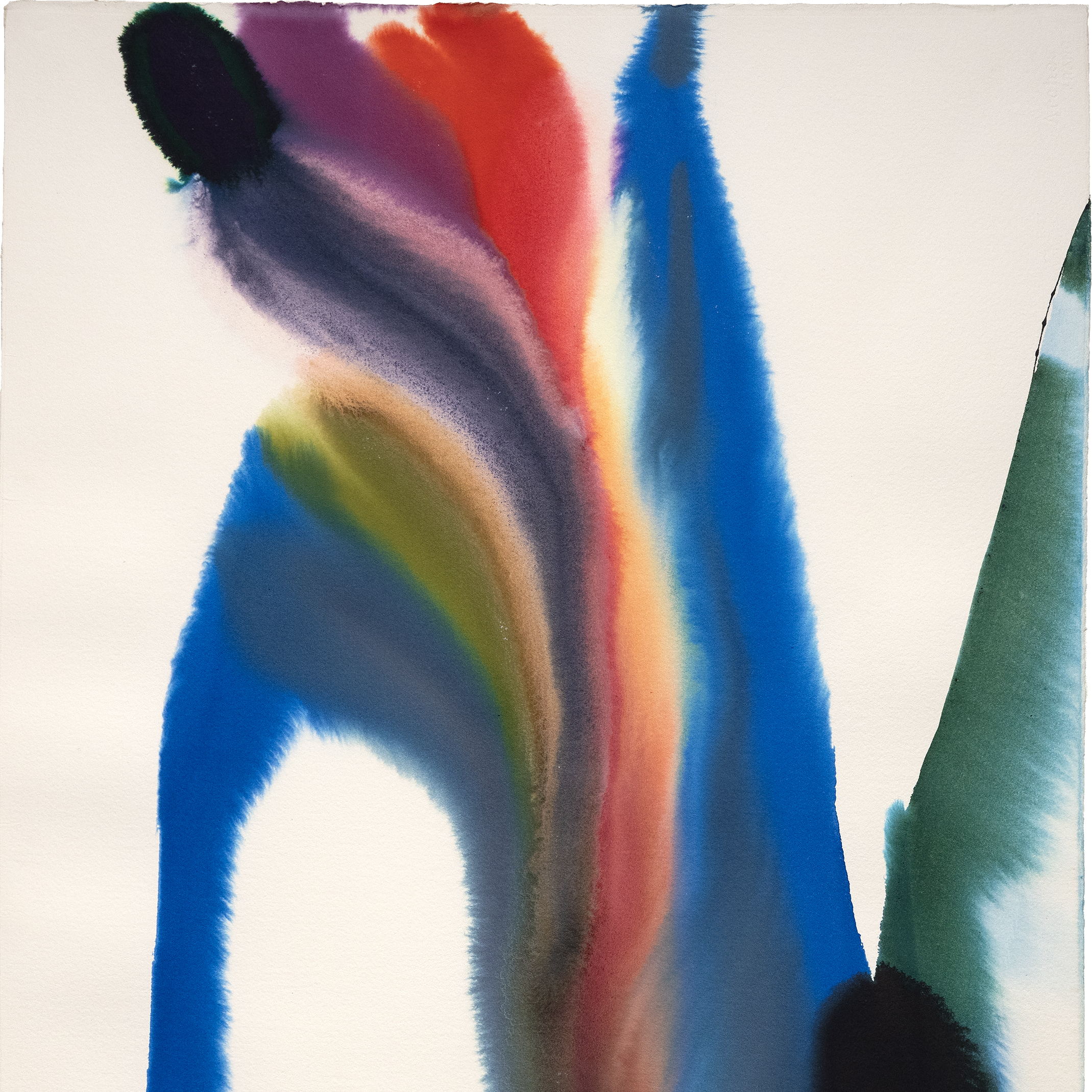
ジョアンナ・プーゼット・ダート

ジュール・シェレ

N.C. ワイス

ロバート・ナトキン

レオン・オーギュスタン・レルミット

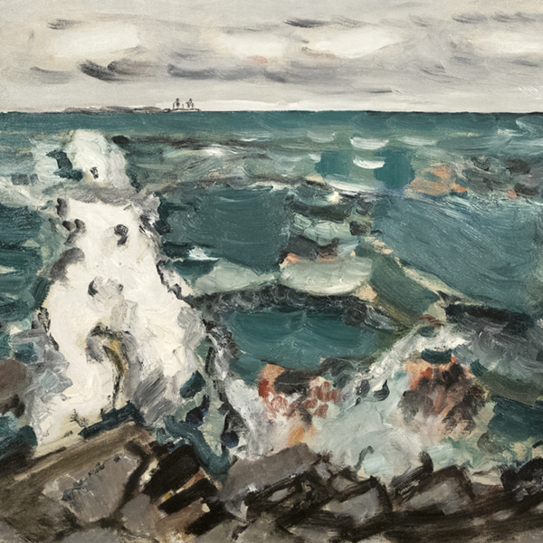
ハッセル・スミス

トム・ヴェッセルマン

ジャン=フランソワ・ラファエリ

トム・ヴェッセルマン

リュール フレデリック・ヘックマン

ジャン・ベロー

エドガー・アルウィン・ペイン

アルフレッド・スティーブンス

AI WEIWEI

フェリペ・カスタネダ

JEAN MANNHEIM(ジャン・マンハイム

ジェームズ・マクドゥガル・ハート

PAUL GRIMM
コンサルタント

モンタナ・アレクサンダー
会長、グローバル・ディレクター
カリフォルニア州パームデザート
ヘザー・ジェームズの会長兼グローバル・ディレクターを務めるモンタナ・アレクサンダーは、国際的なアート界の著名なリーダーである。カリフォルニア州パームデザートにあるフラッグシップ・ギャラリーを拠点に、モンタナはヘザー・ジェームズの全業務を監督し、グローバルなビジョンを推進している。2025年、ニューヨークからパームデザートに戻ったのは、繁栄する砂漠のアートシーンでのつながりを深め、西海岸におけるヘザー・ジェームズの影響力をさらに高めるための意図的な一歩である。
2013年にヘザー・ジェームズに入社して以来、モンタナはギャラリーの世界的なセカンダリーアート市場へのリーチを拡大し、会社全体の戦略を形成し、ArtNews200の主要メンバーから新進のアートパトロンまで、エリートコレクターとの関係を築くことに尽力してきた。ルイーズ・ブルジョワ、アンディ・ウォーホル、エド・ルシェ、クロード・モネ、マーク・ブラッドフォードなど、アイコニックなアーティストの作品を数多く購入している。
モンタナのリーダーシップは、ゼネラル・エレクトリック・カンパニーのコーポレート・アート・コレクションから戦後および現代のアート・コレクションという画期的な買収を実現する上で極めて重要であった。また、フリーダ・カーロやレオノーラ・キャリントンを含む女性シュルレアリストを特集した「The Female Gaze(女性のまなざし)」や、チャーチルの遺族と共同で企画した巡回展「The Paintings of Sir Winston Churchill(ウィンストン・チャーチル卿の絵画)」など、絶賛された展覧会の運営にも携わった。
コネチカット大学で美術史とビジネス・マネジメントの学士号を、ニューヨークのサザビーズ・インスティテュートでアート・ビジネスの大学院修了証を取得したモンタナは、アカデミックな厳しさと実践的な専門知識を融合させている。彼女の先見的なリーダーシップは、ヘザー・ジェームスを世界的なアートの舞台で圧倒的な力を持つ存在へと成長させ続け、最近パームデザートに移転したことは、ギャラリーの成長と影響力の大胆な新章を告げるものである。

エリック・アルテック
美術コンサルタント
カリフォルニア州パーム・デザート
エリック・アーテッシュはカリフォルニア州パームデザートにあるHeather James Fine Artのファインアート・コンサルタントであり、トップクライアントやフォーチュン500企業との10年以上の営業経験を持つ。ウェストモント・カレッジで社会科学と歴史学の学士号を、グリーン・マウンテン・カレッジでレジリエントで持続可能なコミュニティの理学修士号を取得。常に学び、成長したいという思いから、エリックはアートの世界へと導かれ、リサーチとオペレーションからスタートし、現在はクライアントと直接パートナーシップを組み、コレクションに最適な作品を探している。ギャラリーの外では、家族と過ごすこと、新しいレストランを開拓すること、ドライブ旅行、自家焙煎コーヒーなどを楽しんでいる。
ニュースで

ニュース

ギブソン・ダン・アンド・クラッチャー・インストール


ニュース

アートマーケット 2023年3月
ニュース

ゴッホ、デトロイト美術館に貸与
プレス
ヘザー・ジェームズが貸し出したゴッホが「アメリカのゴッホ展」に出品され、観客の注目を浴びる
プレス
ヘザー・ジェームズは「アメリカのゴッホ」に主要なゴッホを貸し出す。
ニュース

アートマーケット・レジリエンス

ニュース

ラグジュアリーホームの設置
ビデオ

2022年5月 アートオークション シーズン総括 ジム・キャロナ氏に聞く
プレス

学芸員チップ・トムが「デザート・オアシス・ショーハウス」の内部をサポート
プレス

HJFAが監修した「デザート・オアシス・ショーハウス」をIconic Lifeが紹介します。
プレス
チップ・トム ゲスト審査員

ニュース

ヘザー・ジェームズ・ファインアートの25周年を記念して
ニュース

ヘザー・ジェームズ、ロンドンにコンサルタント会社を設立

カタログ

ヘザー・ジェームズ・ファイン・アート - 私たちについて
ビデオ

ハッセル・スミス オープニング・レセプション
サービス


私たちを知る
おすすめアート
,_new_mexico_tn40147.jpg "GEORGIA O'KEEFFE-Cottonwood Tree (Near Abiquiu), New Mexico")
ジョージア・オキーフ
_tn37743.jpg "JOAN MIRO-Tête de femme (déesse)")
ジョアン・ミロ

アルフレッド・シスレー
ウィレム・デ・クーニング
_tn43950.jpg "WINSLOW HOMER-In the Wheatfield (Girl Standing in a Wheat Field)")
ウィンスロー・ホーマー
ウェイン・ティーボー
ゲルハルト・リヒター
ショーン・スカリー
トム・ヴェッセルマン

アーヴィング・ノーマン
トム・ヴェッセルマン
連絡先