国立公園を背景にしたワイオミング州ジャクソンホールの野生の美しさに位置するヘザー・ジェームズ・ジャクソンは、10年以上にわたりインターマウンテンウエストに最高の芸術作品とサービスをもたらしました。
ジャクソンホールをアメリカの文化とアウトドアの比類のない目的地にするユニークなコミュニティにケータリング、ヘザージェームズは、同様に地元の人々や訪問者のための芸術作品や白い手袋サービスの比類のない選択を提供するために努力しています。
172 センターストリート スイート 101
P.O. ボックス 3580
ジャクソンホール、WY 83001
(307) 200-6090
時間2025年12月1日~2026年3月28日
火曜日~土曜日 午前10時~午後5時
展示 会
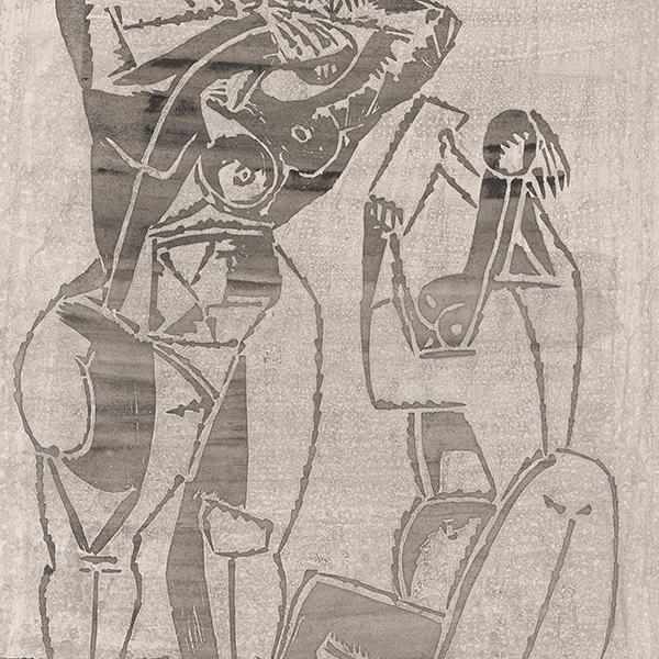
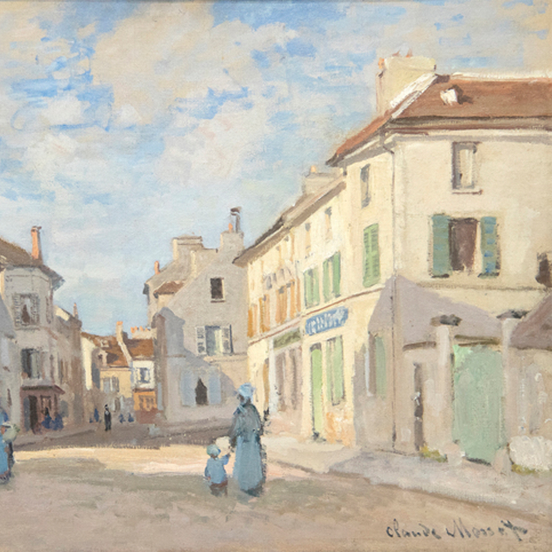
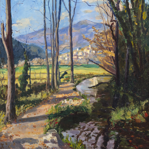
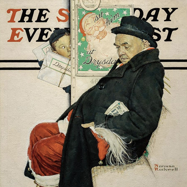
ビュー上のアートワーク

アンドリュー・ワイス

リチャード・セラ

アレクサンダー・カルダー

アレクサンダー・カルダー

アレクサンダー・カルダー

アレクサンダー・カルダー

アレクサンダー・カルダー
_tn47464.jpg "HARRY BERTOIA-Untitled (Sounding Sculpture)")
ハリー・ベルトイア

ハリー・ベルトイア

メアリー・コルス

アンディ・ウォーホル

レイ・パーカー

ラッセル・ヤング

東南アジア

ウェイン・ティーボー
_tn48022.jpg "RUSSELL YOUNG-Mick Jagger (Sympathy for the Devil)")
ラッセル・ヤング
_tn47869.jpg "ELLSWORTH KELLY-Untitled, (from portfolio Eight by Eight to celebrate the Temporary Contemporary)")
エルズワース・ケリー

アレックス・カッツ

ラッセル・ヤング

ラッセル・ヤング

ラッセル・ヤング

ラッセル・ヤング
_tn47873.jpg "ELLSWORTH KELLY-Red Curve (Black State)")
エルズワース・ケリー

ヨーゼフ・アルバース

ヨーゼフ・アルバース

ローレンス・シラー
コンサルタント

アンドレア・リコ・ダーリン
上級副社長
ワイオミング州ジャクソンホール
アンドレアは、ニューヨーク州ビンガムトンのビンガムトン大学で美術史副専攻の学士号を、ニューヨーク州ニューヨークのクリスティーズ・エデュケーションで近代美術、鑑定、美術市場史の修士号を取得。カンザスシティのネルソン・アトキンス美術館と ニューヨークのクリスティーズに勤務した経験を生かし、美術館とオークションハウスの両方で専門知識を発揮している。
2015年にヘザー・ジェームス・ファイン・アートに入社して以来、アンドレアは、クロード・モネ、アルフレッド・シスレー、アンリ・マティス、エドガー・ドガ、ノーマン・ロックウェル、アンドリュー・ワイエス、エレイン・ド・クーニング、アンディ・ウォーホル、トム・ウェッセルマンなどの重要なアーティストとの委託契約を確保し、注目すべき個人および美術館のコレクションの構築を支援してきました。

サラ・フィシェル
ヘザー・ジェームス上級副社長兼アート・アドバイザリー共同会長
ワイオミング州ジャクソンホール
アートに囲まれて育ったサラは、アートと歴史の両方に深い情熱を持っている。その幼いころからの愛情を10年以上にわたるアートの世界での経験につなげ、ギャラリー、オークションハウス、美術館を渡り歩いてきた。
ビジネスのあらゆる側面を学び、経験することを信条とするサラは、さまざまな職務でアートの世界を渡り歩き、アドバイザーや仕事に総合的なアプローチをもたらしてきた。2015年以来、サラはヘザー・ジェームス・ファイン・アートの中心的存在として、トップクラスの顧客サービスを提供し、ジャクソンホールのギャラリーを管理し、ギャラリーの展覧会やコレクターの自宅をキュレーションし、戦略的なプロモーション・イニシアチブを先導してきた。
ニューヨーク大学でジャーナリズムと美術史の学位を取得したサラは、ロンドンにあるクリスティーズ・アート、法律、ビジネス・プログラムで修士号を取得し、学問の基礎を固めた。サラは、仕事と教育の枠を超え、米国ホロコースト記念博物館やジャクソンホール・パブリック・アートとティトン・アダプティブの役員など、身近な活動に積極的に関わっている。
共同会長であるサラは、芸術と収集に関する個人的な経験と知識をあらゆる交流に生かし、常にクライアントのニーズに対する最善の解決策を模索している。
ニュースで
ビデオ

ヘザー・ジェームス・ジャクソン・ホール - サラ・フィッシェルと選ぶ2025年夏のアートセレクション
ビデオ

ヘザー・ジェームス・ジャクソン・ホール - アンドレア・リコ=ダーリンによる2025年夏のアート・セレクション

ニュース

ギブソン・ダン・アンド・クラッチャー・インストール


ニュース

アートマーケット 2023年3月
プレス
ヘザー・ジェームズが貸し出したゴッホが「アメリカのゴッホ展」に出品され、観客の注目を浴びる
プレス
ヘザー・ジェームズは「アメリカのゴッホ」に主要なゴッホを貸し出す。
プレス

ジャクソンホール・ニュース&ガイドのハイライト ヘザー・ジェームズの4世紀にわたる芸術作品
ニュース

アートマーケット・レジリエンス
プレス
ジャクソンホール・ニュース&ガイドにヘザー・ジェームズの新作が掲載されました。


ニュース

ヘザー・ジェームズ・ファインアートの25周年を記念して
ニュース

ヘザー・ジェームズ、ロンドンにコンサルタント会社を設立
プレス
ジャクソンホール・ニュース&ガイドによると、ヘザー・ジェームズはコレクターに珍しいものを提供するそうです。
ビデオ

アンドレア・リコ=ダーリンと女性アーティストたち
ビデオ

デ・クーニングとアンドレア・リコ=ダーリン
ニュース

ジャクソンホールギャラリーウォークスルー - 2021年夏

カタログ

ヘザー・ジェームズ・ファイン・アート - 私たちについて


サービス


私たちを知る
おすすめアート
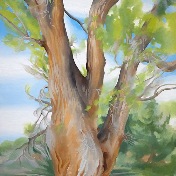
,_new_mexico_tn40147.jpg "GEORGIA O'KEEFFE-Cottonwood Tree (Near Abiquiu), New Mexico")
ジョージア・オキーフ
_tn37743.jpg "JOAN MIRO-Tête de femme (déesse)")
ジョアン・ミロ

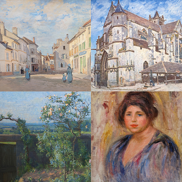
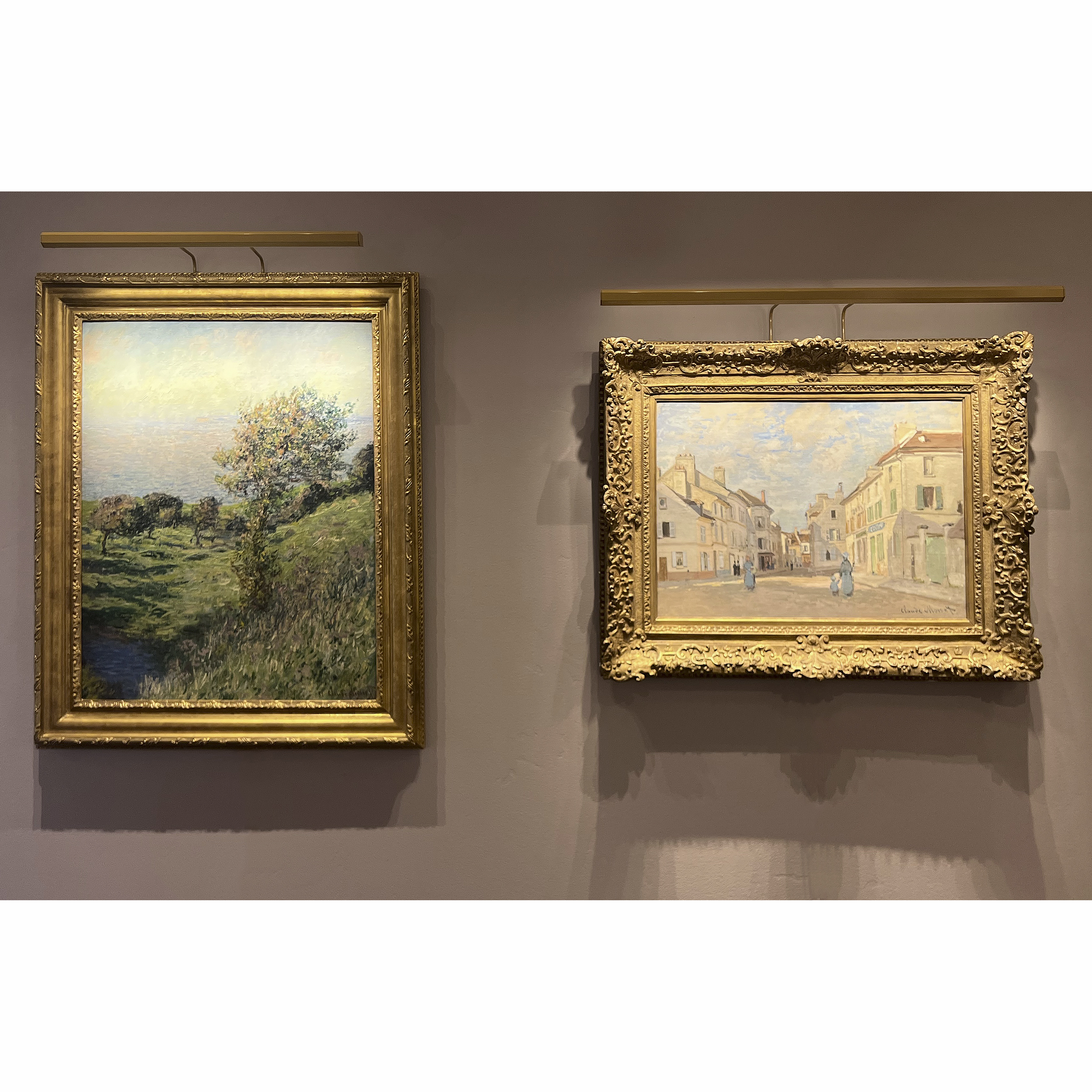
アルフレッド・シスレー

ウィレム・デ・クーニング
_tn43950.jpg "WINSLOW HOMER-In the Wheatfield (Girl Standing in a Wheat Field)")
ウィンスロー・ホーマー

ウェイン・ティーボー

ゲルハルト・リヒター

ショーン・スカリー

トム・ヴェッセルマン

アーヴィング・ノーマン
