Jackson Hole
Caption for the video
Jackson Hole
Opening Hours:Monday to Friday 10am–5pm
Contact:
Address:
172 Center Street, Suite 101
P.O. Box 3580
Jackson Hole, WY 83001
View on Google MapsP.O. Box 3580
Jackson Hole, WY 83001
Admissions:
The gallery is free to attend.
No advanced booking necessary.
No advanced booking necessary.
About Heather James Jackson Hole
Situated in the wild beauty of Jackson Hole, Wyoming, with National Parks as a stunning backdrop, Heather James Jackson has brought the highest caliber of artworks and services to the Intermountain West for over a decade.
Catering to the unique community that makes Jackson Hole an unparalleled destination for American culture and the outdoors, Heather James strives to provide an unmatched selection of artworks and white glove services for locals and visitors alike.
Meet Our Director

Caption of the image
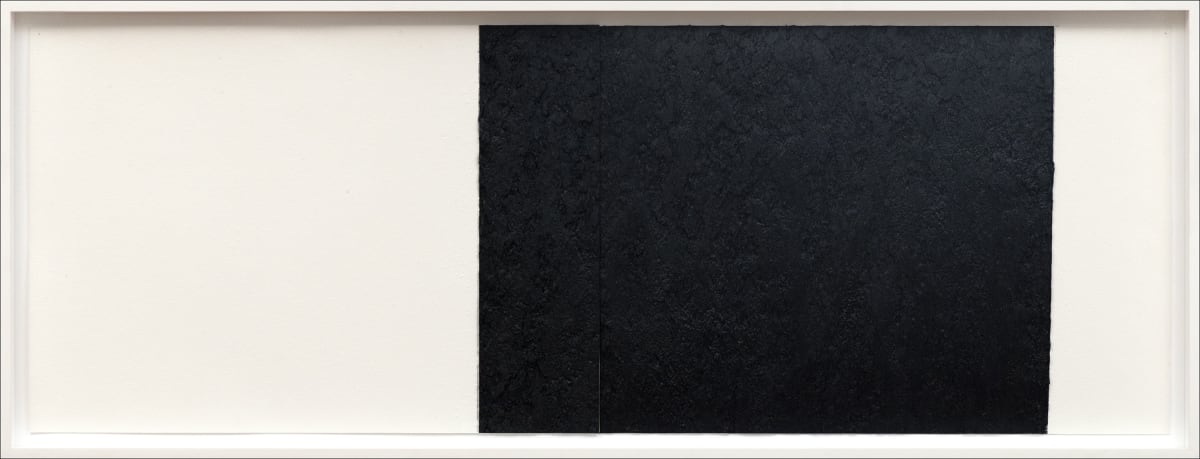
Showing 4 works