TOM VENDITTI

Co-Chairman, Advisory
Montecito

Tom Venditti is a seasoned consultant bringing his experience as an independent art advisor and former Senior Director of Art Collections for Paul Allen, whose collection set records when it sold at Christie’s in 2022.

Building and managing numerous collections, Tom has been instrumental in guiding prominent art collectors throughout their journeys. Prior to his time as a New York-based independent art advisor, Tom spent 14-years with Vulcan Inc. in Seattle, WA, where he played a pivotal role in advising on acquisitions and deaccessions for the Paul Allen Family art collection. Tom’s impact is evident through his established strategic planning and procedural standards for collections management across multiple properties. He has brought this expertise to Heather James’ clients since 2019.

Tom’s dedication shines through his advisory work for private collectors and his contribution to public art installations, exemplifying his commitment to the diverse facets of the art world. As Co-Chairman, Tom brings a wealth of experience, a commitment to service, and a unique blend of skills that resonates with clients seeking unparalleled guidance in the art market.

CATIE RINI PATTON

Fine Art Consultant
Montecito

Catie Rini Patton brings more than 20 years of diverse high-end sales and customer relations experience in the fine arts and interior design communities of San Francisco, Los Angeles, and Manhattan. She has worked for and with major galleries, auction houses, private collectors, and corporations, including Gensler, Chanel, Peter Marino, and The Bank of New York.

Since joining Heather James Fine Art in 2018, Catie has secured consignments and helped build notable private collections with prominent artists across a multitude of genres, including Alfred Sisley, Pablo Picasso, Georgia O’Keeffe, Ansel Adams, Robert Motherwell, Giorgio de Chirico, Leonor Fini, Alexander Calder, Tracey Emin, Takashi Murakami, & Andy Warhol.

Catie received a BS in Business, a BFA in Graphic Design, and a Minor in Arts Management from Miami University of Oxford, Ohio. She is a member of The Battery, San Francisco.

HEATHER JAMES FINE ART – MONTECITO has become a valuable resource for local clients, providing a wide array of support and assistance for a vast range of properties. With the help of Heather James Fine Art experts, our representatives are able to assist you if you have questions regarding buying or selling, or wish to have an object from your collection valued.

We provide a wide range of client-based services including estate and tax planning, collections management, appraisals, logistics management, acquisitions, and financial services.

IN THE NEWS

SERVICES

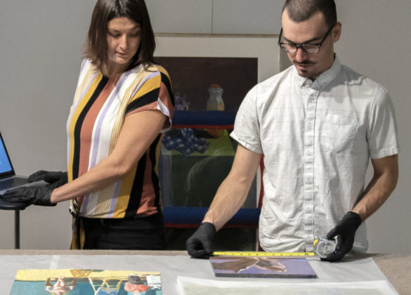
Heather James Fine Art provides a wide range of client-based services catered to your specific art collecting needs. Our Operations team includes professional art handlers, a full registrar department and logistical team with extensive experience in art transportation, installation, and collection management. With white glove service and personalized care, our team goes the extra mile to ensure exceptional art services for our clients.

  • home-services
  • Services-jessica1
  • Svc_hirst
  • Services-brian1
  • Svc_Warhol
  • Conditioning
  • Svc_kapoor

GET TO KNOW US

GALLERIES

CONSULTANCIES

FEATURED ART

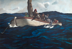
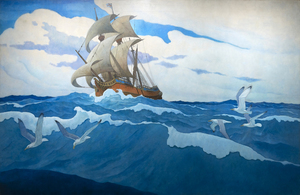
According to the catalogue raisonné compiled by The Brandywine River Museum of Art, the preliminary drawing for Puritan Cod Fishers was completed by N. C Wyeth prior to his death in October 1945. The entry records an image of the sketch as well as the artist’s inscriptions and its title, Puritan Cod Fishers, characterized by the catalogue as ‘alternate’. In either case, the large-scale canvas is a unique work that Andrew Wyeth later recalled was painted solely by his hand, a demarcated collaboration of the father’s design and composition brought to fruition by a remarkable son’s execution. For Andrew, it must have been a deeply felt and emotional experience. Given his father’s attention to detail and authenticity, the lines of the small sailing craft represent a shallot, in use during the sixteenth century. On the other hand, Andrew likely deepened the hues of the restless sea more so than his father might have, a choice that appropriately heightens the perilous nature of the task.

Andrew Wyeth & N. C. Wyeth

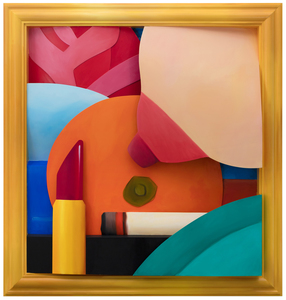
Having unwittingly inserted himself into the Pop Art conversation with his Great American Nude series, Tom Wesselmann spent the rest of his career explaining that his motivation was not to focus excessively on a subject matter or to generate social commentary but instead, to give form to what titillated him most as beautiful and exciting. His disembodied Mouth series of 1965 established that an image did not have to rely on extraneous elements to communicate meaning. But it was his follow-up performances with the Smoker series and its seductive, fetish allure that raised his standing among true sybarites everywhere. Apart from perceiving smoking as cool and chic, a painting such as Smoker #21 is the consummate celebration of Wesselmann’s abilities as a painter. Enticed by the undulating smoke, Wesselmann took great pains to accurately depict its sinuous movements and observe the momentary pauses that heightened his appreciation of its sensual nature. Like all of Wesselmann’s prodigious scaled artworks, Smoker #21 has the commanding presence of an altarpiece. It was produced during long hours in his impressive Manhattan studio in Cooper Square, and the result is one of sultry dynamism — evocative, sensual, alluring, sleek, luscious, and perhaps, even sinister — a painting that flaunts his graphic supremacy and potent realism varnished with his patented sex appeal flair.
<br>
<br>Tom Wesselmann expanded upon the success of his Great American Nudes by focusing on singular features of his subjects and began painting his Mouth series in 1965. In 1967, Wesselmann’s friend Peggy Sarno paused for a cigarette while modeling for Wesselmann’s Mouth series, inspiring his Smoker paintings. The whisps of smoke were challenging to paint and required Wesselmann to utilize photographs as source material to capture the smoke’s ephemeral nature properly. The images here show Wesselmann photographing his friend, the screenwriter Danièle Thompson, as she posed for some of Wesselmann’s source images.

TOM WESSELMANN

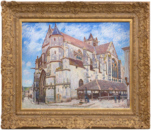
Between Île-de-France and Burgundy and on the edge of the Fontainebleau Forest lies the medieval village of Moret-sur-Loing, established in the 12th century. When Alfred Sisley described its character to Monet in a letter dated 31 August 1881 as “a chocolate-box landscape…” he meant it as a memento of enticement; that its keep, the ramparts, the church, the fortified gates, and the ornate facades nestled along the river were, for a painter, a setting of unmatched charm. An ancient church, always the most striking townscape feature along the Seine Valley, would be a presence in Sisley’s townscape views as it was for Corot, and for Monet at Vétheuil. But unlike Monet whose thirty views of Rouen Cathedral were executed so he could trace the play of light and shadow across the cathedral façade and capture the ephemeral nature of moment-to-moment changes of light and atmosphere, Sisley set out to affirm the permanent nature of the church of Notre-Dame at Moret-sur-Loing.  Monet’s sole concern was air and light, and Sisley’s appears to be an homage keepsake. The painting exudes respect for the original architects and builders of a structure so impregnable and resolute, it stood then as it did in those medieval times, and which for us, stands today, as it will, for time immemorial.
<br>
<br>Nevertheless, Sisley strived to show the changing appearance of the motif through a series of atmospheric changes. He gave the works titles such as “In Sunshine”, “Under Frost”, and “In Rain” and exhibited them as a group at the Salon du Champ-de-Mars in 1894, factors that suggest he thought of them as serial interpretations. Nevertheless, unlike Monet’s work, l’église de Moret, le Soir reveals that Sisley chose to display the motif within a spatial context that accentuates its compositional attributes — the plunging perspective of the narrow street at left, the strong diagonal recession of the building lines as a counterbalance to the right, and the imposing weight of the stony building above the line of sight.

ALFRED SISLEY

When forty rural Sacramento Delta landscapes by Wayne Thiebaud were unveiled at a San Francisco gallery opening in November 1997, attendees were amazed by paintings they never anticipated. This new frontier betrayed neither Thiebaud’s mastery of confectionary-shop colors nor his impeccable eye for formal relationships. Rather, his admirers were shocked to learn that all but seven of these forty interpretations had been completed in just two years. As his son Paul recalled, “the refinements of my father’s artistic process were ever changing in a chameleon-like frenzy.” The new direction had proved an exhilarating experience, each painting an affirmation of Wayne Thiebaud’s impassioned response to the fields and levees of the local environment he dearly loved. 
<br>
<br>Viewed from the perspective of a bird or a plane, The Riverhouse is an agrarian tapestry conceived with a kaleidoscopic range of shapes and simple forms; fields striped with furrows or striated fans, deliriously colored parallelograms and trapezoids, an orchard garnished pizza-shaped wedge, and a boldly limned river, the lifeline of a thirsty California central valley largely dependent upon transported water.
<br>
<br>The Riverhouse is a painting that ‘moves’ between seamlessly shifting planes of aerial mapping that recalls Richard Diebenkorn’s stroke of insight when he took his first commercial flight the spring of 1951, and those partitions engaging a more standard vanishing point perspective. Thiebaud explained his process as “orchestrating with as much variety and tempo as I can.” Brightly lit with a fauve-like intensity, The Riverhouse is a heady concoction of vibrant pigment and rich impasto; one that recalls his indebtedness to Pierre Bonnard whose color Thiebaud referred to as “a bucket full of hot coals and ice cubes.” Among his many other influences, the insertion of objects — often tiny — that defy a rational sense of scale that reflects his interest in Chinese landscape painting.
<br>
<br>As always, his mastery as a painter recalls his titular pies and cakes with their bewitching rainbow-like halos and side-by-side colors of equal intensity but differing in hues to create the vibratory effect of an aura, what Thiebaud explained “denotes an attempt to develop as much energy and light and visual power as you can.” Thiebaud’s Sacramento Delta landscapes are an integral and important part of his oeuvre. Paintings such as The Riverhouse rival the best abstract art of the twentieth century. His good friend, Willem de Kooning thought so, too.

WAYNE THIEBAUD

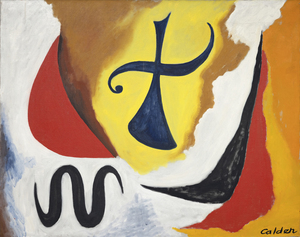
Alexander Calder executed a surprising number of oil paintings during the second half of the 1940s and early 1950s. By this time, the shock of his 1930 visit to Mondrian’s studio, where he was impressed not by the paintings but by the environment, had developed into an artistic language of Calder’s own. So, as Calder was painting The Cross in 1948, he was already on the cusp of international recognition and on his way to winning the XX VI Venice Biennale’s grand prize for sculpture in 1952. Working on his paintings in concert with his sculptural practice, Calder approached both mediums with the same formal language and mastery of shape and color.
<br>
<br>Calder was deeply intrigued by the unseen forces that keep objects in motion. Taking this interest from sculpture to canvas, we see that Calder built a sense of torque within The Cross by shifting its planes and balance. Using these elements, he created implied motion suggesting that the figure is pressing forward or even descending from the skies above. The Cross’s determined momentum is further amplified by details such as the subject’s emphatically outstretched arms, the fist-like curlicue vector on the left, and the silhouetted serpentine figure.
<br>
<br>Calder also adopts a strong thread of poetic abandon throughout The Cross’s surface. It resonates with his good friend Miró’s hieratic and distinctly personal visual language, but it is all Calder in the effective animation of this painting’s various elements. No artist has earned more poetic license than Calder, and throughout his career, the artist remained convivially flexible in his understanding of form and composition. He even welcomed the myriad interpretations of others, writing in 1951, “That others grasp what I have in mind seems unessential, at least as long as they have something else in theirs.”
<br>
<br>Either way, it is important to remember that The Cross was painted shortly after the upheaval of the Second World War and to some appears to be a sobering reflection of the time. Most of all, The Cross proves that Alexander Calder loaded his brush first to work out ideas about form, structure, relationships in space, and most importantly, movement.

ALEXANDER CALDER

Trained as a woodcarver, Emil Nolde was almost 30 years old before he made his first paintings. The early paintings resembled his drawings and woodcuts: grotesque figures with bold lines and strong contrasts. The style was new, and it inspired the nascent movement Die Brücke (The Bridge), whose members invited Nolde to join them in 1906.  But, it was not until the garden became his locus operandi by 1915 that he built upon his mastery of contrasting luminosities to focus on color as the supreme means of expression.  Later, Nolde claimed “color is strength, strength is life,” and he could not have better characterized why his flower paintings reinvigorate our perception of color.
<br>
<br>Much of the strength of Nolde’s dramatic, Wagnerian-like color sensibilities is the effect of staging primary colors, such as the deep reds and golden yellows of Sonnenblumen, Abend II, against a somber palette. The contrast highlights and deepens the luminosity of the flowers, not just visually, but emotionally as well. In 1937, when Nolde’s art was rejected, confiscated, and defiled, his paintings were paraded as “degenerate art” throughout Nazi Germany in dimly lit galleries. Despite that treatment, Nolde’s status as a degenerate artist gave his art more breathing space because he seized the opportunity to produce more than 1,300 watercolors, which he called “unpainted pictures.” No novice in handling watercolor, his free-flowing style of painting had been a hallmark of his highly-charge, transparent washes since 1918. Sonnenblumen, Abend II, painted in 1944, is a rare wartime oil. He let his imagination run wild with this work, and his utilization of wet-on-wet techniques heightened the drama of each petal.
<br>
<br>Nolde’s intense preoccupation with color and flowers, particularly sunflowers, reflects his continuing devotion to van Gogh.  He was aware of van Gogh as early as 1899 and, during the 1920s and early 1930s, visited several exhibitions of the Dutch artist’s work.  They shared a profound love of nature. Nolde’s dedication to expression and the symbolic use of color found fullness in the sunflower subject, and it became a personal symbol for him, as it did for Van Gogh.

EMIL NOLDE

During the early 1870s, Winslow Homer frequently painted scenes of country living near a small farm hamlet renowned for generations for its remarkable stands of wheat, situated between the Hudson River and the Catskills in New York state. Today Hurley is far more famous for inspiring one of Homer’s greatest works, Snap the Whip painted the summer of 1872. Among the many other paintings inspired by the region, Girl Standing in the Wheatfield is rich in sentiment, but not over sentimentalized. It directly relates to an 1866 study painted in France entitled, In the Wheatfields, and another, painted the following year after he returned to America. But Homer would have undoubtedly been most proud of this one. It is a portrait, a costume study, a genre painting in the great tradition of European pastoral painting, and a dramatically backlit, atmospheric tour de force steeped in the quickly fading gloaming hour light buoyed with lambent, flowery notes and wheat spike touches. In 1874, Homer sent four paintings to the National Academy of Design exhibition. One was titled, “Girl”. Might it not be this one?

WINSLOW HOMER

Emerging at the end of the Gilded Age, N.C. Wyeth was one of the most important American artists and illustrators. His paintings and illustrations brought life to classic literature from Treasure Island to The Boy’s King Arthur and more. He is most remembered for his ability to capture crucial moments in narratives, fleshing out just a few words into a visual representation of deep drama and tension. Patriarch of the Wyeth artistic dynasty which includes his son Andrew and grandson Jamie, his influence touched future illustrators and artists.
<br>
<br>Perhaps his most important legacy is how he shaped American imagination – of America itself and of wild possibilities. Wyeth’s powerful paintings gave life to many of the stories America told of itself. His early paintings captured life of the American West and some of his most beloved illustrations were for novels such as The Last of the Mohicans or short stories like “Rip Van Winkle”. Despite this success, Wyeth struggled with the commercialism of illustrations and advertisements, seeking his work to be accepted as fine art. Throughout his career, he experimented with different styles shifting from Impressionism to Divisionism to Regionalism.
<br>
<br>N.C. Wyeth produced over 3,000 paintings and illustrated 112 books. His illustrations for the publisher Charles Scribner’s Sons were so popular they became known as Scribner’s Classics and remain in print to this day.
<br>
<br>This quietly powerful painting of a Native American forms part of a quartet of paintings, inspired by and a metaphor for the four seasons. The paintings were used to illustrate George T. Marsh’s set of poems “The Moods”. Wyeth recognized that the series came at a crucial moment in his career in which the paintings go beyond realism to capture atmosphere and mood, an internal world of emotion made external. He even contemplated and attempted to write his own poems based on these paintings.
<br> 
<br>
<br>Summer, Hush is a striking example of Wyeth pulling from his imagination and melding it with careful observation of nature. As noted in a letter to his mother, Wyeth combined the fictional subject with natural effects as in the sky. Native Americans were a subject he returned to numerous times; these paintings reflect not only Wyeth’s fascination but also of America. As observed by art historian Krstine Ronan, Wyeth was part of a larger dialogue that developed around Native Americans, cementing a general Native American culture in the imagination of the United States. Thus, the painting operates on numerous levels simultaneously. How do we relate to this painting and its conception of the four seasons? How do we interpret Wyeth’s depiction of a Native American? What role do Native Americans play in America’s imagination?
<br>
<br>We must also not forget that these works were first used to illustrate the poems of George T. Marsh. Marsh, a poet born in New York who often also wrote of the Canadian wilderness, provides subtle evocations of the seasons hinted at in the series title “The Moods”. This painting was used alongside “Hush,” which ends:
<br>
<br>Are they runes of summers perished
<br>
<br>That the fisher hears –and ceases—
<br>
<br>Or the voice of one he cherished.
<br>
<br>Within these few lines, Wyeth gives us a thoughtful and restrained painting that stirs from within. The poem and the painting avoid obvious clichés to represent the seasons. They develop a profound interpretation filled with sensitivity.
<br>
<br>These paintings were important to Wyeth who hoped that “they may suggest to some architect the idea that such decorations would be appropriate in a library or capitol or some public building.” Summer, Hush demonstrates Wyeth’s control of color and composition so that small touches such as the ripples of water or the towering cloud that envelopes the figure are in service to sketch out the feeling of summer and of the poem. Through exploring this rich and complex painting, we are better able to appreciate NC Wyeth as an artist and the role this specific painting plays in the context of art history.

N.C. WYETH

The frame of reference for Irish American Sean Scully’s signature blocks and stripes is vast. From Malevich’s central premise that geometry can provide the means for universal understanding to Rothko’s impassioned approach to color and rendering of the dramatic sublime, Scully learned how to condense the splendor of the natural world into simple modes of color, light, and composition. Born in Dublin in 1945 and London-raised, Scully was well-schooled in figurative drawing when he decided to catch the spirit of his lodestar, Henri Matisse, by visiting Morocco in 1969. He was captivated by the dazzling tessellated mosaics and richly dyed fabrics and began to paint grids and stipes of color. Subsequent adventures provided further inspiration as the play of intense light on the reflective surfaces of Mayan ruins and the ancient slabs of stone at Stonehenge brought the sensation of light, space, and geometric movement to Scully’s paintings. The ability to trace the impact of Scully’s travels throughout his paintings reaffirms the value of abstract art as a touchstone for real-life experience.
<br>
<br>
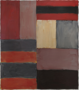
<br>Painted in rich, deep hues and layered, nuanced surfaces, Grey Red is both poetic and full of muscular formalism. Scully appropriately refers to these elemental forms as ‘bricks,’ suggesting the formal calculations of an architect. As he explained, “these relationships that I see in the street doorways, in windows between buildings, and in the traces of structures that were once full of life, I take for my work. I use these colors and forms and put them together in a way that perhaps reminds you of something, though you’re not sure of that” (David Carrier, Sean Scully, 2004, pg. 98). His approach is organic, less formulaic; intuitive painter’s choices are layering one color upon another so that contrasting hues and colors vibrate with subliminal energy. Diebenkorn comes to mind in his pursuit of radiant light. But here, the radiant bands of terracotta red, gray, taupe, and black of Grey Red resonate with deep, smoldering energy and evoke far more affecting passion than you would think it could impart. As his good friend, Bono wrote, “Sean approaches the canvas like a kickboxer, a plasterer, a builder. The quality of painting screams of a life being lived.”

SEAN SCULLY

The world of Marc Chagall cannot be contained or limited by the labels we attach to it. It is a world of images and meanings which form their own splendidly mystical discourse. Les Mariés sous le baldaquin (The Bride and Groom under the Canopy) was begun as the artist entered his 90th year, a man who had known tragedy and strife, but who never forgot life’s moments of rapturous pleasure. Here, the dreamy delights of a Russian village wedding with its arrangements of well-worn attendees are brought to us with such happy wit and cheerful innocence that there is no resisting its charm. Using a golden toned emulsion combining oil and opaque, water-based gouache, the warmth, happiness, and optimism of Chagall’s usual positivism is wrapped in a luminous radiance suggesting the influence of gold-leaf religious icons or early Renaissance painting that sought to impart the impression of divine light or spiritual enlightenment. Using a combination of oil and gouache can be challenging. But here, in Les Mariés sous le baldaquin, Chagall employs it to give the scene an otherworldly quality, almost as if it has just materialized out of his mind’s eye. Its textural delicacy creates the impression that light is emanating from the work itself and gives a spectral quality to the figures floating the sky.

MARC CHAGALL

Tom Wesselmann will undoubtedly be remembered for associating his erotic themes with the colors of the American flag. But Wesselmann had considerable gifts as a draftsman, and the line was his principal preoccupation, first as a cartoonist and later as an ardent admirer of Matisse. That he also pioneered a method of turning drawings into laser-cut steel wall reliefs proved a revelation. He began to focus ever more on drawing for the sake of drawing, enchanted that the new medium could be lifted and held: “It really is like being able to pick up a delicate line drawing from the paper.”
<br>
<br>The Steel Drawings caused both excitement and confusion in the art world. After acquiring one of the ground-breaking works in 1985, the Whitney Museum of American Art wrote Wesselmann wondering if it should be cataloged as a drawing or a sculpture. The work had caused such a stir that when Eric Fischl visited Wesselmann at his studio and saw steel-cut works for the first time, he remembered feeling jealous. He wanted to try it but dared not. It was clear: ‘Tom owned the technique completely.’
<br>
<br>Wesselmann owed much of that technique to his year-long collaboration with metalwork fabricator Alfred Lippincott. Together, in 1984 they honed a method for cutting the steel with a laser that provided the precision he needed to show the spontaneity of his sketches. Wesselmann called it ‘the best year of my life’, elated at the results that he never fully achieved with aluminum that required each shape be hand-cut.  “I anticipated how exciting it would be for me to get a drawing back in steel. I could hold it in my hands. I could pick it up by the lines…it was so exciting…a kind of near ecstasy, anyway, but there’s really been something about the new work that grabbed me.”
<br>
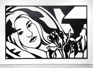
<br>Bedroom Brunette with Irises is a Steel Drawing masterwork that despite its uber-generous scale, utilizes tight cropping to provide an unimposing intimacy while maintaining a free and spontaneous quality. The figure’s outstretched arms and limbs and body intertwine with the petals and the interior elements providing a flowing investigative foray of black lines and white ‘drop out’ shapes provided by the wall. It recalls Matisse and any number of his reclining odalisque paintings. Wesselmann often tested monochromatic values to discover the extent to which color would transform his hybrid objects into newly developed Steel Drawing works and, in this case, continued with a color steel-cut version of the composition Bedroom Blonde with Irises (1987) and later still, in 1993 with a large-scale drawing in charcoal and pastel on paper.

TOM WESSELMANN

Shortly after arriving in Paris by April 1912, Marsden Hartley received an invitation. It had come from Gertrude Stein and what he saw at her 27 rue de Fleurus flat stunned him. Despite his presumptions and preparedness, “I had to get used to so much of everything all at once…a room full of staggering pictures, a room full of strangers and two remarkable looking women, Alice and Gertrude Stein…I went often I think after that on Saturday evenings — always thinking, in my reserved New England tone, ‘ how do people do things like that — let everyone in off the street to look at their pictures?… So one got to see a vast array of astounding pictures — all burning with life and new ideas — and as strange as the ideas seemed to be — all of them terrifically stimulating — a new kind of words for an old theme.” (Susan Elizabeth Ryan, The Autobiography of Marsden Hartley, pg. 77)
<br>
<br>The repeated visits had a profound effect. Later that year, Hartley was clearly disappointed when Arthur B. Davies and Walt Kuhn chose two of his still-life paintings for the upcoming New York Armory show in February 1913. “He (Kuhn) speaks highly of them (but) I would not have chosen them myself chiefly because I am so interested at this time in the directly abstract things of the present. But Davies says that no American has done this kind of thing and they would (not) serve me and the exhibition best at this time.” (Correspondence, Marsden Hartley to Alfred Stieglitz, early November 1912) A month later, he announced his departure from formal representationalism in “favor of intuitive abstraction…a variety of expression I find to be closest to my temperament and ideals. It is not like anything here. It is not like Picasso, it is not like Kandinsky, not like any cubism. For want of a better name, subliminal or cosmic cubism.” (Correspondence, Marsden Hartley to Alfred Stieglitz, December 1912)
<br>
<br>At the time, Hartley consumed Wassily Kandinsky’s recently published treatise Uber das Geistige in der Kunst (The Art of Spiritual Harmony) and Stieglitz followed the artist’s thoughts with great interest. For certain, they both embraced musical analogy as an opportunity for establishing a new visual language of abstraction. Their shared interest in the synergetic effects of music and art can be traced to at least 1909 when Hartley exhibited landscape paintings of Maine under titles such as “Songs of Autumn” and “Songs of Winter” at the 291 Gallery. The gravity of Hartley’s response to the treatise likely sparked Stieglitz’s determination to purchase Kandinsky’s seminal painting Improvisation no. 27 (Garden of Love II) at the Armory Show. As for Hartley, he announced to his niece his conviction that an aural/vision synesthetic pairing of art and music was a way forward for modern art. “Did you ever hear of anyone trying to paint music — or the equivalent of sound in color?…there is only one artist in Europe working on it (Wassily Kandinsky) and he is a pure theorist and his work is quite without feeling — whereas I work wholly from intuition and the subliminal.” (D. Cassidy, Painting the Musical City: Jazz and Cultural Identity in American Art, Washington, D.C., pg. 6)
<br>
<br>In Paris, during 1912 and 1913 Hartley was inspired to create a series of six musically themed oil paintings, the first of which, Bach Preludes et Fugues, no. 1 (Musical Theme), incorporates strong Cubist elements as well as Kandinsky’s essential spirituality and synesthesia. Here, incorporating both elements seems particularly appropriate. Whereas Kandinsky’s concepts were inspired by Arnold Schoenberg’s twelve-tone method of composition whereby no note could be reused until the other eleven had been played, Hartley chose Bach’s highly structured, rigorously controlled twenty-four Preludes and Fugues from his Well-Tempered Clavier, each of which establishes an absolute tonality. The towering grid of Bach Preludes et Fugues, no. 1 suggests the formal structure of an organ, its pipes ever-rising under a high, vaulted church ceiling to which Hartley extends an invitation to stand within the lower portion of the picture plane amongst the triangular and circular ‘sound tesserae’ and absorb its essential sonority and deeply reverberating sound. All of it is cast with gradients of color that conjures an impression of Cézanne’s conceptual approach rather than Picasso’s, Analytic Cubism. Yet Bach Preludes et Fugues, no. 1, in its entirety suggests the formal structural of Picasso’s Maisons à Horta (Houses on the Hill, Horta de Ebro), one of the many Picasso paintings Gertrude Stein owned and presumably staged in her residence on the many occasions he came to visit.

MARSDEN HARTLEY

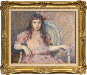
Théo van Rysselberghe’s Portrait de Sylvie Lacombe, painted in 1906, is a classic masterwork by one of the most refined and consistent portrait painters of his time. The color is harmonious, the brushwork vigorous and tailored to its material task, her body and countenance true and revealing. The sitter is the daughter of his good friend, the painter Georges Lacombe, who shared a close association with Gauguin, and was a member of Les Nabis with artists Bonnard, Denis, and Vuillard, among others. We now know about Sylvie Lacombe because Van Rysselberghe is so skilled at rendering subtle facial expressions and through careful observation and attention to detail, provided insights into her inner world. He has chosen a direct gaze, her eyes to yours, an inescapable covenant between subject and viewer regardless of our physical relationship to the painting. Van Rysselberghe had largely abandoned the Pointillist technique when he painted this portrait. But he continued to apply color theory guidelines by using tints of red — pinks and mauves — against greens to create a harmonious ameliorated palette of complementary colors to which he added a strong accent to draw the eye – an intensely saturated, red bow asymmetrically laid to the side of her head.

THÉO VAN RYSSELBERGHE

It is not difficult to grasp how Robert Indiana’s brilliant two-row arrangement of four letters came to help empower a movement during the 1960s. Its origin emerged from deeply felt exposure to religion and from friend and mentor Ellsworth Kelly, whose hard-edged style and sensuous, unaccented color made a lasting impression. But as Indiana exclaimed, it was a moment of kismet that just happened when “LOVE bit me!” and the design came to him sharp and focused. Indiana, of course, put the design through many paces, and then the logo began to sprout up everywhere. The message, best conveyed in sculpture, stands in cities worldwide and has been translated into several languages, not least of which, is its Italian iteration, “Amor” with its fortuitous “O” also tilted to the right. But rather than being kicked by the foot of the “L”, this version lends a beautifully staged teetering effect to the “A” above. It gives a new, but no less profound, impression of love and its emotionally charged nature.  In either case, Love’s tilted “O” imparts instability to an otherwise stable design, a profound projection of Indiana’s implicit critique of “the often-hollow sentimentality associated with the word, metaphorically suggesting unrequited longing and disappointment rather than saccharine affection” (Robert Indiana’s Best: A Mini Retrospective, New York Times, May 24, 2018). Repetition, of course has a nasty habit of dampening our appreciation for the genius of simplicity and, groundbreaking design. Late in life, Indiana lamented that “it was a marvelous idea, but also terrible mistake. It became too popular. And there are people who don’t like popularity.” But we, denizens of a world fraught with divisiveness and caught in turmoil, thank you. “Love” and its many versions are strong reminders of our capacity for love, and that is our best everlasting hope for a better future.

ROBERT INDIANA

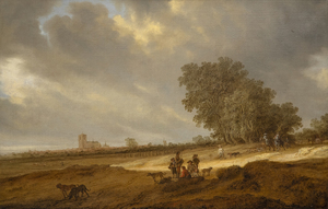
SALOMON VAN RUYSDAEL - A Dune Landscape with Figures Resting and a Couple on Horseback, a View of Nijmegen Cathedral Beyond - oil on canvas - 26 1/2 x 41 1/2 in.

SALOMON VAN RUYSDAEL

JOAN MIRO - L'Oiseau - bronze and cinderblock - 23 7/8 x 20 x 16 1/8 in.

JOAN MIRO

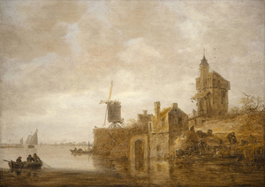
JAN JOSEPHSZOON VAN GOYEN - River Landscape with a Windmill and Chapel - oil on panel - 22 1/2 x 31 3/4 in.

JAN JOSEPHSZOON VAN GOYEN