Breck-video-thumb

HJFA has operated internationally since founding 26 years ago. Our Palm Beach consultancy, led by Breck Kling, represents an exciting new chapter that allows us to serve clients more directly.

– James Carona, Co-Founder and Co-Owner of Heather James Fine Art

BreckPB

BRECK KLING

Fine Art Consultant
Palm Beach, FL

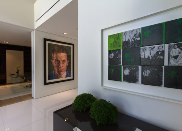
Breck is a Fine Art Consultant for Heather James Fine Art. He splits his time between Palm Beach and Jackson Hole. First introduced to HJFA as a collector, Breck’s collection includes Robert Rauschenberg, Chuck Close, Takashi Murakami, Yoshimoto Nara, and Dana Schutz, among others. He is a longtime board member of the Memorial Art Gallery, Rochester, NY, and was a collector advisor to the first VOLTA art fair in Basel, CH, in 2005. A co-founder of the national art non-profit Everyartist.me, he is also a co-founder and a trustee of Silicon Couloir, a network for entrepreneurs based in Jackson Hole. 

Breck has spent every winter in Palm Beach and enjoys golf and pickle ball. He is excited to meet you and learn about your art interests and collecting stories.

HEATHER JAMES FINE ART – PALM BEACH is a valuable resource for local clients, providing a wide array of support and assistance for a vast range of properties. With the help of Heather James Fine Art experts, our representatives are able to assist you if you have questions regarding buying or selling, or wish to have an object from your collection valued.

We provide a wide range of client-based services including estate and tax planning, collections management, appraisals, logistics management, acquisitions, and financial services.

IN THE NEWS

SERVICES

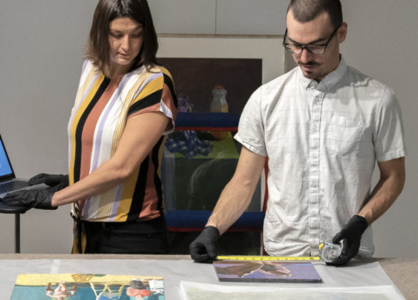
Heather James Fine Art provides a wide range of client-based services catered to your specific art collecting needs. Our Operations team includes professional art handlers, a full registrar department and logistical team with extensive experience in art transportation, installation, and collection management. With white glove service and personalized care, our team goes the extra mile to ensure exceptional art services for our clients.

  • home-services
  • Services-jessica1
  • Svc_hirst
  • Services-brian1
  • Svc_Warhol
  • Conditioning
  • Svc_kapoor

GET TO KNOW US

GALLERIES

CONSULTANCIES

FEATURED ART

Cottonwood Tree (Near Abiquiu), New Mexico (1943) by celebrated American artist Georgia O’Keeffe is exemplary of the airier, more naturalistic style that the desert inspired in her. O’Keeffe had great affinity for the distinctive beauty of the Southwest, and made her home there among the spindly trees, dramatic vistas, and bleached animal skulls that she so frequently painted. O’Keeffe took up residence at Ghost Ranch, a dude ranch twelve miles outside of the village of Abiquiú in northern New Mexico and painted this cottonwood tree around there. The softer style befitting this subject is a departure from her bold architectural landscapes and jewel-toned flowers.
<br>
<br>The cottonwood tree is abstracted into soft patches of verdant greens through which more delineated branches are seen, spiraling in space against pockets of blue sky. The modeling of the trunk and delicate energy in the leaves carry forward past experimentations with the regional trees of the Northeast that had captivated O’Keeffe years earlier: maples, chestnuts, cedars, and poplars, among others. Two dramatic canvases from 1924, Autumn Trees, The Maple and The Chestnut Grey, are early instances of lyrical and resolute centrality, respectively. As seen in these early tree paintings, O’Keeffe exaggerated the sensibility of her subject with color and form.
<br>
<br>In her 1974 book, O’Keeffe explained: “The meaning of a word— to me— is not as exact as the meaning of a color. Color and shapes make a more definite statement than words.” Her exacting, expressive color intrigued. The Precisionist painter Charles Demuth described how, in O’Keeffe’s work, “each color almost regains the fun it must have felt within itself on forming the first rainbow” (As quoted in C. Eldridge, Georgia O’Keeffe, New York, 1991, p. 33). As well, congruities between forms knit together her oeuvre. Subjects like hills and petals undulate alike, while antlers, trees, and tributaries correspond in their branching morphology.
<br>
<br>The sinewy contours and gradated hues characteristic of O’Keeffe find an incredible range across decades of her tree paintings. In New Mexico, O’Keeffe returned to the cottonwood motif many times, and the seasonality of this desert tree inspired many forms. The vernal thrill of new growth was channeled into spiraling compositions like Spring Tree No.1 (1945). Then, cottonwood trees turned a vivid autumnal yellow provided a breathtaking compliment to the blue backdrop of Mount Pedernal. The ossified curves of Dead Cottonweed Tree (1943) contain dramatic pools of light and dark, providing a foil to the warm, breathing quality of this painting, Cottonwood Tree (Near Abiquiu). The aural quality of this feathered cottonwood compels a feeling guided by O’Keeffe’s use of form of color.

GEORGIA O'KEEFFE

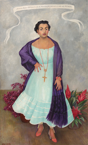
DIEGO RIVERA - Portrait of Enriqueta G. Dávila - oil on canvas - 79 1/8 x 48 3/8 in.

DIEGO RIVERA

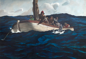
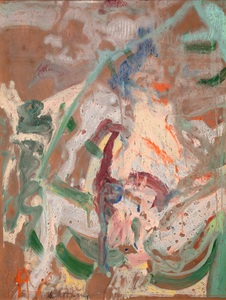
WILLEM DE KOONING - Woman in a Rowboat - oil on paper laid on masonite - 47 1/2 x 36 1/4 in.

WILLEM DE KOONING

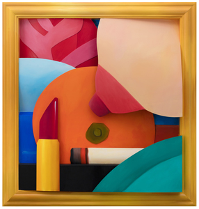
Having unwittingly inserted himself into the Pop Art conversation with his Great American Nude series, Tom Wesselmann spent the rest of his career explaining that his motivation was not to focus excessively on a subject matter or to generate social commentary but instead, to give form to what titillated him most as beautiful and exciting. His disembodied Mouth series of 1965 established that an image did not have to rely on extraneous elements to communicate meaning. But it was his follow-up performances with the Smoker series and its seductive, fetish allure that raised his standing among true sybarites everywhere. Apart from perceiving smoking as cool and chic, a painting such as Smoker #21 is the consummate celebration of Wesselmann’s abilities as a painter. Enticed by the undulating smoke, Wesselmann took great pains to accurately depict its sinuous movements and observe the momentary pauses that heightened his appreciation of its sensual nature. Like all of Wesselmann’s prodigious scaled artworks, Smoker #21 has the commanding presence of an altarpiece. It was produced during long hours in his impressive Manhattan studio in Cooper Square, and the result is one of sultry dynamism — evocative, sensual, alluring, sleek, luscious, and perhaps, even sinister — a painting that flaunts his graphic supremacy and potent realism varnished with his patented sex appeal flair.
<br>
<br>Tom Wesselmann expanded upon the success of his Great American Nudes by focusing on singular features of his subjects and began painting his Mouth series in 1965. In 1967, Wesselmann’s friend Peggy Sarno paused for a cigarette while modeling for Wesselmann’s Mouth series, inspiring his Smoker paintings. The whisps of smoke were challenging to paint and required Wesselmann to utilize photographs as source material to capture the smoke’s ephemeral nature properly. The images here show Wesselmann photographing his friend, the screenwriter Danièle Thompson, as she posed for some of Wesselmann’s source images.

TOM WESSELMANN

When forty rural Sacramento Delta landscapes by Wayne Thiebaud were unveiled at a San Francisco gallery opening in November 1997, attendees were amazed by paintings they never anticipated. This new frontier betrayed neither Thiebaud’s mastery of confectionary-shop colors nor his impeccable eye for formal relationships. Rather, his admirers were shocked to learn that all but seven of these forty interpretations had been completed in just two years. As his son Paul recalled, “the refinements of my father’s artistic process were ever changing in a chameleon-like frenzy.” The new direction had proved an exhilarating experience, each painting an affirmation of Wayne Thiebaud’s impassioned response to the fields and levees of the local environment he dearly loved. 
<br>
<br>Viewed from the perspective of a bird or a plane, The Riverhouse is an agrarian tapestry conceived with a kaleidoscopic range of shapes and simple forms; fields striped with furrows or striated fans, deliriously colored parallelograms and trapezoids, an orchard garnished pizza-shaped wedge, and a boldly limned river, the lifeline of a thirsty California central valley largely dependent upon transported water.
<br>
<br>The Riverhouse is a painting that ‘moves’ between seamlessly shifting planes of aerial mapping that recalls Richard Diebenkorn’s stroke of insight when he took his first commercial flight the spring of 1951, and those partitions engaging a more standard vanishing point perspective. Thiebaud explained his process as “orchestrating with as much variety and tempo as I can.” Brightly lit with a fauve-like intensity, The Riverhouse is a heady concoction of vibrant pigment and rich impasto; one that recalls his indebtedness to Pierre Bonnard whose color Thiebaud referred to as “a bucket full of hot coals and ice cubes.” Among his many other influences, the insertion of objects — often tiny — that defy a rational sense of scale that reflects his interest in Chinese landscape painting.
<br>
<br>As always, his mastery as a painter recalls his titular pies and cakes with their bewitching rainbow-like halos and side-by-side colors of equal intensity but differing in hues to create the vibratory effect of an aura, what Thiebaud explained “denotes an attempt to develop as much energy and light and visual power as you can.” Thiebaud’s Sacramento Delta landscapes are an integral and important part of his oeuvre. Paintings such as The Riverhouse rival the best abstract art of the twentieth century. His good friend, Willem de Kooning thought so, too.

WAYNE THIEBAUD

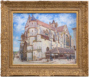
ALFRED SISLEY - L'Église de Moret, le Soir - oil canvas - 31 1/4 x 39 1/2 in.

ALFRED SISLEY

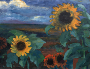
EMIL NOLDE - Sonnenblumen, Abend II - oil on canvas - 26 1/2 x 35 3/8 in.

EMIL NOLDE

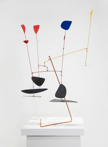
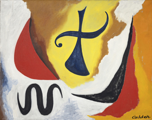
ALEXANDER CALDER - The Cross - oil on canvas - 28 3/4 x 36 1/4 in.

ALEXANDER CALDER

During the early 1870s, Winslow Homer frequently painted scenes of country living near a small farm hamlet renowned for generations for its remarkable stands of wheat, situated between the Hudson River and the Catskills in New York state. Today Hurley is far more famous for inspiring one of Homer’s greatest works, Snap the Whip painted the summer of 1872. Among the many other paintings inspired by the region, Girl Standing in the Wheatfield is rich in sentiment, but not over sentimentalized. It directly relates to an 1866 study painted in France entitled, In the Wheatfields, and another, painted the following year after he returned to America. But Homer would have undoubtedly been most proud of this one. It is a portrait, a costume study, a genre painting in the great tradition of European pastoral painting, and a dramatically backlit, atmospheric tour de force steeped in the quickly fading gloaming hour light buoyed with lambent, flowery notes and wheat spike touches. In 1874, Homer sent four paintings to the National Academy of Design exhibition. One was titled, “Girl”. Might it not be this one?

WINSLOW HOMER

FRIDA KAHLO - Hammer and Sickle (and unborn baby) - dry plaster and mixed media - 16 1/4 x 13 x 6 in.

FRIDA KAHLO

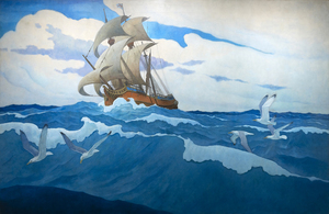
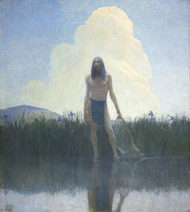
N.C. WYETH - Summer. "Hush" - oil on canvas - 33 3/4 x 30 1/4 in.

N.C. WYETH

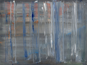
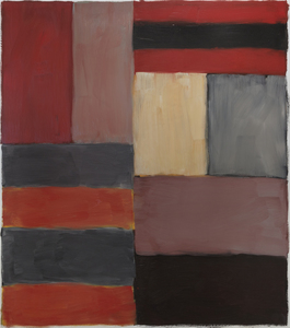
SEAN SCULLY - Grey Red - oil on aluminum - 85 x 75 in.

SEAN SCULLY

The world of Marc Chagall cannot be contained or limited by the labels we attach to it. It is a world of images and meanings which form their own splendidly mystical discourse. Les Mariés sous le baldaquin (The Bride and Groom under the Canopy) was begun as the artist entered his 90th year, a man who had known tragedy and strife, but who never forgot life’s moments of rapturous pleasure. Here, the dreamy delights of a Russian village wedding with its arrangements of well-worn attendees are brought to us with such happy wit and cheerful innocence that there is no resisting its charm. Using a golden toned emulsion combining oil and opaque, water-based gouache, the warmth, happiness, and optimism of Chagall’s usual positivism is wrapped in a luminous radiance suggesting the influence of gold-leaf religious icons or early Renaissance painting that sought to impart the impression of divine light or spiritual enlightenment. Using a combination of oil and gouache can be challenging. But here, in Les Mariés sous le baldaquin, Chagall employs it to give the scene an otherworldly quality, almost as if it has just materialized out of his mind’s eye. Its textural delicacy creates the impression that light is emanating from the work itself and gives a spectral quality to the figures floating the sky.

MARC CHAGALL

ANISH KAPOOR - Halo - stainless steel - 120 x 120 x 27 in.

ANISH KAPOOR

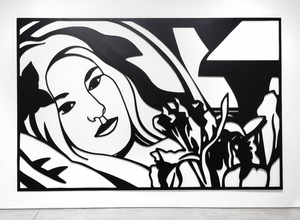
TOM WESSELMANN - Bedroom Brunette with Irises - oil on cut-out aluminum - 105 3/4 x 164 5/8 in.

TOM WESSELMANN

MARSDEN HARTLEY - Bach Preludes et Fugues No. 1 (Musical Theme) - oil on canvas laid down on board - 28 1/2 x 21 in.

MARSDEN HARTLEY

Pablo Picasso was not only the greatest painter and most innovative sculptor of the twentieth century, but he was also its foremost printmaker. He produced a staggering number of prints in every conceivable medium. Yet Picasso’s crowning printmaking achievement may be the linocut, a relief print of such a low technical barrier that it is accessible to almost anyone. If you have ever made a block print and experienced the carving and removing of portions so that a succession of colors can be preserved on the resulting print, it is a thrill to feel in your hand how Picasso created the image.
<br>
<br>Buste de Femme au Chapeau was created in 1962 when Picasso was eighty years of age. Boldly designed and simply conceived, it remains today as a testament to his ever-restless nature and genius for expanding his repertoire. Printed in five vibrant opaque colors – yellow, blue, green, red – and black assembled on the strength of his unmatched graphic skill, it is a portrait inspired by his wife Jacqueline Roque. The assertive layering of color carries a visual impact similar to his paintings in oil. Considered by many collectors as his most important linocut, it was printed and published in an edition of 50. The colors of this particular print — an artist’s proof — are exceptionally fresh and strong.

PABLO PICASSO

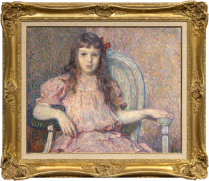
Théo van Rysselberghe’s Portrait de Sylvie Lacombe, painted in 1906, is a classic masterwork by one of the most refined and consistent portrait painters of his time. The color is harmonious, the brushwork vigorous and tailored to its material task, her body and countenance true and revealing. The sitter is the daughter of his good friend, the painter Georges Lacombe, who shared a close association with Gauguin, and was a member of Les Nabis with artists Bonnard, Denis, and Vuillard, among others. We now know about Sylvie Lacombe because Van Rysselberghe is so skilled at rendering subtle facial expressions and through careful observation and attention to detail, provided insights into her inner world. He has chosen a direct gaze, her eyes to yours, an inescapable covenant between subject and viewer regardless of our physical relationship to the painting. Van Rysselberghe had largely abandoned the Pointillist technique when he painted this portrait. But he continued to apply color theory guidelines by using tints of red — pinks and mauves — against greens to create a harmonious ameliorated palette of complementary colors to which he added a strong accent to draw the eye – an intensely saturated, red bow asymmetrically laid to the side of her head.

THÉO VAN RYSSELBERGHE

Initially used as a frontispiece illustration for the 1914 novel, “The Witch,” by Mary Johnston, Wyeth’s painting presents a poignant scene of friendship and understanding between a grieving, independent woman and a generous, misunderstood doctor. Although the two hardly know each other, they have a shared understanding of and reverence for what is good. While the rest of the town searches for the devil in all things, these two choose kindness and light. Here, they take a moment to appreciate the lives they have led and the good they have done. Wyeth’s illustration depicts hope and expectation of good despite the perils and sorrows of human life.
<br>
<br>In addition to illustrating more than 100 books, including adventure classics like Treasure Island, Kidnapped, Robinson Crusoe, and The Last of the Mohicans, Wyeth was also a highly regarded muralist, receiving numerous commissions for prestigious corporate and government buildings throughout the United States. Wyeth’s style, honed by early work at the Saturday Evening Post and Scribner’s, demonstrates his keen awareness of the revealing gesture, allowing readers to instantly grasp the essence of a scene.

N.C. WYETH

It is not difficult to grasp how Robert Indiana’s brilliant two-row arrangement of four letters came to help empower a movement during the 1960s. Its origin emerged from deeply felt exposure to religion and from friend and mentor Ellsworth Kelly, whose hard-edged style and sensuous, unaccented color made a lasting impression. But as Indiana exclaimed, it was a moment of kismet that just happened when “LOVE bit me!” and the design came to him sharp and focused. Indiana, of course, put the design through many paces, and then the logo began to sprout up everywhere. The message, best conveyed in sculpture, stands in cities worldwide and has been translated into several languages, not least of which, is its Italian iteration, “Amor” with its fortuitous “O” also tilted to the right. But rather than being kicked by the foot of the “L”, this version lends a beautifully staged teetering effect to the “A” above. It gives a new, but no less profound, impression of love and its emotionally charged nature.  In either case, Love’s tilted “O” imparts instability to an otherwise stable design, a profound projection of Indiana’s implicit critique of “the often-hollow sentimentality associated with the word, metaphorically suggesting unrequited longing and disappointment rather than saccharine affection” (Robert Indiana’s Best: A Mini Retrospective, New York Times, May 24, 2018). Repetition, of course has a nasty habit of dampening our appreciation for the genius of simplicity and, groundbreaking design. Late in life, Indiana lamented that “it was a marvelous idea, but also terrible mistake. It became too popular. And there are people who don’t like popularity.” But we, denizens of a world fraught with divisiveness and caught in turmoil, thank you. “Love” and its many versions are strong reminders of our capacity for love, and that is our best everlasting hope for a better future.
ROBERT INDIANA

ADOLPH GOTTLIEB - Azimuth - oil on canvas - 95 3/4 x 144 1/4 in.

ADOLPH GOTTLIEB

FRANK STELLA - The Musket - mixed media on aluminum - 74 1/2 x 77 1/2 x 33 in.

FRANK STELLA

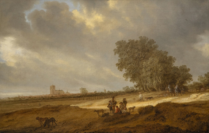
SALOMON VAN RUYSDAEL - A Dune Landscape with Figures Resting and a Couple on Horseback, a View of Nijmegen Cathedral Beyond - oil on canvas - 26 1/2 x 41 1/2 in.

SALOMON VAN RUYSDAEL

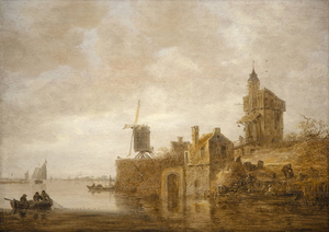
JAN JOSEPHSZOON VAN GOYEN - River Landscape with a Windmill and Chapel - oil on panel - 22 1/2 x 31 3/4 in.

JAN JOSEPHSZOON VAN GOYEN

JOAN MIRO - L'Oiseau - bronze and cinderblock - 23 7/8 x 20 x 16 1/8 in.

JOAN MIRO