Jackson Hole
Situada en la belleza salvaje de Jackson Hole, Wyoming, con los Parques Nacionales como un impresionante telón de fondo, Heather James Jackson ha traído el más alto calibre de obras de arte y servicios a la Intermontaña Oeste durante más de una década.
Atendiendo a la comunidad única que hace de Jackson Hole un destino incomparable para la cultura estadounidense y al aire libre, Heather James se esfuerza por ofrecer una selección inigualable de obras de arte y servicios de guante blanco para los lugareños y visitantes por igual.
172 Center Street, Suite 101
P.O. Box 3580
Jackson Hole, WY 83001
(307) 200-6090
Horario: Del 1 de diciembre de 2025 al 28 de marzo de 2026
De martes a sábado de 10.00 a 17.00 horas
Exposiciones
ARCHIVO
El legado de la tierra: Georgia O'Keeffe y Emily Kame Kngwarreye
ARCHIVO
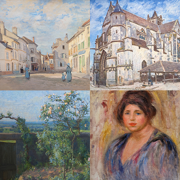
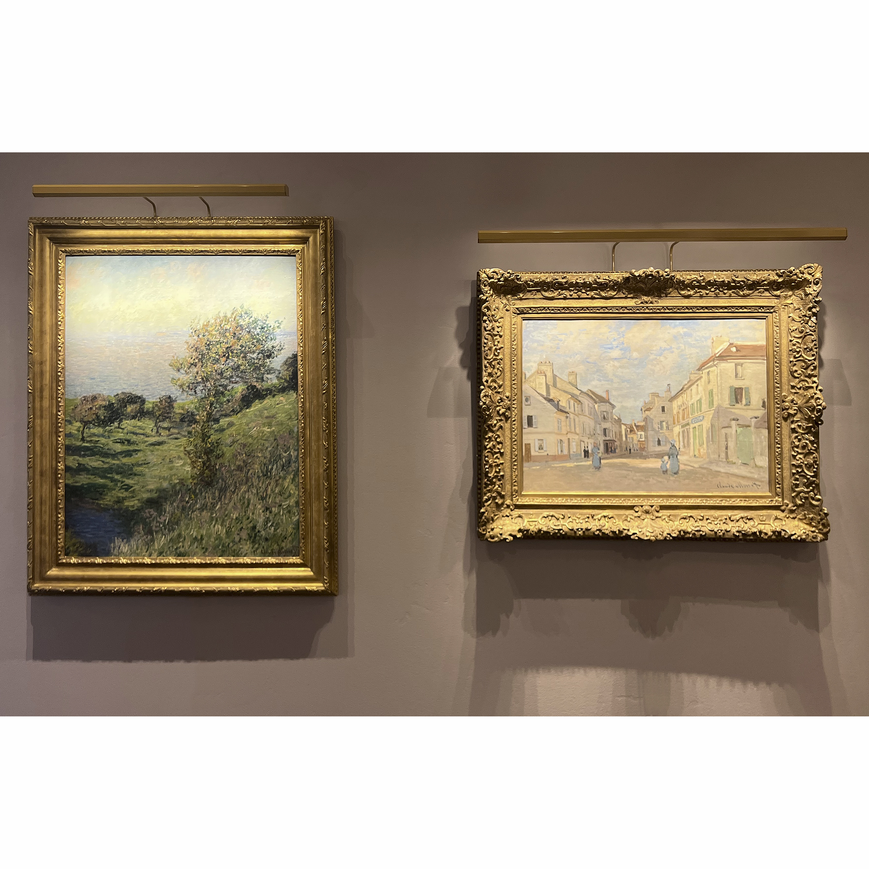
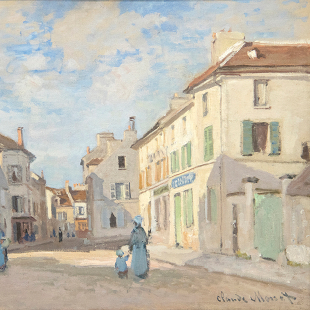
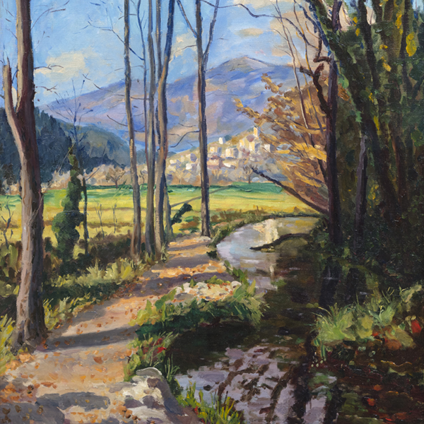
Todo lo que hemos visto: Paisajes impresionistas de Monet a Kleitsch
OBRA DE ARTE A LA VISTA

ANDREW WYETH

RICHARD SERRA

ALEXANDER CALDER

ALEXANDER CALDER

ALEXANDER CALDER

ALEXANDER CALDER

ALEXANDER CALDER
_tn47464.jpg "HARRY BERTOIA-Untitled (Sounding Sculpture)")
HARRY BERTOIA

HARRY BERTOIA

CÓRCULO MARÍA

ANDY WARHOL

RAY PARKER

RUSSELL YOUNG

SUDESTE ASIÁTICO

WAYNE THIEBAUD
_tn48022.jpg "RUSSELL YOUNG-Mick Jagger (Sympathy for the Devil)")
RUSSELL YOUNG
_tn47869.jpg "ELLSWORTH KELLY-Untitled, (from portfolio Eight by Eight to celebrate the Temporary Contemporary)")
ELLSWORTH KELLY

ALEX KATZ

RUSSELL YOUNG

RUSSELL YOUNG

RUSSELL YOUNG

RUSSELL YOUNG
_tn47873.jpg "ELLSWORTH KELLY-Red Curve (Black State)")
ELLSWORTH KELLY

JOSEF ALBERS

JOSEF ALBERS

LAWRENCE SCHILLER
ASESORES

ANDREA RICO DAHLIN
Vicepresidente Senior
Jackson Hole, Wyoming
Con más de 20 años en el sector, Andrea es licenciada en Historia del Arte con especialización en Bellas Artes por la Universidad de Binghamton (Nueva York ) y posee un máster en Arte Moderno, Connoisseurship e Historia del Mercado del Arte por Christie's Education (Nueva York). Aporta su experiencia tanto en museos como en casas de subastas, habiendo trabajado en el Museo de Arte Nelson-Atkins de Kansas City y en Christie's de Nueva York.
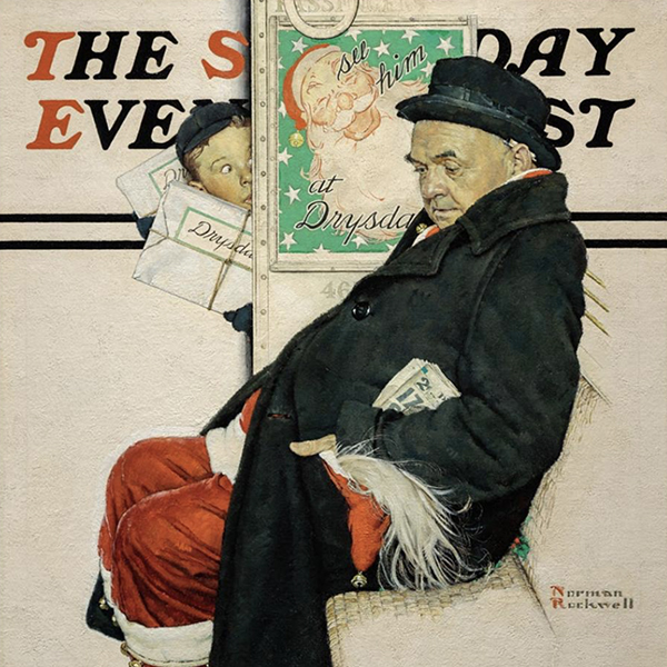
Desde que se unió a Heather James Fine Art en 2015, Andrea ha asegurado consignaciones y ha ayudado a construir notables colecciones privadas y de museos con importantes artistas, que incluyen a Claude Monet, Alfred Sisley, Henri Matisse, Edgar Degas, Norman Rockwell, Andrew Wyeth, Elaine de Kooning, Andy Warhol y Tom Wesselmann.

SARAH FISCHEL
Vicepresidenta Heather James y Copresidenta de Art Advisory
Jackson Hole, Wyoming
Sarah siente una profunda pasión por el arte y la historia, ya que creció rodeada de arte. Tras más de una década de experiencia en el mundo del arte, ha recorrido galerías, casas de subastas y museos.
Firme creyente en aprender y experimentar todos los aspectos de un negocio, Sarah ha trabajado en todo el mundo del arte en diversas funciones, aportando un enfoque holístico al asesoramiento y a su trabajo. Desde 2015, Sarah ha sido una pieza clave en Heather James Fine Art, donde ha proporcionado un servicio al cliente de primer nivel, ha gestionado la galería de Jackson Hole, ha comisariado exposiciones en la galería y casas de coleccionistas, y ha encabezado iniciativas estratégicas de promoción.
Licenciada en Periodismo e Historia del Arte por la Universidad de Nueva York, Sarah continuó su formación académica con un máster en el programa Christie's Art, Law, and Business de Londres. Más allá de sus actividades profesionales y educativas, Sarah participa activamente en causas que le son cercanas, como el Museo Conmemorativo del Holocausto de Estados Unidos y como miembro del consejo de Jackson Hole Public Art y Teton Adaptive.
Como copresidenta, Sarah aporta sus experiencias personales y sus conocimientos sobre arte y coleccionismo a cada interacción, buscando siempre la mejor solución para las necesidades de sus clientes.
EN LAS NOTICIAS
VIDEO

Heather James Jackson Hole - Verano 2025 Selecciones de Arte con Sarah Fischel
VIDEO

Heather James Jackson Hole - Selecciones artísticas de verano 2025 con Andrea Rico-Dahlin
NOTICIAS

Obras vendidas recientemente
NOTICIAS

Instalaciones de Gibson, Dunn & Crutcher
NOTICIAS

Vende tus obras Blue Chip con Heather James
NOTICIAS

Préstamos del Museo de Bellas Artes Heather James
NOTICIAS

Claude Monet Obras vendidas recientemente
NOTICIAS

El mercado del arte Marzo 2023
PRENSA
El Van Gogh prestado por Heather James incluido en "Van Gogh in America" atrae a la multitud
PRENSA
Heather James presta el mayor Van Gogh a "Van Gogh en América"
PRENSA

Jackson Hole News & Guide destaca los cuatro siglos de arte de Heather James
NOTICIAS

Resistencia del mercado del arte
PRENSA
Jackson Hole News & Guide presenta las nuevas obras de Heather James
NOTICIAS

El arte como inversión
VIDEO

Conociendo a Heather James Fine Art
NOTICIAS

Celebrando 25 años de Heather James Fine Art
NOTICIAS

Heather James abre una consultoría en Londres
PRENSA
Jackson Hole News & Guide informa de que Heather James regala a los coleccionistas hallazgos raros
VIDEO

Mujeres artistas con Andrea Rico-Dahlin
VIDEO

De Kooning con Andrea Rico-Dahlin
NOTICIAS

Paseo por la Galería Jackson Hole - Verano 2021
CATÁLOGOS

Revoluciones en el arte moderno
CATÁLOGOS

Heather James Fine Art - Acerca de nosotros
VIDEO

Exposición Edward Hopper


SERVICIOS
Heather James Fine Art ofrece una amplia gama de servicios basados en el cliente que se adaptan a sus necesidades específicas de coleccionismo de arte. Nuestro equipo de operaciones está formado por gestores profesionales de arte, un departamento de registro completo y un equipo logístico con amplia experiencia en el transporte, instalación y gestión de colecciones de arte. Con servicio de guante blanco y atención personalizada, nuestro equipo hace todo lo posible para garantizar servicios artísticos excepcionales para nuestros clientes.


CONÓCENOS
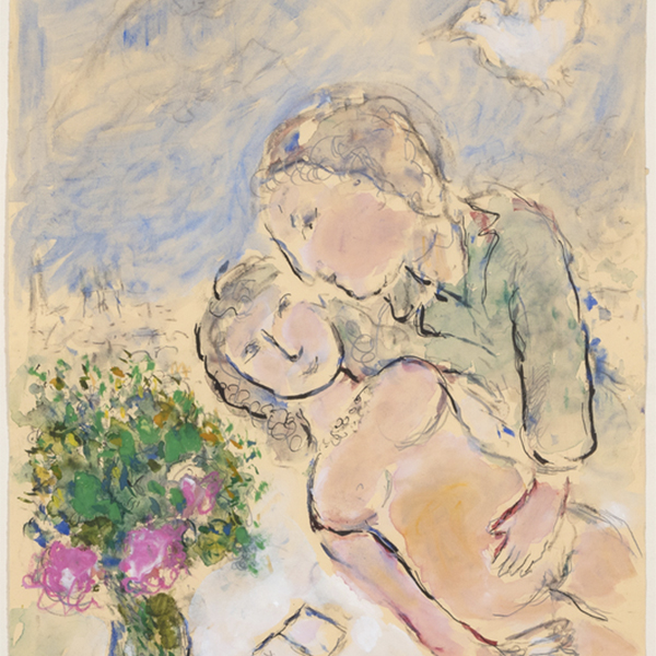
ARTE DESTACADO
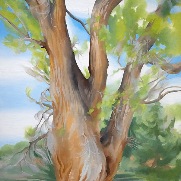
,_new_mexico_tn40147.jpg "GEORGIA O'KEEFFE-Cottonwood Tree (Near Abiquiu), New Mexico")
GEORGIA O'KEEFFE
_tn37743.jpg "JOAN MIRO-Tête de femme (déesse)")
JOAN MIRO

ALFRED SISLEY

WILLEM DE KOONING
_tn43950.jpg "WINSLOW HOMER-In the Wheatfield (Girl Standing in a Wheat Field)")
WINSLOW HOMER

WAYNE THIEBAUD

GERHARD RICHTER

SEAN SCULLY

TOM WESSELMANN

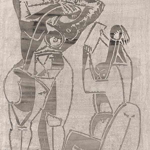
IRVING NORMAN
