Desierto de Palma


Nuestra galería en Palm Desert está ubicada en el centro en el área de Palm Springs de California, adyacente a la popular zona comercial y de restaurantes de El Paseo. Nuestra clientela aprecia nuestra selección de arte postguerra, moderno y contemporáneo. El magnífico clima durante los meses de invierno atrae a visitantes de todo el mundo a ver nuestro hermoso desierto, y pasar por nuestra galería. El paisaje montañoso del desierto en el exterior ofrece el telón de fondo panorámico perfecto para la fiesta visual que le espera en su interior.
45188 Avenida Portola
Palm Desert, CA 92260
(760) 346-8926
Horario:
De lunes a sábado: 9.00 a 17.00 horas
Exposiciones
ARCHIVO
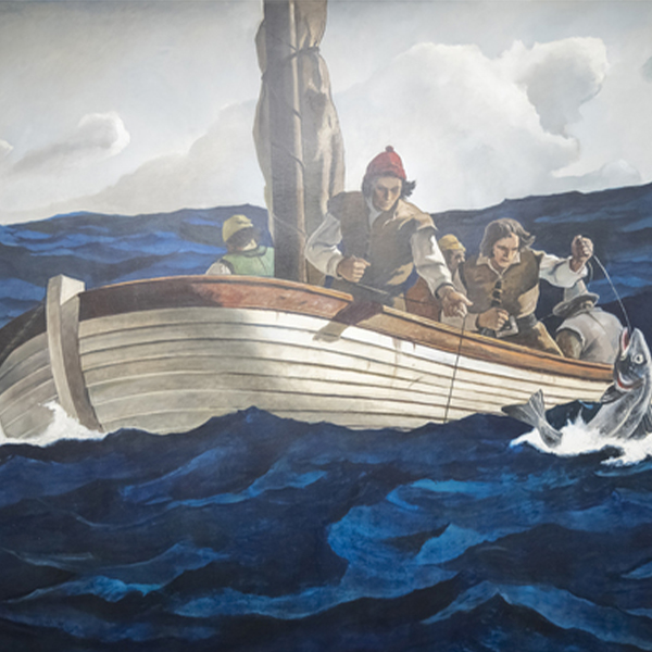
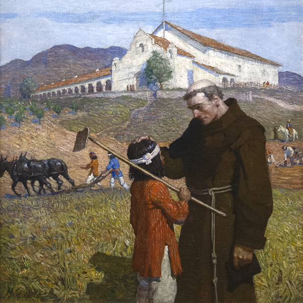
El encuentro con la vida: N.C. Wyeth y los murales de MetLife
ARCHIVO
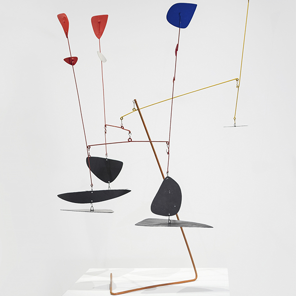
Alexander Calder: Dando forma a un universo primario
ARCHIVO
La sangre de tu corazón: Intersecciones del arte y la literatura
ARCHIVO
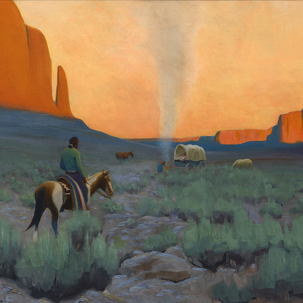
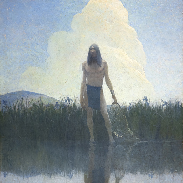
Arte del Oeste Americano: Una colección destacada
ARCHIVO
Más a la vida: diálogos impresionistas de Monet y más allá
ARCHIVO
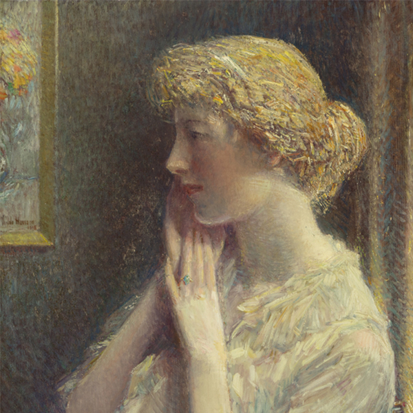
Una época hermosa: el arte americano en la Edad Dorada
ARCHIVO
Georgia O'Keeffe y Marsden Hartley: Mentes modernas
ARCHIVO
Expresionismo abstracto: Las mujeres persistentes
ARCHIVO
Modernismo judío Parte 2: Figuración de Chagall a Norman
ARCHIVO
Vincent van Gogh y los grandes impresionistas del Grand Boulevard
ARCHIVO
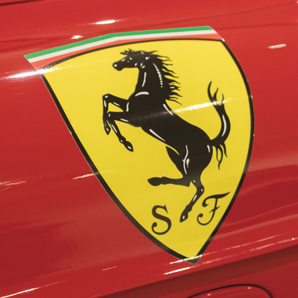
Ferrari y Futuristas: Una mirada italiana a la velocidad
ARCHIVO
Maestros del Impresionismo y del Arte Moderno
OBRA DE ARTE A LA VISTA
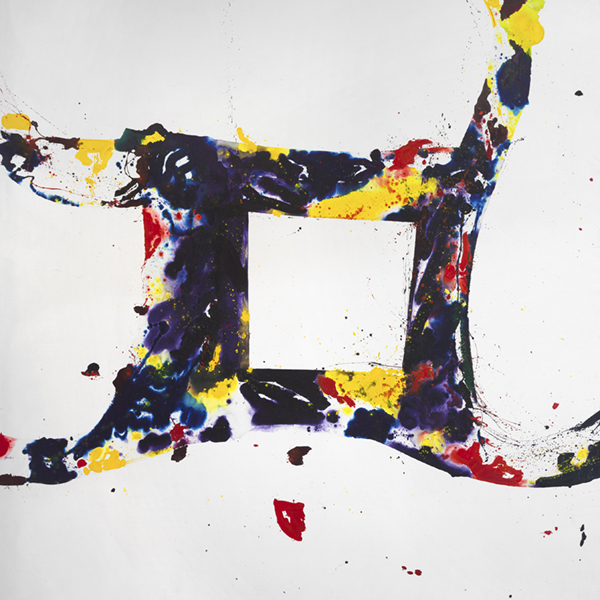
_tn27843.jpg "ELAINE DE KOONING-Untitled (Totem Pole)")
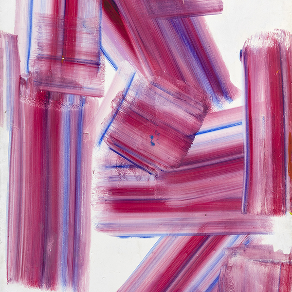
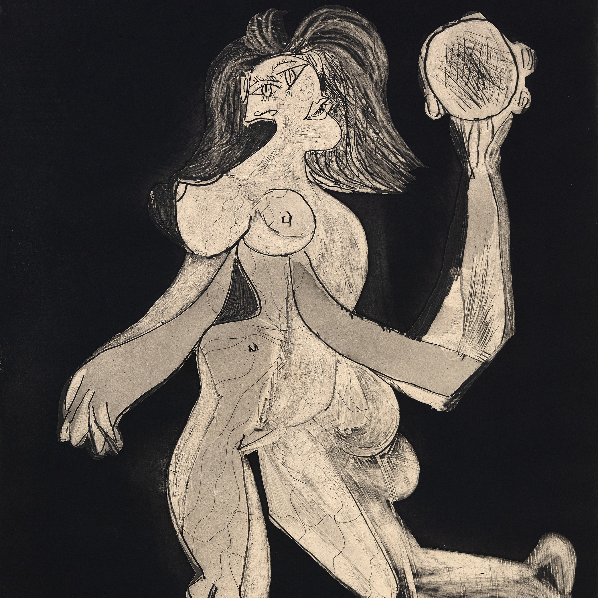
ELAINE DE KOONING

HIROSHI SENJU

HERB ALPERT
_tn46214.jpg "HARRY BERTOIA-Untitled (Sounding Sculpture)")
HARRY BERTOIA

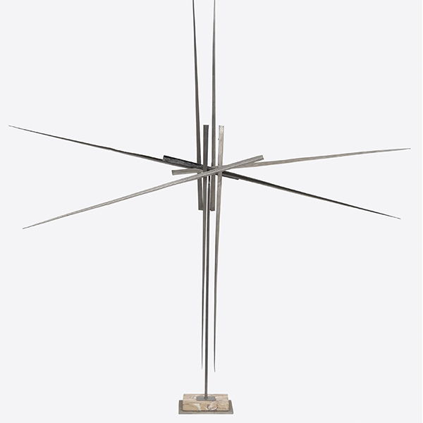
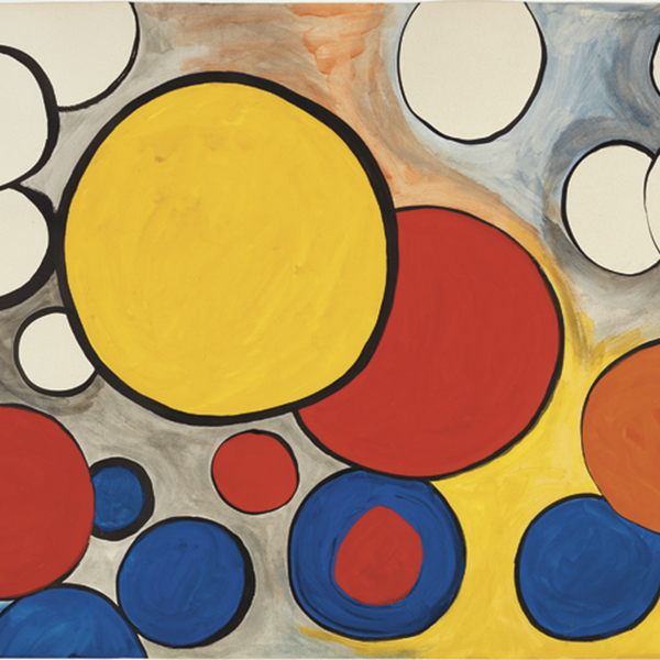
ALEXANDER CALDER

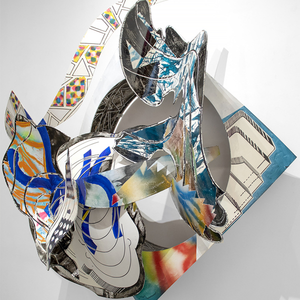
JULIAN SCHNABEL

JOHN CHAMBERLAIN

ROGER BROWN
_tn39239.jpg "ANDY WARHOL-Diamond Dust Shoes (Black and White)")
ANDY WARHOL

KIKI SMITH

RYAN MCGINNESS

PAUL KLEE
_tn28596.jpg "DEBORAH BUTTERFIELD-Untitled (Horse)")
DEBORAH BUTTERFIELD

MANUEL NERI

CHINO

CHINO

WALEAD BESHTY
_tn47033.jpg "HARRY BERTOIA-Untitled (Willow)")
HARRY BERTOIA

CHARLES ARNOLDI

WILLIAM WENDT

MARC QUINN

SETH KAUFMAN

CHINO

EDGAR ALWIN PAYNE
_tn16764.b.jpg "HARRY BERTOIA-Untitled (Suspended Willow)")
HARRY BERTOIA
_tn40803.jpg "JOANNA POUSETTE-DART-Untitled (Red Desert Study)")
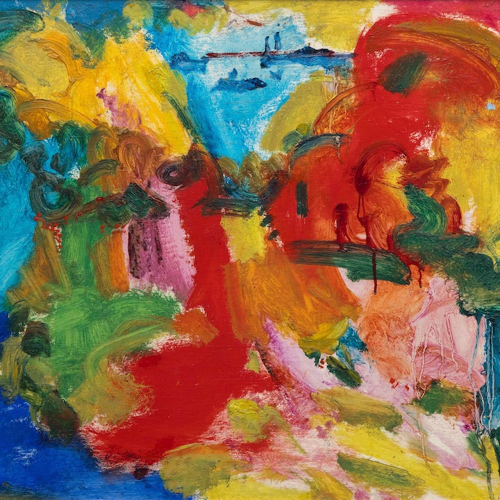
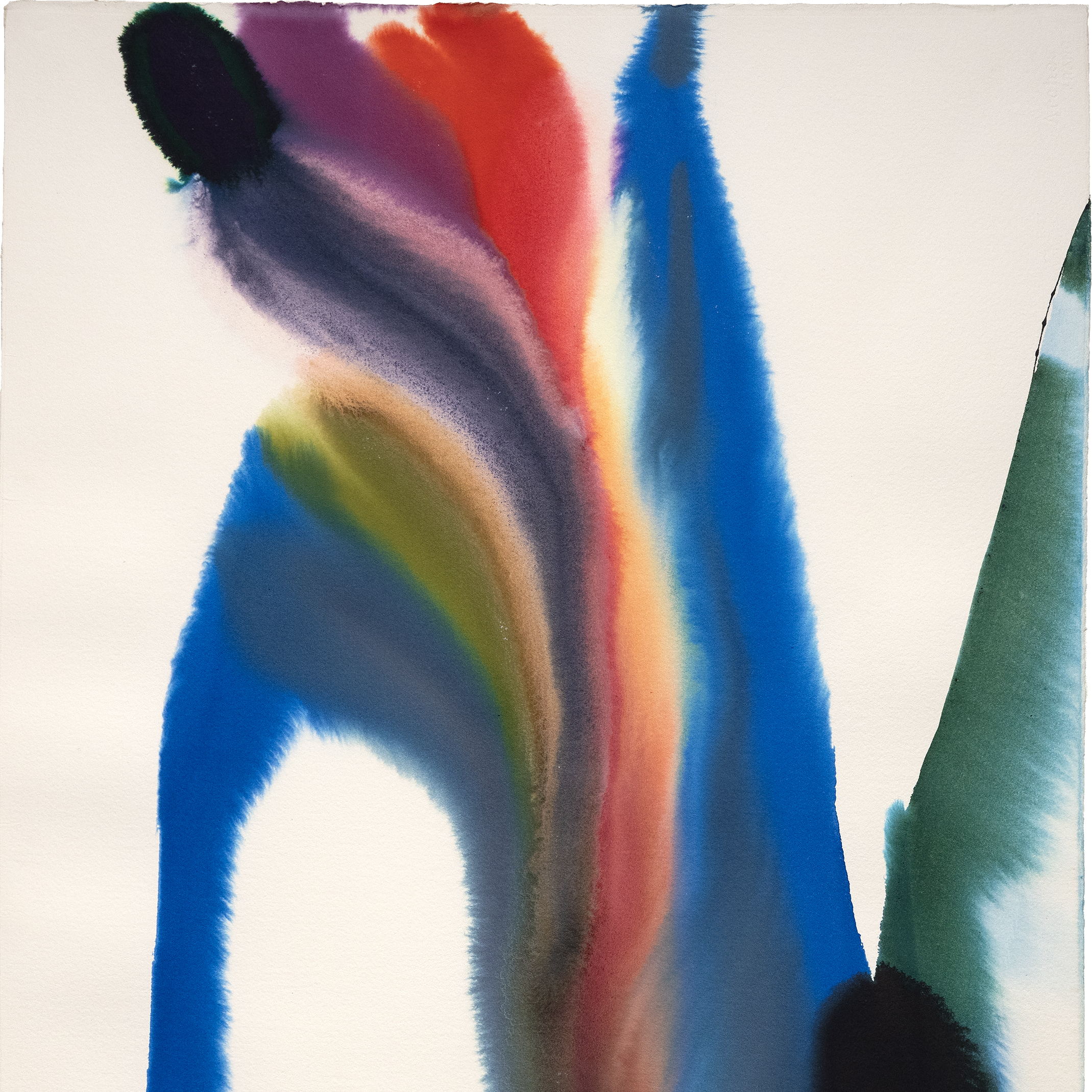
JOANNA POUSETTE-DART

MANUEL NERI

MANUEL NERI

MEL RAMOS

AI WEIWEI
EN LAS NOTICIAS
NOTICIAS

Obras vendidas recientemente
NOTICIAS

Instalaciones de Gibson, Dunn & Crutcher
NOTICIAS

Vende tus obras Blue Chip con Heather James
NOTICIAS

Préstamos del Museo de Bellas Artes Heather James
NOTICIAS

Claude Monet Obras vendidas recientemente
NOTICIAS

El mercado del arte Marzo 2023
NOTICIAS

Préstamos de Van Gogh al Instituto de Arte de Detroit
PRENSA
El Van Gogh prestado por Heather James incluido en "Van Gogh in America" atrae a la multitud
PRENSA
Heather James presta el mayor Van Gogh a "Van Gogh en América"
NOTICIAS

Resistencia del mercado del arte
NOTICIAS

El arte como inversión
NOTICIAS

Instalación de viviendas de lujo
VIDEO

Resumen de la temporada de subastas de arte de mayo de 2022 con Jim Carona
PRENSA

El conservador Chip Tom ayuda en el interior de la casa piloto de Oasis del Desierto
PRENSA

Iconic Life presenta el perfil de la casa piloto Oasis del Desierto, comisariada por la HJFA
PRENSA
Chip Tom Juez invitado
VIDEO

Conociendo a Heather James Fine Art
NOTICIAS

Celebrando 25 años de Heather James Fine Art
NOTICIAS

Heather James abre una consultoría en Londres
CATÁLOGOS

Revoluciones en el arte moderno
CATÁLOGOS

Heather James Fine Art - Acerca de nosotros
VIDEO

Recepción de apertura de Hassel Smith
SERVICIOS
Heather James Fine Art ofrece una amplia gama de servicios basados en el cliente que se adaptan a sus necesidades específicas de coleccionismo de arte. Nuestro equipo de operaciones está formado por gestores profesionales de arte, un departamento de registro completo y un equipo logístico con amplia experiencia en el transporte, instalación y gestión de colecciones de arte. Con servicio de guante blanco y atención personalizada, nuestro equipo hace todo lo posible para garantizar servicios artísticos excepcionales para nuestros clientes.


CONÓCENOS
ARTE DESTACADO
_tn47012.jpg "CLYFFORD STILL-Untitled (PH-589)")
CLYFFORD STILL

AGNES MARTIN
,_new_mexico_tn40147.jpg "GEORGIA O'KEEFFE-Cottonwood Tree (Near Abiquiu), New Mexico")
GEORGIA O'KEEFFE

WILLEM DE KOONING

AI WEIWEI

ALFRED SISLEY
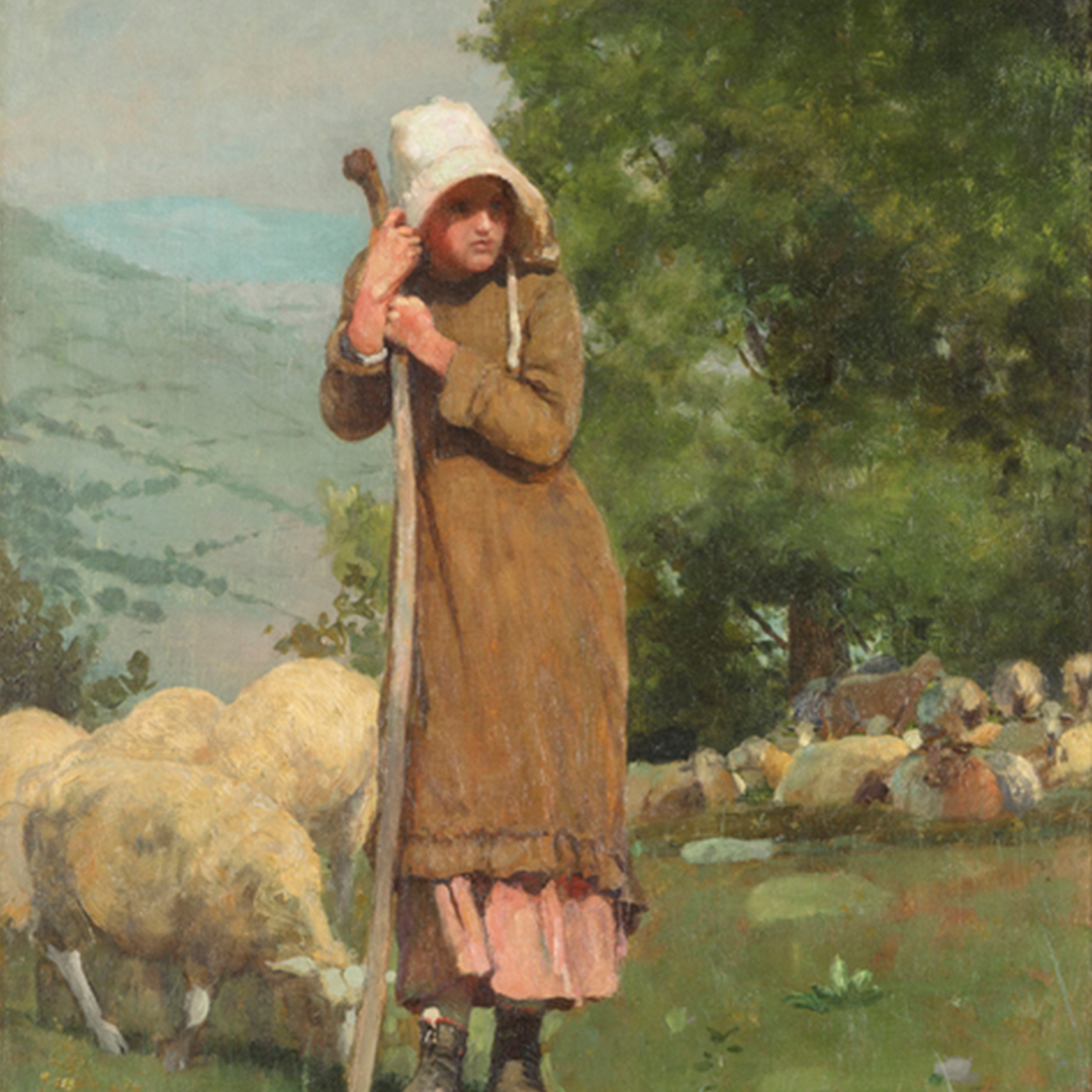
_tn43950.jpg "WINSLOW HOMER-In the Wheatfield (Girl Standing in a Wheat Field)")
WINSLOW HOMER

GERHARD RICHTER

RUFINO TAMAYO

KENNETH NOLAND

SEAN SCULLY

TOM WESSELMANN

ALBERT BIERSTADT
