Désert de palmier


Notre galerie à Palm Desert est située au centre de la région de Palm Springs en Californie, à côté de la zone commerçante et salle à manger populaire d'El Paseo. Notre clientèle apprécie notre sélection d'art d'après-guerre, moderne et contemporain. Le temps magnifique pendant les mois d'hiver attire les visiteurs de partout dans le monde pour voir notre beau désert, et s'arrêter à notre galerie. Le paysage désertique montagneux à l'extérieur offre la toile de fond panoramique parfaite à la fête visuelle qui vous attend à l'intérieur.
45188, avenue Portola
Palm Desert, Californie 92260
(760) 346-8926
Heures d'ouverture :
Du lundi au samedi : 9h00 - 17h00
Expositions
ARCHIVES
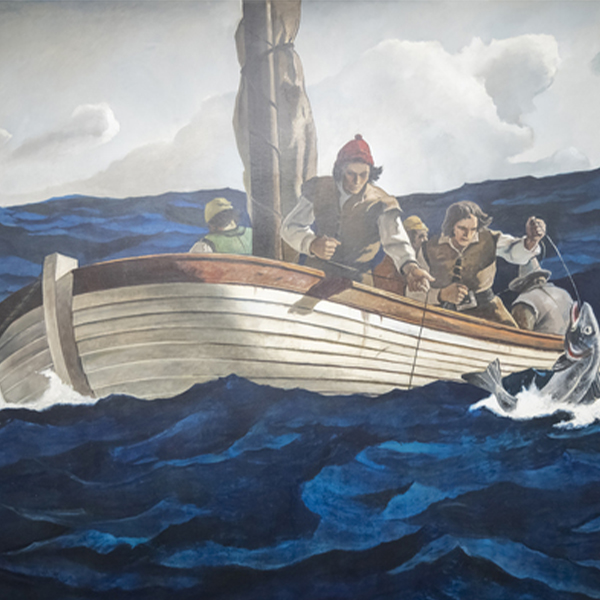
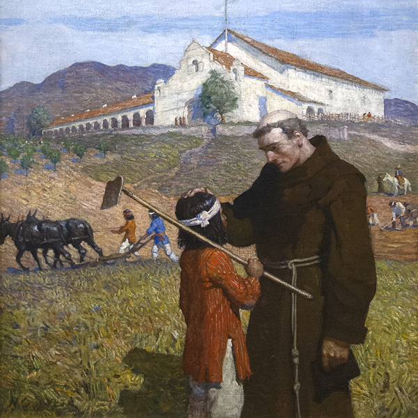
Rencontre avec la vie : N.C. Wyeth et les fresques de MetLife
ARCHIVES
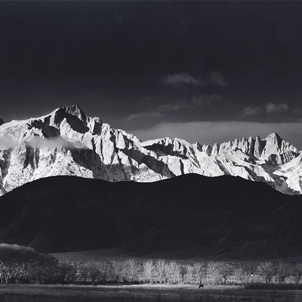
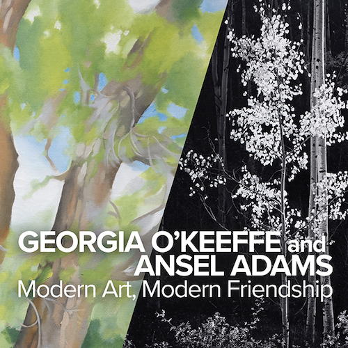
Georgia O'Keeffe et Ansel Adams : Art moderne, amitié moderne
ARCHIVES
Le sang de votre cœur : Intersections de l'art et de la littérature
ARCHIVES
Des fleurs pour le printemps, un coup de pied dans la fourmilière
ARCHIVES
Plus que de la vie : Dialogues impressionnistes de Monet et au-delà
ARCHIVES
Le modernisme juif - Partie 2 : La figuration de Chagall à Norman
ARCHIVES
Vincent van Gogh et les grands impressionnistes du Grand Boulevard

ARCHIVES
Ferrari et Futuristes : Un regard italien sur la vitesse
OEUVRED-ŒUVRE SUR LA VUE
_tn27843.jpg "ELAINE DE KOONING-Untitled (Totem Pole)")
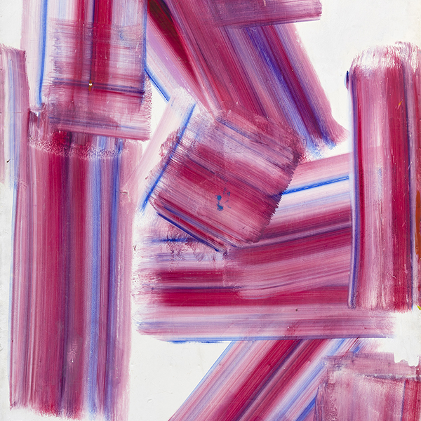
ELAINE DE KOONING

HIROSHI SENJU

ALPERT HERB
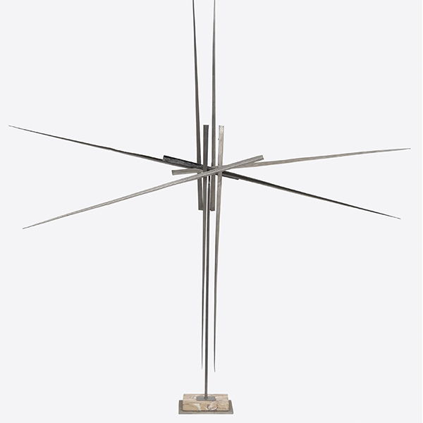
_tn46214.jpg "HARRY BERTOIA-Untitled (Sounding Sculpture)")
BERTOIA HARRY

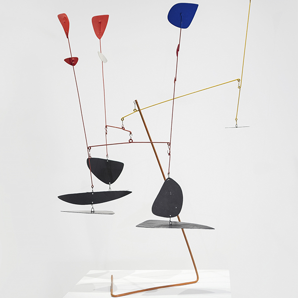
ALEXANDRE CALDER

JULIAN SCHNABEL

JOHN CHAMBERLAIN (EN)

ROGER BROWN
_tn39239.jpg "ANDY WARHOL-Diamond Dust Shoes (Black and White)")
ANDY WARHOL (EN)

KIKI SMITH

RYAN MCGINNESS

PAUL KLEE
_tn28596.jpg "DEBORAH BUTTERFIELD-Untitled (Horse)")
DEBORAH BUTTERFIELD (EN)

NERI MANUEL

CHINOIS

CHINOIS

WALEAD BESHTY
_tn47033.jpg "HARRY BERTOIA-Untitled (Willow)")
BERTOIA HARRY

DEBORAH BUTTERFIELD (EN)

CHARLES ARNOLDI

WILLIAM WENDT

MARC QUINN

SETH KAUFMAN

CHINOIS

EDGAR ALWIN PAYNE
_tn16764.b.jpg "HARRY BERTOIA-Untitled (Suspended Willow)")
BERTOIA HARRY
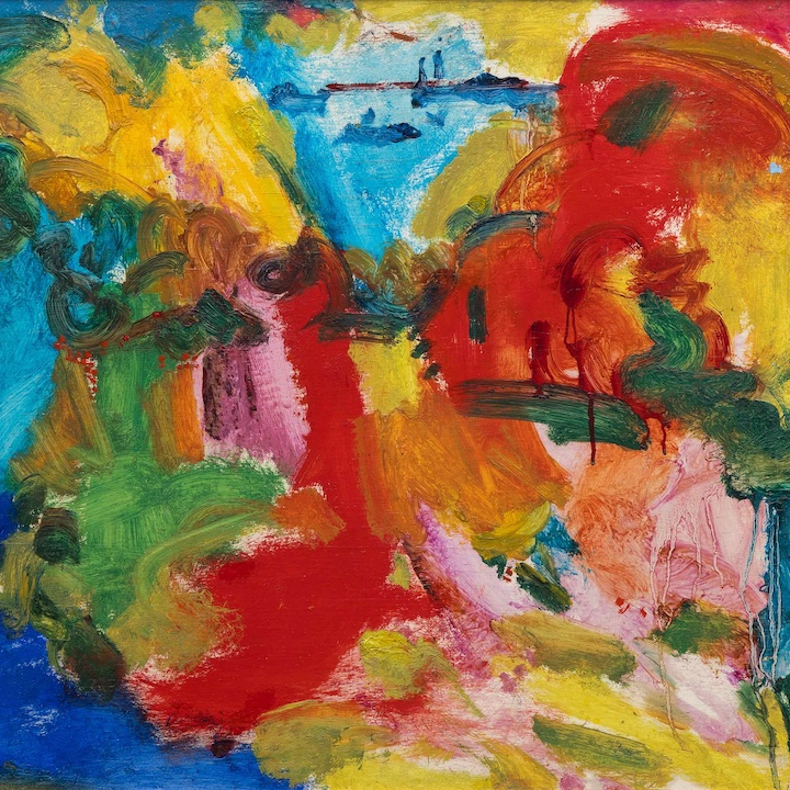
_tn40803.jpg "JOANNA POUSETTE-DART-Untitled (Red Desert Study)")
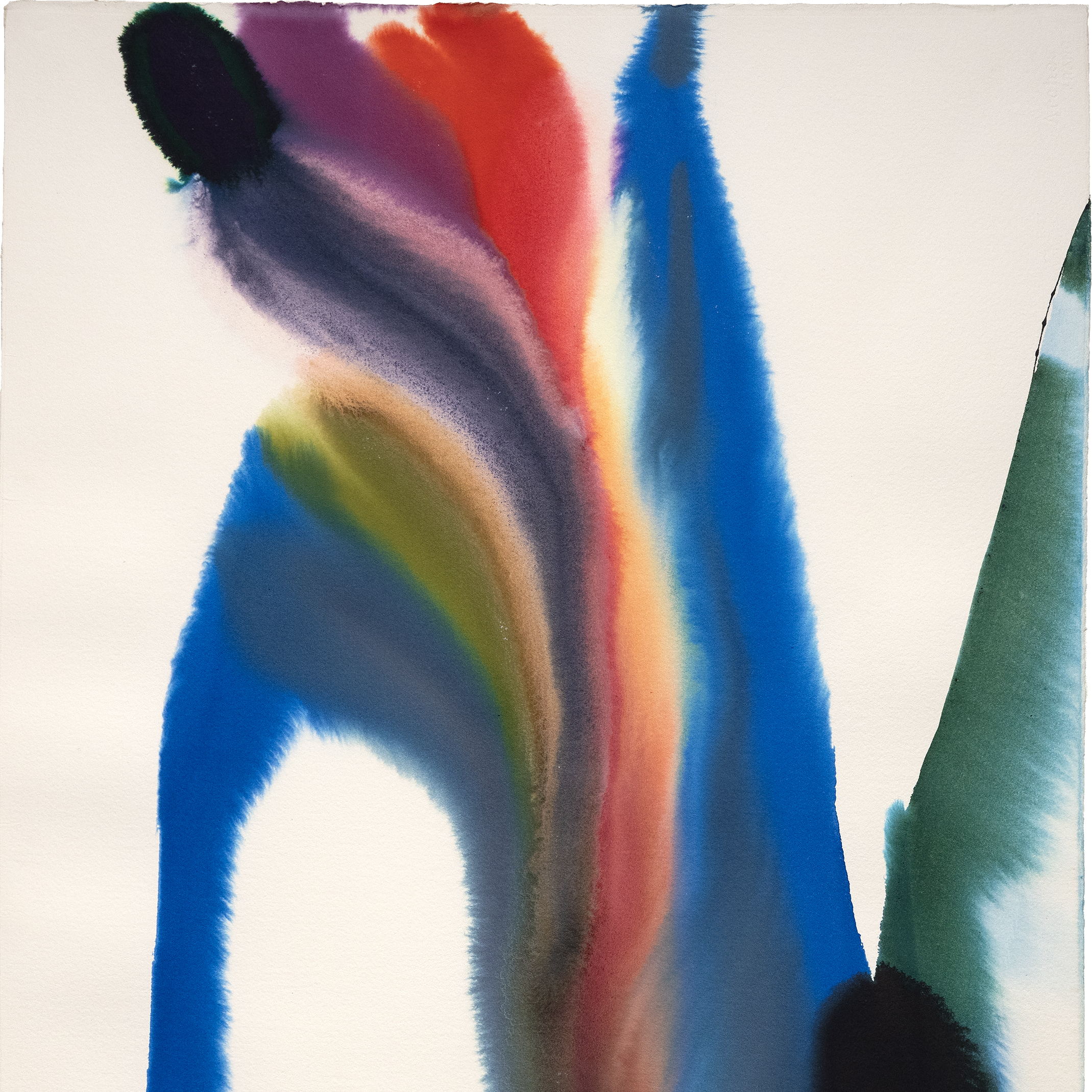
JOANNA POUSETTE-DART

NERI MANUEL

NERI MANUEL

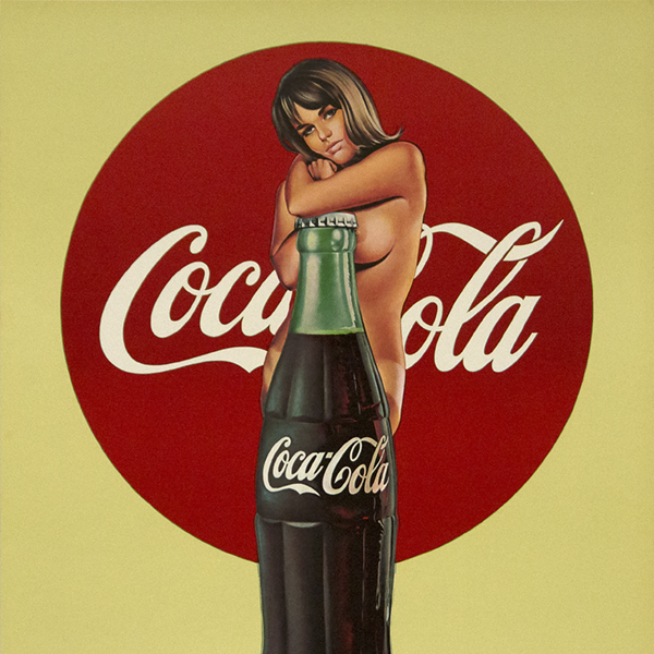
MEL RAMOS

AI WEIWEI
DANS LES NOUVELLES
NOUVELLES

Top Works récemment vendus
NOUVELLES

Installations de Gibson, Dunn & Crutcher
NOUVELLES

Vendez vos œuvres de premier ordre avec Heather James
NOUVELLES

Prêts du musée des beaux-arts Heather James
NOUVELLES

Claude Monet Oeuvres récemment vendues
NOUVELLES

Le marché de l'art mars 2023
NOUVELLES

Prêts de Van Gogh au Detroit Institute of Arts
PRESSE
Le Van Gogh prêté par Heather James, inclus dans "Van Gogh in America", attire la foule.
PRESSE
Heather James prête le grand Van Gogh à "Van Gogh en Amérique".
NOUVELLES

Résilience du marché de l'art
NOUVELLES

L'art comme investissement
NOUVELLES

Installation de maisons de luxe
VIDÉO

Mai 2022 Récapitulation de la saison des ventes aux enchères d'art avec Jim Carona
PRESSE

Le conservateur Chip Tom apporte son aide à l'intérieur de la maison témoin de Desert Oasis
PRESSE

Iconic Life présente la maison d'exposition Desert Oasis, organisée par la HJFA.
PRESSE
Chip Tom Juge invité
VIDÉO

Apprendre à connaître Heather James Fine Art
NOUVELLES

Célébration des 25 ans de Heather James Fine Art
NOUVELLES

Heather James ouvre un cabinet de conseil à Londres
CATALOGUE

Révolutions dans l'art moderne
CATALOGUE

Heather James Fine Art - À propos de nous
VIDÉO

Réception d'ouverture de Hassel Smith
SERVICES
Heather James Fine Art offre une vaste gamme de services à la clientèle qui répondent à vos besoins particuliers en matière de collection d'œuvres d'art. Notre équipe d'exploitation comprend des gestionnaires d'œuvres d'art professionnels, un service de registraire complet et une équipe logistique possédant une vaste expérience du transport, de l'installation et de la gestion des collections d'œuvres d'art. Avec un service de gants blancs et des soins personnalisés, notre équipe fait un effort supplémentaire pour assurer des services artistiques exceptionnels à nos clients.


APPRENEZ À NOUS CONNAÎTRE
ART POUR LES CARACTÉRISTIQUES
_tn47012.jpg "CLYFFORD STILL-Untitled (PH-589)")
CLYFFORD STILL

AGNES MARTIN
,_new_mexico_tn40147.jpg "GEORGIA O'KEEFFE-Cottonwood Tree (Near Abiquiu), New Mexico")
GÉORGIE O'KEEFFE

CLAUDE MONET

WILLEM DE KOONING

AI WEIWEI

ALFRED SISLEY
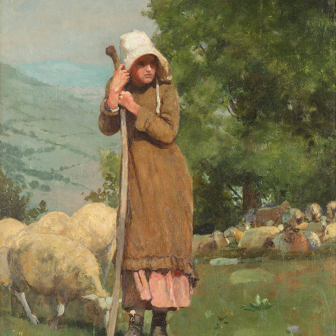
_tn43950.jpg "WINSLOW HOMER-In the Wheatfield (Girl Standing in a Wheat Field)")
WINSLOW HOMER

RENOIR PIERRE-AUGUSTE

GERHARD RICHTER

TAMAYO RUFINO

KENNETH NOLAND (EN)

SEAN SCULLY (EN)

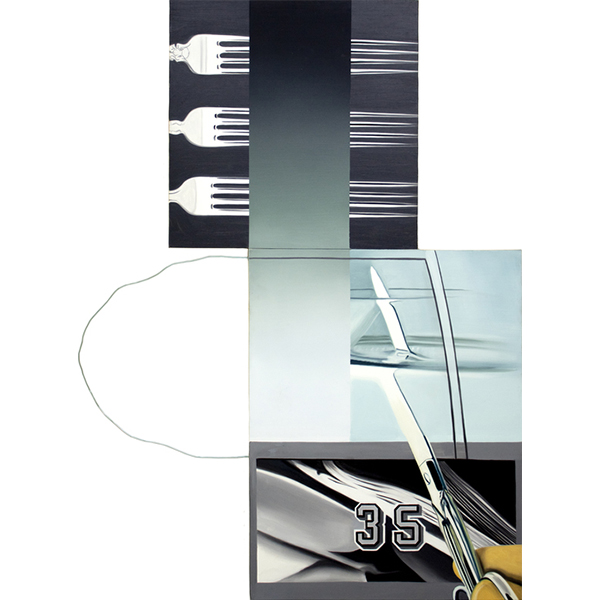
TOM WESSELMANN

ALBERT BIERSTADT
