


Unsere Galerie in Palm Desert liegt zentral im kalifornischen Palm Springs, angrenzend an den beliebten Einkaufs- und Essbereich von El Paseo. Unsere Kundschaft schätzt unsere Auswahl an Nachkriegs-, Moderner- und Zeitgenössischer Kunst. Das herrliche Wetter in den Wintermonaten zieht Besucher aus der ganzen Welt an, um unsere schöne Wüste zu sehen und in unserer Galerie vorbeizuschauen. Die bergige Wüstenlandschaft im Freien bietet die perfekte landschaftliche Kulisse für das visuelle Fest, das im Inneren erwartet.
45188 Portola Avenue
Palm Desert, CA 92260
(760) 346-8926
Öffnungszeiten:
Nur nach Vereinbarung - bis 15. Oktober 2024
Ausstellungen
AKTUELL
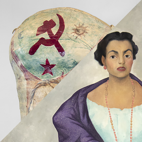
Kein anderes Land: Ein Jahrhundert amerikanischer Landschaften
AKTUELL
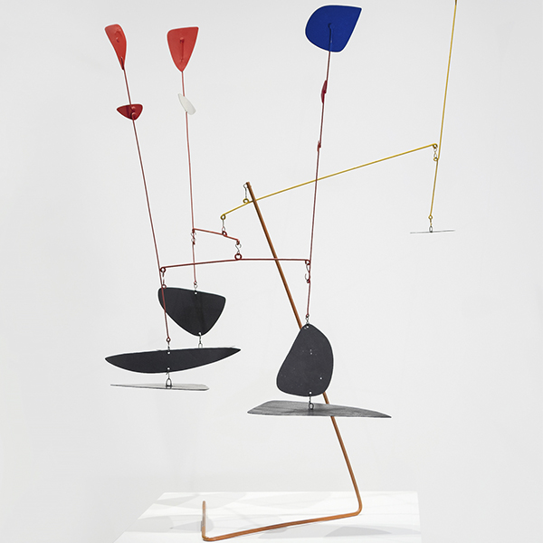
Alexander Calder: Die Gestaltung eines primären Universums
AKTUELL
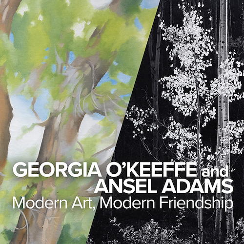
Georgia O'Keeffe und Ansel Adams: Moderne Kunst, moderne Freundschaft
AKTUELL
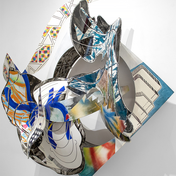
Das Blut deines Herzens: Überschneidungen von Kunst und Literatur
AKTUELL
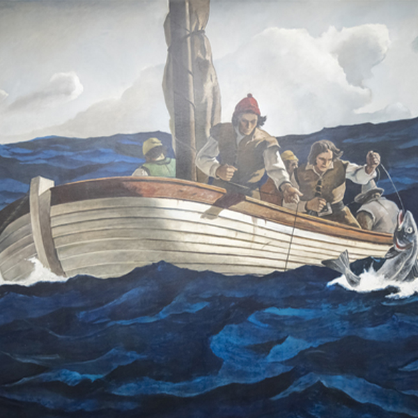
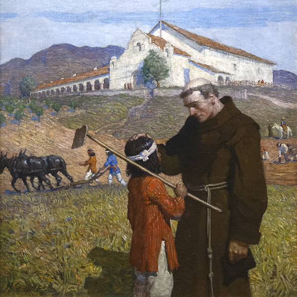
Dem Leben begegnen: N.C. Wyeth und die MetLife-Wandmalereien
ARCHIV
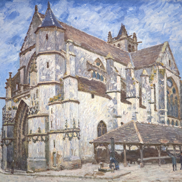
Mehr zum Leben: Impressionistische Dialoge von Monet und darüber hinaus
ARCHIV
Jüdische Moderne Teil 2: Figuration von Chagall bis Norman
ARCHIV
Vincent van Gogh und die großen Impressionisten des Grand Boulevard

ARCHIV
Ferrari und Zukunftsforscher: Ein italienischer Blick auf die Geschwindigkeit
KUNSTWERKE ZUR ANSICHT

Andrew Wyeth & N. C. Wyeth

N.C. WYETH
_tn43950.jpg "WINSLOW HOMER-In the Wheatfield (Girl Standing in a Wheat Field)")
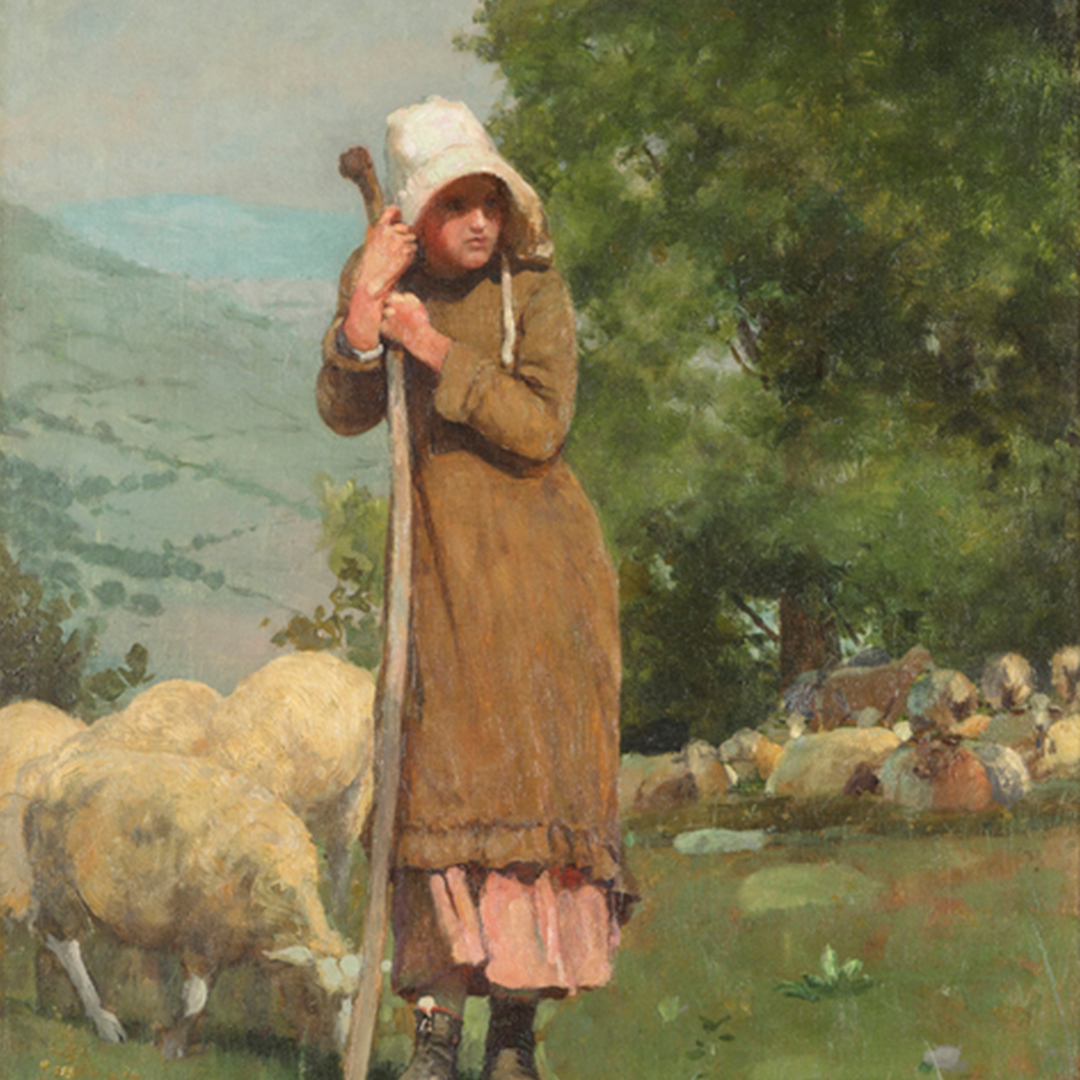
WINSLOW HOMER

GERHARD RICHTER

RUFINO TAMAYO TAMAYO
_tn27035.jpg "ROBERT INDIANA-AMOR (Red Yellow)")
ROBERT INDIANA

JULIANISCHES SCHNABEL

FERNANDO BOTERO

JULIE CURTISS
_tn45106.jpg "CAMILLE CLAUDEL-La Vague (The Wave)")
CAMILLE CLAUDEL

MEL RAMOS

THÉO VAN RYSSELBERGHE
_tn27843.jpg "ELAINE DE KOONING-Untitled (Totem Pole)")
ELAINE DE KOONING

KATHARINA GROSSE

MEL RAMOS

HERB ALPERT

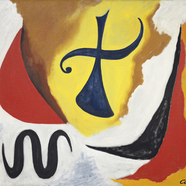
ALEXANDER KALANDER

HERB ALPERT

ALEXANDER KALANDER

IRVING NORMAN

FRANK STELLA

PAUL JENKINS

MANUEL NERI

IRVING NORMAN

KIKI SMITH

DEBORAH BUTTERFIELD

THÉO VAN RYSSELBERGHE

MANUEL NERI

RYAN MCGINNESS
_tn28596.jpg "DEBORAH BUTTERFIELD-Untitled (Horse)")
DEBORAH BUTTERFIELD

JOSEPH STELLA

HERB ALPERT

IRVING NORMAN

MANUEL NERI

CHINESISCH

SUBODH GUPTA

MARC QUINN

IRVING NORMAN

CHARLES ARNOLDI

WAYNE THIEBAUD

MAX PELLEGRINI

VALERIE JAUDON

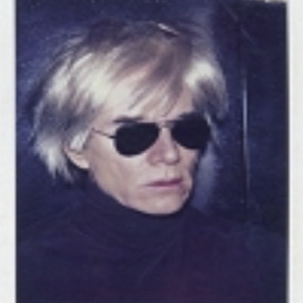
ANDY WARHOL

SETH KAUFMAN

ANDY WARHOL
_tn40803.jpg "JOANNA POUSETTE-DART-Untitled (Red Desert Study)")
JOANNA POUSETTE-DART

CHINESISCH
_tn36185.jpg "ANDY WARHOL-Self-Portrait with Camera (diptych)")
ANDY WARHOL

ROBERT NATKIN

MAURICE ASKENAZYY

ANDY WARHOL

ANDY WARHOL
_tn37425.jpg "ANDY WARHOL-The Shadow (from Myths)")
ANDY WARHOL

MAX PELLEGRINI

MAX PELLEGRINI

MAX PELLEGRINI

MAX PELLEGRINI

MAX PELLEGRINI

CHINESISCH
IN DEN NACHRICHTEN
NACHRICHTEN

Kürzlich verkaufte Spitzenwerke
NACHRICHTEN

Gibson, Dunn & Crutcher Einrichtungen
NACHRICHTEN

Verkaufen Sie Ihre Blue Chip Werke mit Heather James
NACHRICHTEN

Heather James Museum für Bildende Kunst Leihgaben
NACHRICHTEN

Claude Monet Kürzlich verkaufte Werke
NACHRICHTEN

Der Kunstmarkt März 2023
NACHRICHTEN

Van Gogh-Leihgaben an das Detroit Institute of Arts
PRESSE
Van Gogh als Leihgabe von Heather James bei "Van Gogh in Amerika" zieht Publikum an
PRESSE
Heather James leiht großen Van Gogh an "Van Gogh in Amerika" aus
NACHRICHTEN

Widerstandsfähigkeit des Kunstmarktes
NACHRICHTEN

Kunst als Investition
NACHRICHTEN

Luxuriöse Hausinstallation
VIDEO

Mai 2022 Kunstauktion Saisonrückblick mit Jim Carona
PRESSE

Kurator Chip Tom hilft im Inneren des Musterhauses der Wüstenoase
PRESSE

Iconic Life stellt das von der HJFA kuratierte Desert Oasis Show House vor
PRESSE
Chip Tom Gastrichter
VIDEO

Kennenlernen von Heather James Fine Art
NACHRICHTEN

Wir feiern 25 Jahre Heather James Fine Art
NACHRICHTEN

Heather James eröffnet Beratungsbüro in London
KATALOGE

Revolutionen in der modernen Kunst
KATALOGE

Heather James Fine Art - Über uns
VIDEO

Hassel-Smith-Eröffnungsempfang
DIENSTLEISTUNGEN
Heather James Fine Art bietet eine breite Palette von kundenorientierten Dienstleistungen, die auf Ihre spezifischen Bedürfnisse zugeschnitten sind. Unser Operations-Team besteht aus professionellen Kunsthändlern, einer kompletten Registrierungsabteilung und einem Logistikteam mit umfangreicher Erfahrung im Bereich Kunsttransport, Installation und Sammlungsmanagement. Mit einem weißen Handschuhservice und einer persönlichen Betreuung geht unser Team noch einen Schritt weiter, um unseren Kunden außergewöhnliche Kunstleistungen zu bieten.


KENNENLERNEN
FEATURED ART

PAUL SIGNAC
,_new_mexico_tn40147.jpg "GEORGIA O'KEEFFE-Cottonwood Tree (Near Abiquiu), New Mexico")
GEORGIA O'KEEFFE

DIEGO RIVERA

GRANT WOOD
Andrew Wyeth & N. C. Wyeth
N.C. WYETH

ALEXANDER KALANDER

ALFRED SISLEY

EMIL NOLDE
_tn45742.jpg "SIR WINSTON CHURCHILL-On the Rance, Near St. Malo (C520)")
SIR WINSTON CHURCHILL

ALEXANDER KALANDER
WINSLOW HOMER
GERHARD RICHTER
_tn45741.jpg "SIR WINSTON CHURCHILL-By Lake Lugano (C413)")
SIR WINSTON CHURCHILL
_tn45731.jpg "SIR WINSTON CHURCHILL-Riviera Coast Scene (C295)")
SIR WINSTON CHURCHILL
_tn45733.jpg "SIR WINSTON CHURCHILL-The Bay of Eze (C490)")
SIR WINSTON CHURCHILL

MARC CHAGALL

TOM WESSELMANN
_tn45732.jpg "SIR WINSTON CHURCHILL-Oranges and Lemons (C455)")
SIR WINSTON CHURCHILL
ROBERT INDIANA

STEUERFLÜSSE
_tn45736.jpg "SIR WINSTON CHURCHILL-Coastal Town on the Riviera (Double-Sided C111 & 535)")
SIR WINSTON CHURCHILL
THÉO VAN RYSSELBERGHE
