Jackson Loch
In der wilden Schönheit von Jackson Hole, Wyoming, mit den Nationalparks als atemberaubende Kulisse gelegen, bringt Heather James Jackson seit über einem Jahrzehnt Kunstwerke und Dienstleistungen von höchstem Niveau in das Intermountain West.
Heather James ist bestrebt, eine unvergleichliche Auswahl an Kunstwerken und Dienstleistungen für Einheimische und Besucher anzubieten, die Jackson Hole zu einem unvergleichlichen Ziel für die amerikanische Kultur und die freie Natur machen.
172 Center Street, Suite 101
Postfach 3580
Jackson Hole, WY 83001
(307) 200-6090
Öffnungszeiten: Nur nach Vereinbarung bis 1. Juli 2025
Ausstellungen
ARCHIV
Das Vermächtnis des Landes: Georgia O'Keeffe und Emily Kame Kngwarreye
ARCHIV
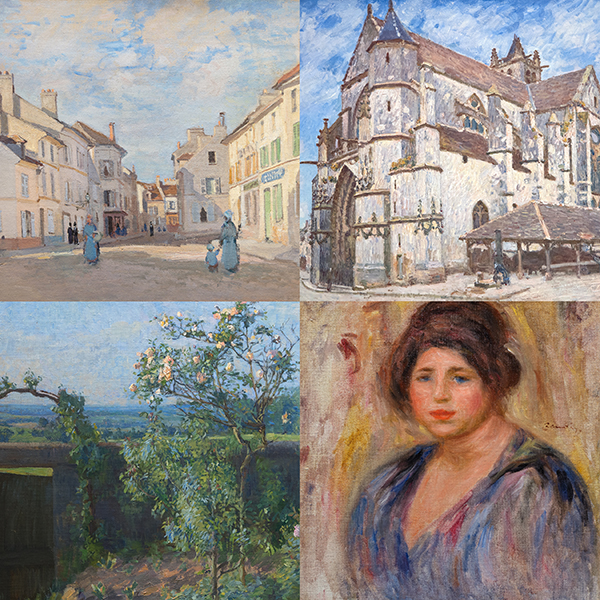
Alles, was wir gesehen haben: Impressionistische Landschaften von Monet bis Kleitsch
KUNSTWERKE ZUR ANSICHT

RICHARD DIEBENKORN

AGNES MARTIN

WILLEM DE KOONING
_tn43950.jpg "WINSLOW HOMER-In the Wheatfield (Girl Standing in a Wheat Field)")
WINSLOW HOMER

GERHARD RICHTER

SEAN SCULLY

HANS HOFMANN

HANS HOFMANN

HANS HOFMANN

HANS HOFMANN

HANS HOFMANN

HANS HOFMANN

CHINESISCH

HANS HOFMANN

MEL RAMOS

CAMILLE PISSARRO

LEE KRASNER

ROLAND PETERSEN

GEORGE RICKEY

HANS HOFMANN

ANDY WARHOL

ANDY WARHOL
_tn46616.jpg "RICHARD PRINCE-Untitled (Censor Painting Pink)")
RICHARD PRINCE

HARRY BERTOIA
_tn47464.jpg "HARRY BERTOIA-Untitled (Sounding Sculpture)")
HARRY BERTOIA

MARIA BLANCHARD

MARIA BLANCHARD

IRVING NORMAN

IRVING NORMAN

JACK ROTH

KARL BENJAMIN

KHMER

PAUL JENKINS

ANDY WARHOL

THOMAS NOZKOWSKI

SÜDOSTASIATISCH

THEASTER TORE

ROY LICHTENSTEIN

KHMER

ROY LICHTENSTEIN

FRANK STELLA

ALEX KATZ

AMERIKANISCHER UREINWOHNER

JAPANISCHE
CONSULTANTS

ANDREA RICO DAHLIN
Leitender Vizepräsident
Jackson Hole, Wyoming
Andrea ist seit über 20 Jahren in der Branche tätig und hat einen BA in Kunstgeschichte mit einem Nebenfach in Bildender Kunst von der Binghamton University, Binghamton, NY, und einen MA in Moderner Kunst, Kennerschaft und Geschichte des Kunstmarktes von Christie's Education, New York, NY. Sie bringt ihr Fachwissen aus ihrer Erfahrung in Museen und Auktionshäusern mit, da sie am Nelson-Atkins Museum of Art in Kansas City und bei Christie's in New York gearbeitet hat.
Seit ihrem Eintritt bei Heather James Fine Art im Jahr 2015 hat Andrea Einlieferungen gesichert und beim Aufbau bemerkenswerter Privat- und Museumssammlungen mit wichtigen Künstlern geholfen, zu denen Claude Monet, Alfred Sisley, Henri Matisse, Edgar Degas, Norman Rockwell, Andrew Wyeth, Elaine de Kooning, Andy Warhol und Tom Wesselmann gehören.

SARAH FISCHEL
Ko-Vorsitzender, Beratung
Jackson Hole, Wyoming
Sarah hat eine tiefe Leidenschaft für Kunst und Geschichte, denn sie wuchs inmitten von Kunst auf. Diese frühe Liebe führte zu mehr als einem Jahrzehnt Erfahrung in der Kunstwelt. Sie hat sich in Galerien, Auktionshäusern und Museen umgesehen.
Sarah glaubt fest daran, dass es wichtig ist, alle Aspekte eines Unternehmens kennenzulernen und zu erfahren. Sie hat in der gesamten Kunstwelt in verschiedenen Funktionen gearbeitet und bringt einen ganzheitlichen Ansatz in die Beratung und ihre Arbeit ein. Seit 2015 ist Sarah eine Schlüsselfigur bei Heather James Fine Art, wo sie einen erstklassigen Kundenservice bietet, die Galerie in Jackson Hole leitet, Galerieausstellungen und Sammlerwohnungen kuratiert und strategische Werbeinitiativen anführt.
Nach ihrem Abschluss in Journalismus und Kunstgeschichte an der New York University setzte Sarah ihre akademische Ausbildung mit einem Master-Abschluss des Christie's Art, Law, and Business Program in London fort. Neben ihren beruflichen und schulischen Aktivitäten engagiert sich Sarah aktiv für Dinge, die ihr am Herzen liegen, darunter Jackson Hole Public Art als Vorstandsmitglied und das United States Holocaust Memorial Museum.
Als Co-Vorsitzende bringt Sarah ihre persönlichen Erfahrungen und ihr Wissen über Kunst und Sammeln in jede Interaktion ein und sucht stets nach der besten Lösung für die Bedürfnisse ihrer Kunden.
IN DEN NACHRICHTEN
NACHRICHTEN

Kürzlich verkaufte Spitzenwerke
NACHRICHTEN

Gibson, Dunn & Crutcher Einrichtungen
NACHRICHTEN

Verkaufen Sie Ihre Blue Chip Werke mit Heather James
NACHRICHTEN

Heather James Museum für Bildende Kunst Leihgaben
NACHRICHTEN

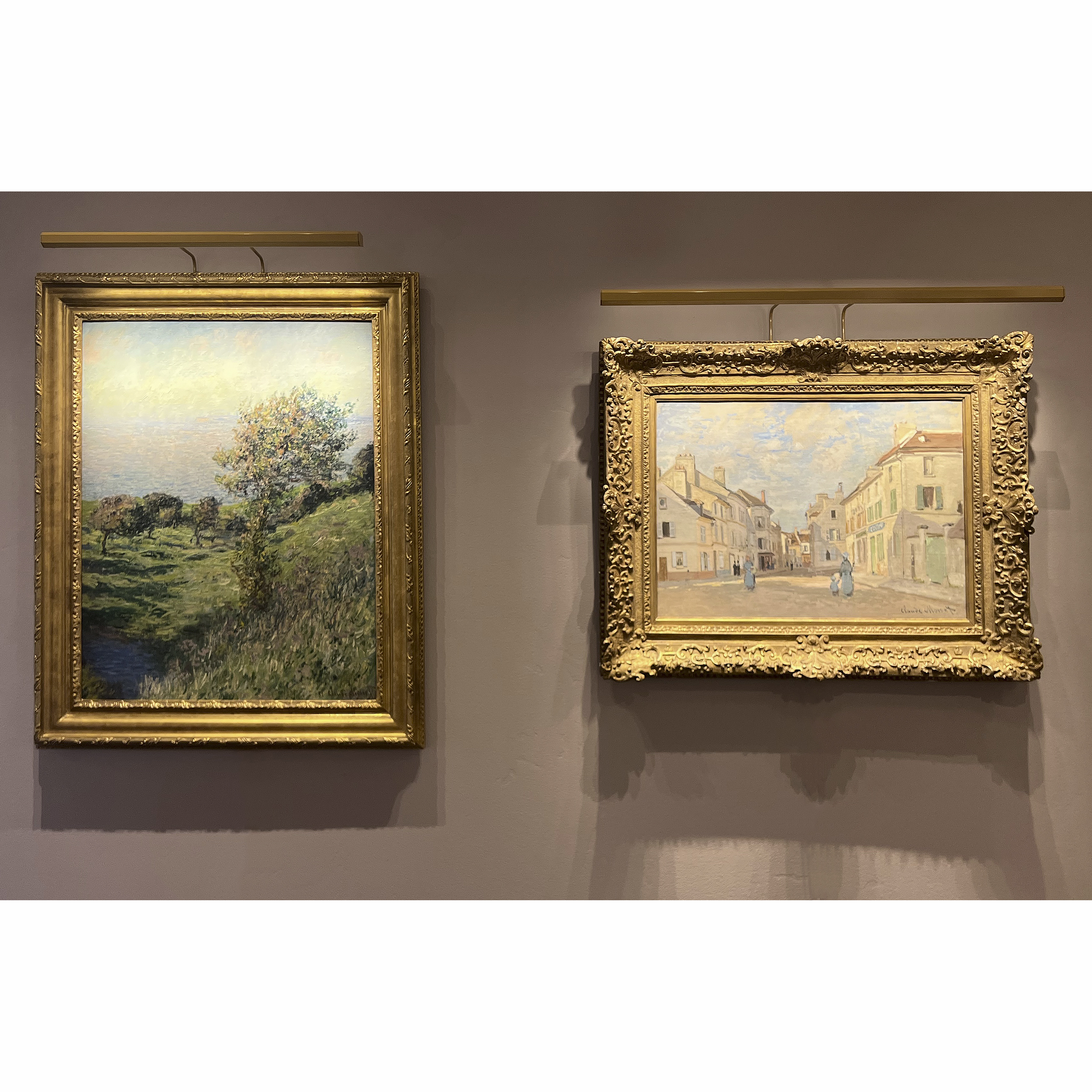
Claude Monet Kürzlich verkaufte Werke
NACHRICHTEN

Der Kunstmarkt März 2023
PRESSE
Van Gogh als Leihgabe von Heather James bei "Van Gogh in Amerika" zieht Publikum an
PRESSE
Heather James leiht großen Van Gogh an "Van Gogh in Amerika" aus
PRESSE

Jackson Hole News & Guide hebt Heather James Vier Jahrhunderte Kunst hervor
NACHRICHTEN

Widerstandsfähigkeit des Kunstmarktes
PRESSE
Jackson Hole News & Guide zeigt Heather James' neue Werke
NACHRICHTEN

Kunst als Investition
VIDEO

Kennenlernen von Heather James Fine Art
NACHRICHTEN

Wir feiern 25 Jahre Heather James Fine Art
NACHRICHTEN

Heather James eröffnet Beratungsbüro in London
PRESSE
Jackson Hole News & Guide berichtet: Heather James gibt Sammlern seltene Fundstücke
VIDEO

Künstlerinnen mit Andrea Rico-Dahlin
VIDEO

De Kooning mit Andrea Rico-Dahlin
VIDEO

Lateinamerikanische Meister mit Andrea Rico-Dahlin
NACHRICHTEN

Jackson Hole Gallery Walkthrough - Sommer 2021
KATALOGE

Revolutionen in der modernen Kunst
KATALOGE

Heather James Fine Art - Über uns
VIDEO

Edward Hopper Ausstellung


DIENSTLEISTUNGEN
Heather James Fine Art bietet eine breite Palette von kundenorientierten Dienstleistungen, die auf Ihre spezifischen Bedürfnisse zugeschnitten sind. Unser Operations-Team besteht aus professionellen Kunsthändlern, einer kompletten Registrierungsabteilung und einem Logistikteam mit umfangreicher Erfahrung im Bereich Kunsttransport, Installation und Sammlungsmanagement. Mit einem weißen Handschuhservice und einer persönlichen Betreuung geht unser Team noch einen Schritt weiter, um unseren Kunden außergewöhnliche Kunstleistungen zu bieten.


KENNENLERNEN
FEATURED ART
_tn47012.jpg "CLYFFORD STILL-Untitled (PH-589)")
CLYFFORD STILL
AGNES MARTIN
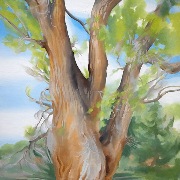
,_new_mexico_tn40147.jpg "GEORGIA O'KEEFFE-Cottonwood Tree (Near Abiquiu), New Mexico")
GEORGIA O'KEEFFE
WILLEM DE KOONING

AI WEIWEIWEI

ALFRED SISLEY
WINSLOW HOMER
GERHARD RICHTER

RUFINO TAMAYO TAMAYO

KENNETH NOLAND
SEAN SCULLY

TOM WESSELMANN

ALBERT BIERSTADT
