Jackson Hole
Situated in the wild beauty of Jackson Hole, Wyoming, with National Parks as a stunning backdrop, Heather James Jackson has brought the highest caliber of artworks and services to the Intermountain West for over a decade.
Catering to the unique community that makes Jackson Hole an unparalleled destination for American culture and the outdoors, Heather James strives to provide an unmatched selection of artworks and white glove services for locals and visitors alike.
172 Center Street, Suite 101
P.O. Box 3580
Jackson Hole, WY 83001
(307) 200-6090
Hours: December 1, 2025 through March 28, 2026
Tuesday – Saturday 10am to 5pm
Exhibitions
ARCHIVE
Legacy of the Land: Georgia O’Keeffe and Emily Kame Kngwarreye
ARCHIVE
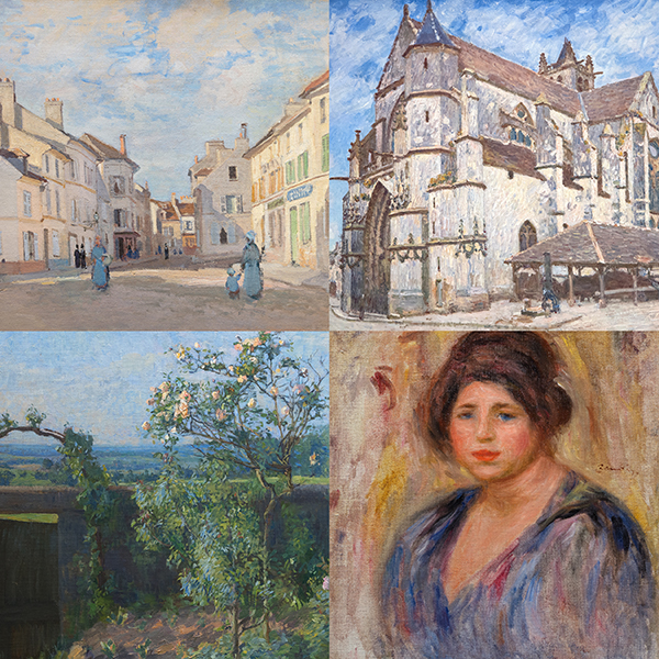
All We Have Seen: Impressionist Landscapes from Monet to Kleitsch
ARTWORK ON VIEW

RICHARD SERRA

ALEXANDER CALDER

ANDY WARHOL

ALEXANDER CALDER

ALEXANDER CALDER

ALEXANDER CALDER

ALEXANDER CALDER

ALEXANDER CALDER

ALEXANDER CALDER

ALEXANDER CALDER
_tn47464.jpg "HARRY BERTOIA-Untitled (Sounding Sculpture)")
HARRY BERTOIA

HARRY BERTOIA

ALEXANDER CALDER
_tn46213.jpg "HARRY BERTOIA-Untitled (Sounding Sculpture)")
HARRY BERTOIA

MARY CORSE

ANDY WARHOL

RAY PARKER
_tn48021.jpg "RUSSELL YOUNG-Elvis Heartbreak Hotel (Diptych)")
RUSSELL YOUNG

SOUTHEAST ASIAN

WAYNE THIEBAUD
_tn47869.jpg "ELLSWORTH KELLY-Untitled, (from portfolio Eight by Eight to celebrate the Temporary Contemporary)")
ELLSWORTH KELLY

ED RUSCHA

ALEX KATZ

ELLSWORTH KELLY
_tn47873.jpg "ELLSWORTH KELLY-Red Curve (Black State)")
ELLSWORTH KELLY

JOSEF ALBERS

JOSEF ALBERS

LAWRENCE SCHILLER
CONSULTANTS

ANDREA RICO DAHLIN
Senior Vice President
Jackson Hole, Wyoming
With over 20 years in the industry, Andrea holds a BA in Art History with a Minor in Fine Art from Binghamton University, Binghamton, NY, and a MA in Modern Art, Connoisseurship, and History of the Art Market from Christie’s Education, New York, NY. She brings expertise from her experience in both museums and auction houses, having worked at the Nelson-Atkins Museum of Art in Kansas City and Christie’s in New York.
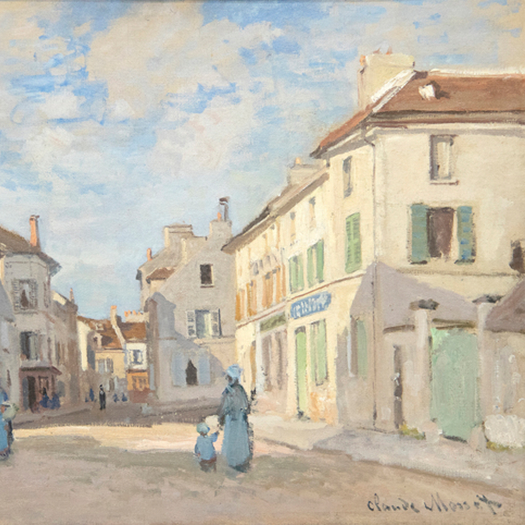
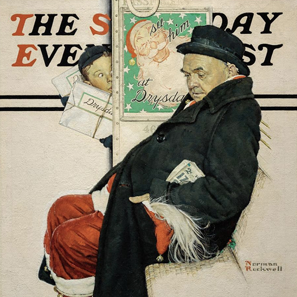
Since joining Heather James Fine Art in 2015, Andrea has secured consignments and helped build notable private and museum collections with important artists, which include Claude Monet, Alfred Sisley, Henri Matisse, Edgar Degas, Norman Rockwell, Andrew Wyeth, Elaine de Kooning, Andy Warhol, and Tom Wesselmann.

SARAH FISCHEL
Senior-Vice President Heather James and Co-Chairman, Art Advisory
Jackson Hole, Wyoming
Sarah has a deep passion for both art and history having grown up surrounded by art. Propelling that early love into over a decade of experience in the art world, she has navigated galleries, auction houses, and museums.
A firm believer in learning and experiencing every aspect of a business, Sarah has worked across the art world in various roles, bringing a holistic approach to the advisory and her work. Since 2015, Sarah has been a key player at Heather James Fine Art, where she has provided top-tier client service, managed the Jackson Hole gallery, curated gallery exhibitions and collectors’ homes, and spearheaded strategic promotional initiatives.
Earning degrees in journalism and art history from New York University, Sarah continued her academic foundation with a master’s degree from Christie’s Art, Law, and Business program in London. Beyond her professional and educational pursuits, Sarah is actively involved with causes close to her, including the United States Holocaust Memorial Museum and as a board member of Jackson Hole Public Art and Teton Adaptive.
As Co-Chairman, Sarah brings her personal experiences and knowledge of art and collecting to every interaction, always seeking out the best solution for her clients’ needs.
IN THE NEWS
VIDEO

Heather James Jackson Hole – Summer 2025 Art Selections with Sarah Fischel
VIDEO

Heather James Jackson Hole – Summer 2025 Art Selections with Andrea Rico-Dahlin
NEWS

Recently Sold Top Works
NEWS

Gibson, Dunn & Crutcher Installations
NEWS

Sell Your Blue Chip Works With Heather James
NEWS

Heather James Fine Art Museum Loans
NEWS

Claude Monet Recently Sold Works
NEWS

The Art Market March 2023
PRESS
Heather James loaned Van Gogh included in “Van Gogh in America” draws crowd
PRESS
Heather James loans major Van Gogh to “Van Gogh in America”
PRESS

Jackson Hole News & Guide Highlights Heather James Four Centuries of Art
NEWS

Art Market Resilience
PRESS
Jackson Hole News & Guide Features Heather James New Works
NEWS

Art as an Investment
VIDEO

Getting to Know Heather James Fine Art
NEWS

Celebrating 25 Years of Heather James Fine Art
NEWS

Heather James Opens London Consultancy
PRESS
Jackson Hole News & Guide reports Heather James gives collectors rare finds
VIDEO

Women Artists with Andrea Rico-Dahlin
VIDEO

De Kooning with Andrea Rico-Dahlin
NEWS

Jackson Hole Gallery Walkthrough – Summer 2021
CATALOGS

Revolutions in Modern Art
CATALOGS

Heather James Fine Art – About Us
VIDEO

Edward Hopper Exhibition


SERVICES
Heather James Fine Art provides a wide range of client-based services catered to your specific art collecting needs. Our Operations team includes professional art handlers, a full registrar department and logistical team with extensive experience in art transportation, installation, and collection management. With white glove service and personalized care, our team goes the extra mile to ensure exceptional art services for our clients.


GET TO KNOW US
FEATURED ART
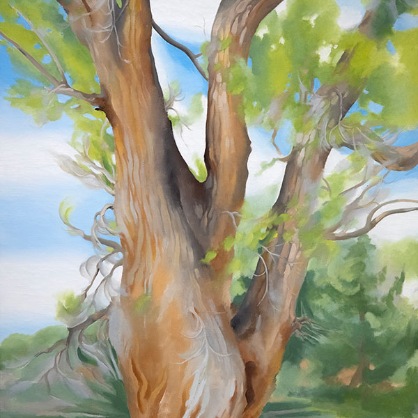
,_new_mexico_tn40147.jpg "GEORGIA O'KEEFFE-Cottonwood Tree (Near Abiquiu), New Mexico")
GEORGIA O'KEEFFE

ALFRED SISLEY
_tn43950.jpg "WINSLOW HOMER-In the Wheatfield (Girl Standing in a Wheat Field)")
WINSLOW HOMER

WAYNE THIEBAUD

GERHARD RICHTER

SEAN SCULLY

TOM WESSELMANN
