بالم ديزرت


يتميز معرضنا في بالم ديزرت بموقع مركزي في منطقه بالم سبرينغز في كاليفورنيا ، بجوار منطقه التسوق وتناول الطعام الشهيرة في ال باسيو. ويقدر عملاؤنا اختيارنا للفن الحديث والمعاصر وما بعد الحرب. الطقس رائع خلال أشهر الشتاء يجذب الزوار من جميع انحاء العالم لرؤية الصحراء الجميلة لدينا ، والتوقف عن طريق معرضنا. المناظر الطبيعية الصحراوية الجبلية خارج يوفر خلفيه مثاليه المناظر الخلابة لوليمة البصرية التي تنتظر في الداخل.
45188 شارع بورتولا
بالم ديزرت, كاليفورنيا 92260
346-8926 (760)
ساعات العمل:
من الاثنين - السبت 9 صباحاً إلى 5 مساءً
المعارض

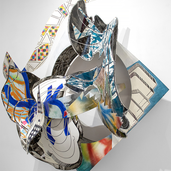
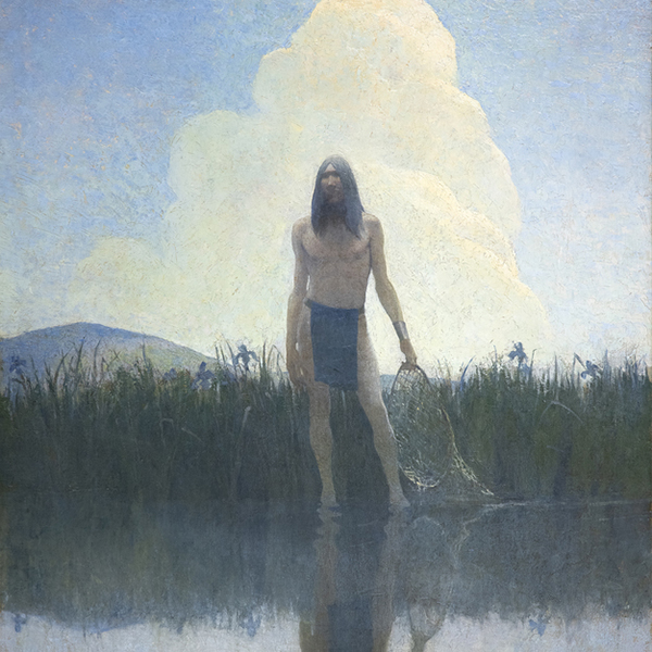


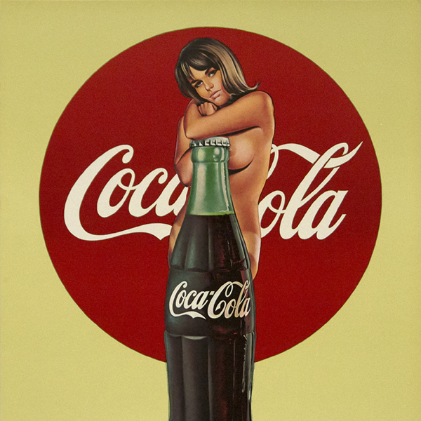

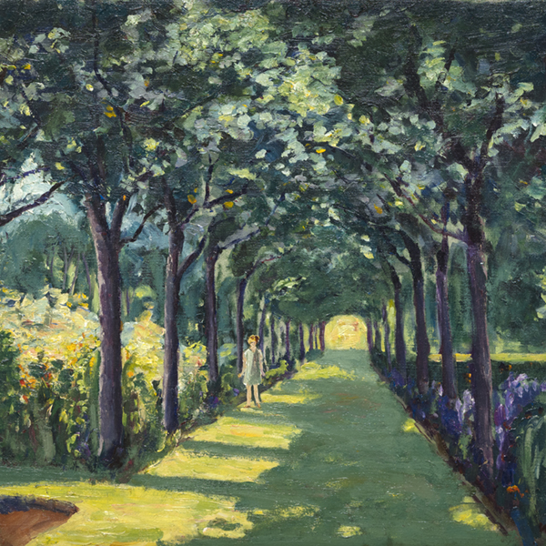
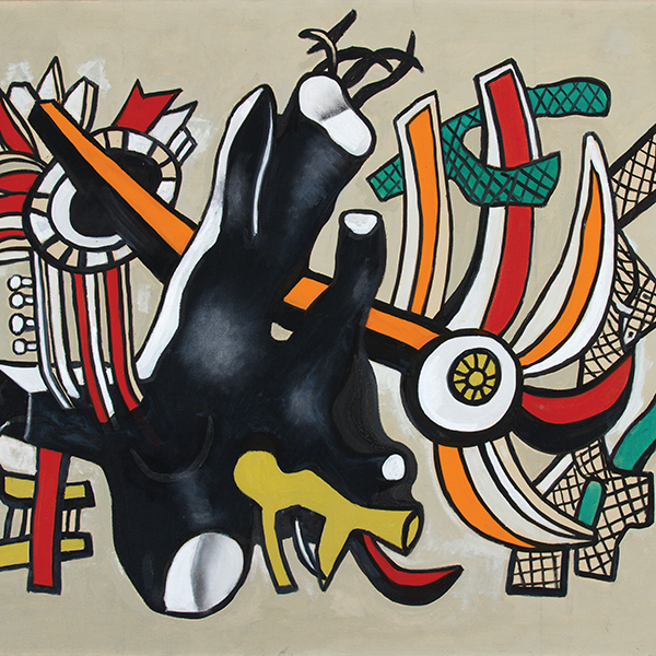
![[كاليكلينينس]](/Art_Images/Medium/Kleitsch 12477.jpg)

العمل الفني على العرض

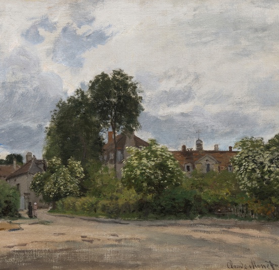
كلود مونيه

كلود مونيه

بول سيجناك

ويليم دي كونينغ

واين ثيبود

CHILDE HASSAM

كلود مونيه
_tn48131.jpg "PIERRE BONNARD-La robe de chambre rouge (Marthe Bonnard)")
بيير بونارد

كاميل بيسارو

ألفريد سسيلي

غيرهارد ريختر

جوليو تشيزاري بروكاسيني

توم ويسلمان

CHILDE HASSAM

شون سكولي

جون سينجر سارجنت

توم ويسلمان

واين ثيبود

بيير أوغست رينوار

أولغا دي أمارال

جيمس روزنكويست

أندي وارهول

بول سيجناك

هانز هوفمان

كينيث نولاند
_tn27843.jpg "ELAINE DE KOONING-Untitled (Totem Pole)")
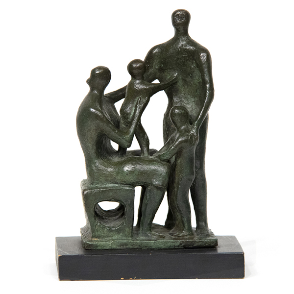
إلين دي كونينغ

جورج إنيس

عشب البير
_tn46214.jpg "HARRY BERTOIA-Untitled (Sounding Sculpture)")
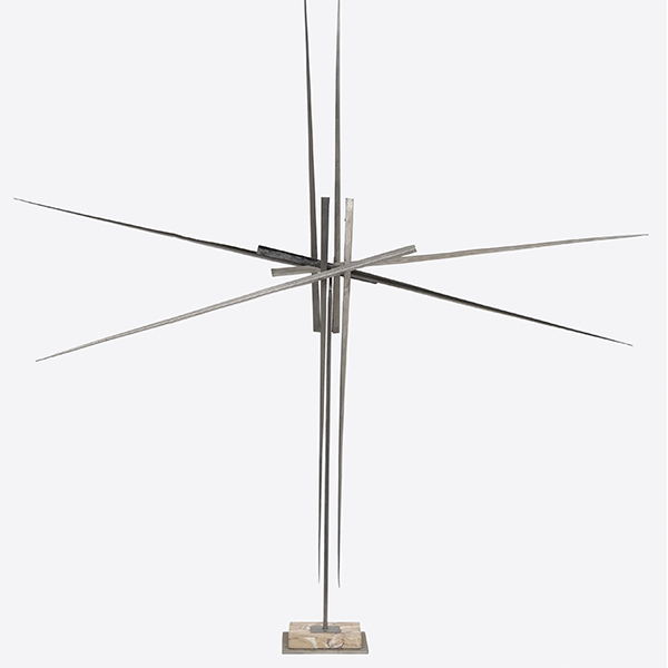
هاري بيرتويا

ميل راموس

كاميل بيسارو
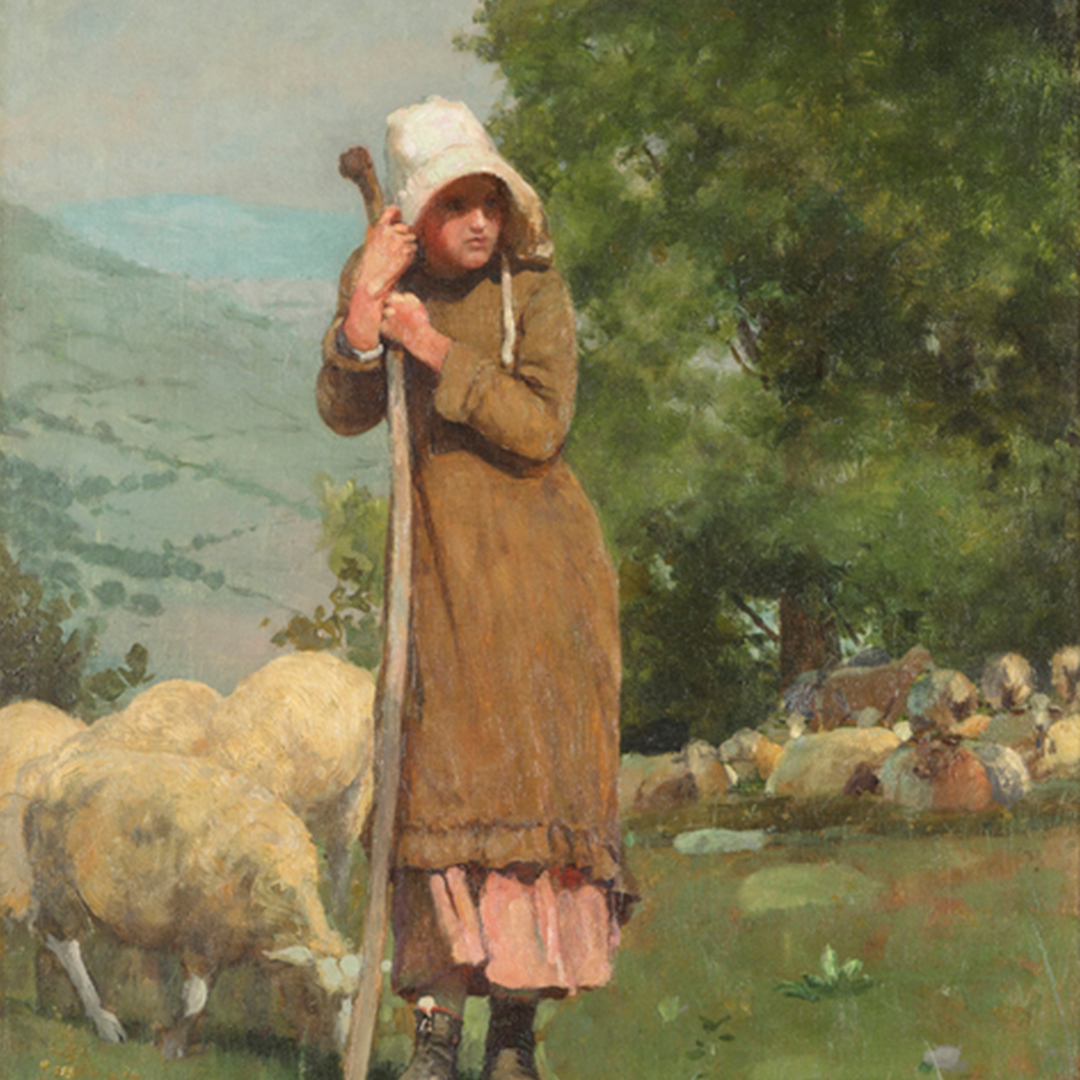
_tn48055.jpg "WINSLOW HOMER-Houghton Farms (Girls Strolling in an Orchard)")
وينسلو هومر

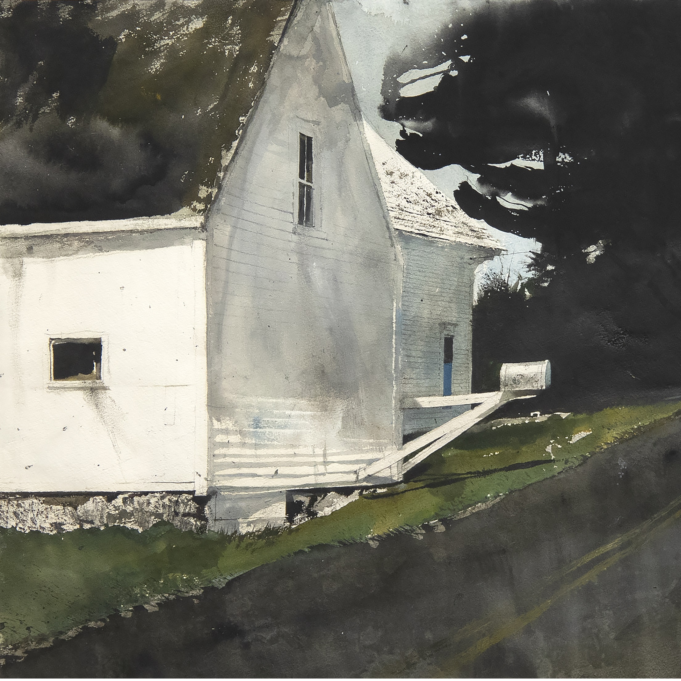
جوزيف كليفيتش

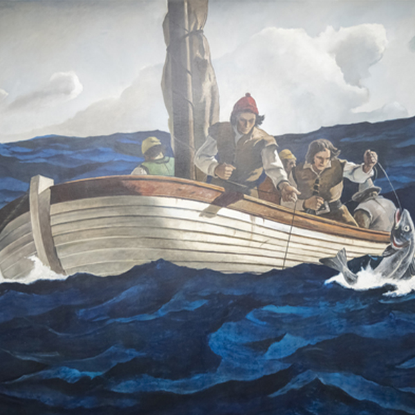
N.C. WYETH

N.C. WYETH
_tn47245.jpg "DAVID TENIERS THE YOUNGER-The Kermesse of Saint George (A Village Festival)")
ديفيد تينيرز الأصغر

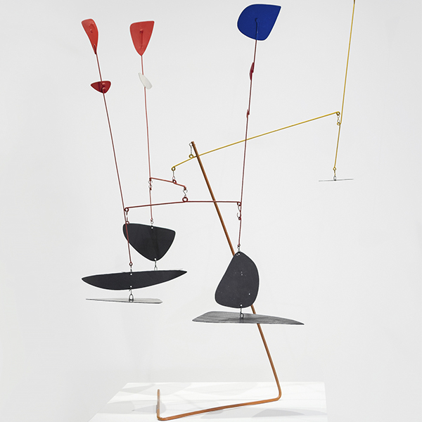
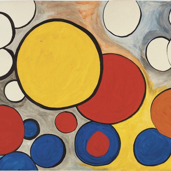
ألكسندر كالدر

أندي وارهول

أندرو وايث

كاميل بيسارو

لي كراسنر

ويليام ميريت تشيس

تشارلز جوزيف فريدريك سولاكرو

موريس دي فلامنك

N.C. WYETH
_tn48062.jpg "FRANK WESTON BENSON-Girl in White (Seated Figure)")
فرانك ويستون بنسون

مانويل نيري

ماريا بلانشارد

ماريا بلانشارد

الصينية

وليد بيشتي

موريس دي فلامنك

جين بيترسون

ديفيد تينيرز الأصغر

بيت موندريان

ويليام ميريت تشيس

ألفريد طومسون بريشر

الابن كلارك

ليون أوغسطين ليرميت

ويليام ويندت

م. إيفلين ماكورميك

موريس دي فلامنك

جون مارين

جين بيترسون

جول شيريه

N.C. WYETH

كارل بنجامين

إدغار ألوين باين
_tn16764.b.jpg "HARRY BERTOIA-Untitled (Suspended Willow)")
هاري بيرتويا
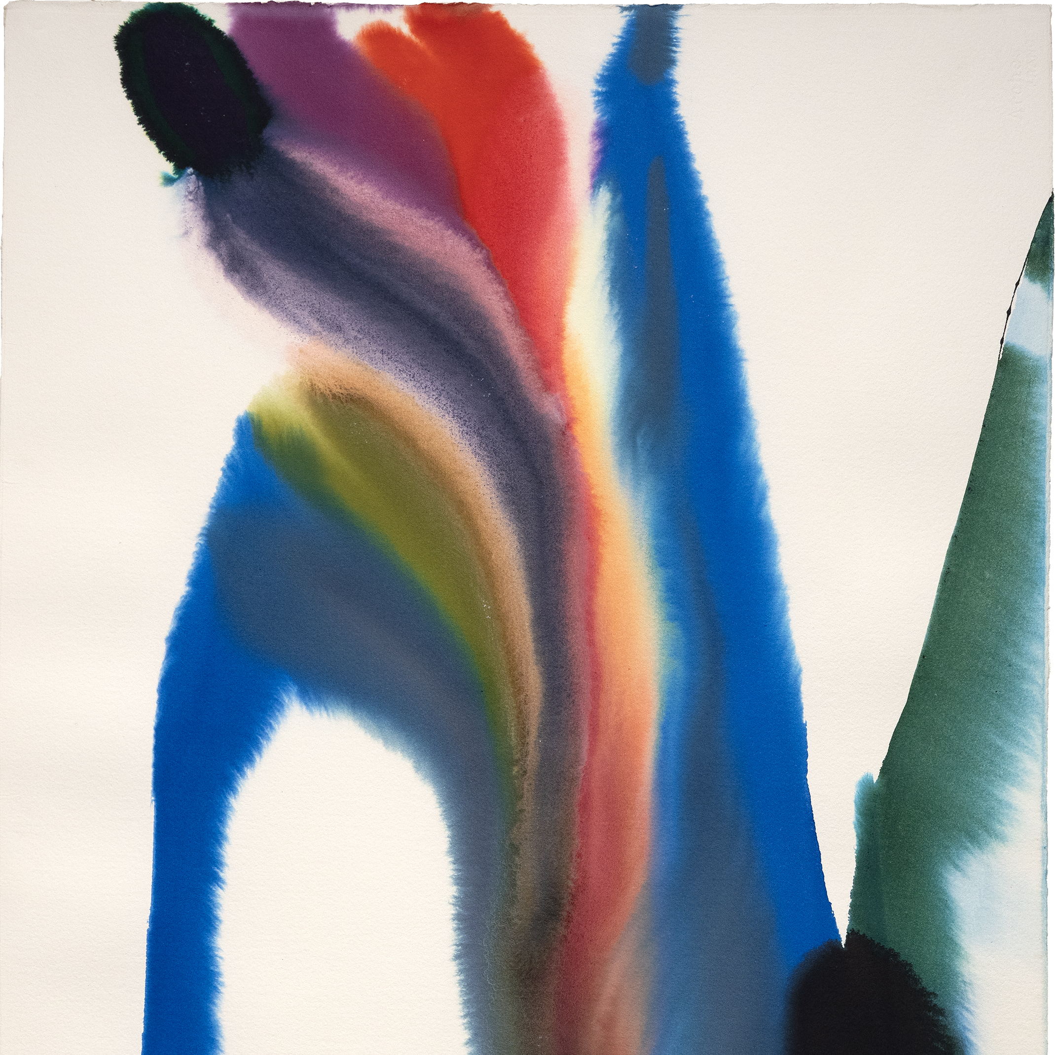
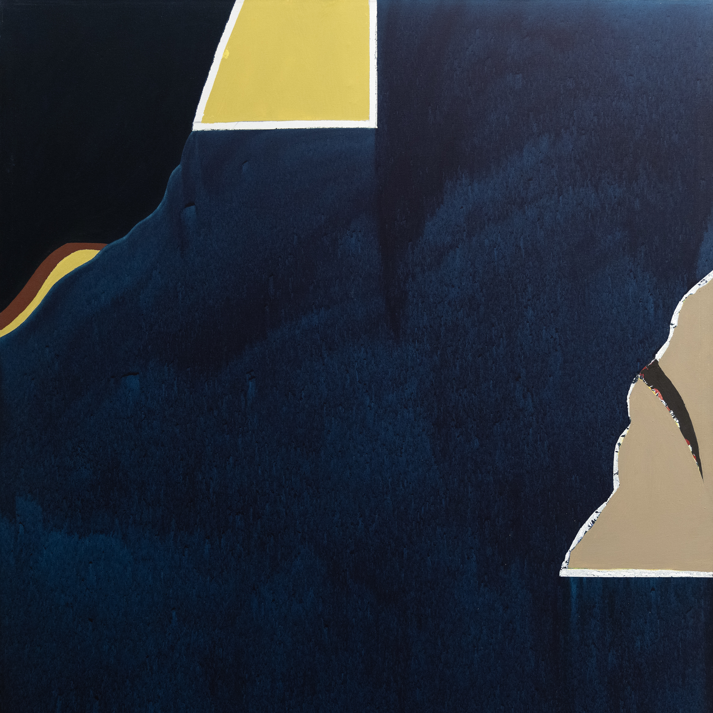
_tn40803.jpg "JOANNA POUSETTE-DART-Untitled (Red Desert Study)")
جوانا بوسيت-دارت

روبرت ناتكين

ليون أوغستين إيرميت
_metropolitan_museum_m_tn48271.jpg "FRANK STELLA (AFTER)-Metropolitan Museum M")
فرانك ستيلا (بعد)

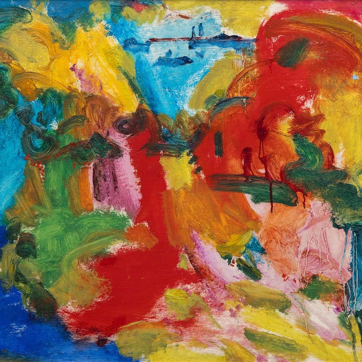
هاسل سميث

توم ويسلمان

جان فرانسوا رافايلي

توم ويسلمان

جان بيرو

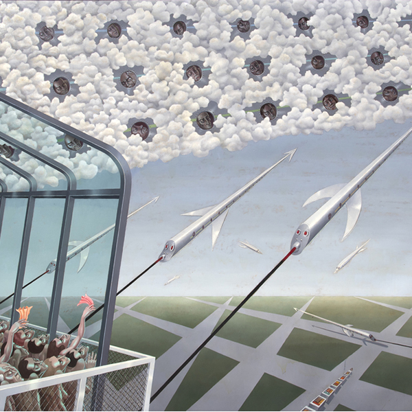
الذكاء الاصطناعي ويوي

فيليبي كاستانيدا

إدغار ألوين باين

ألفريد ستيفنز

جان مانهايم

جيمس ماكدوغال هارت
الاستشاريون

مونتانا ألكسندر
رئيس مجلس الإدارة، المدير العالمي
بالم ديزرت، كاليفورنيا
تُعد مونتانا ألكسندر رائدة متميزة في عالم الفن الدولي، حيث تشغل منصب رئيس مجلس الإدارة والمدير العالمي لشركة هيذر جيمس. من مقرها في المعرض الرئيسي في بالم ديزرت، كاليفورنيا، تشرف مونتانا على عمليات الشركة بأكملها وتقود رؤيتها العالمية. يمثل انتقالها إلى بالم ديزرت في عام 2025 من مدينة نيويورك إلى بالم ديزرت خطوة مدروسة لتعميق الروابط داخل المشهد الفني الصحراوي المزدهر ولتعزيز تأثير هيذر جيمس في الساحل الغربي.
منذ انضمامها إلى هيذر جيمس في عام 2013، لعبت مونتانا دوراً أساسياً في توسيع نطاق وصول المعرض إلى سوق الفن الثانوي العالمي وتشكيل استراتيجية الشركة على مستوى الشركة وإقامة علاقات مع قائمة من نخبة جامعي الأعمال الفنية - من الأعضاء الرئيسيين في مجلة ArtNews 200 إلى رعاة الفن الناشئين. وقد قادت عينها الفطنة وشغفها بالتميز عمليات استحواذ كبيرة على أعمال لفنانين مبدعين مثل لويز بورجوا وآندي وارهول وإد روشا وكلود مونيه ومارك برادفورد.
كان لقيادة مونتانا دور محوري في تأمين الاستحواذ التاريخي على المجموعة الفنية لما بعد الحرب والفن المعاصر من مجموعة الأعمال الفنية للشركات التابعة لشركة جنرال إلكتريك - وهي واحدة من أهم مجموعات الشركات التي دخلت السوق الثانوية. كما كانت وراء المعارض التي نالت استحسان النقاد مثل معرض "النظرة الأنثوية" الذي يضم فنانات سرياليات من بينهن فريدا كاهلو وليونورا كارينغتون، ومعرض "لوحات السير ونستون تشرشل"، وهو معرض متجول تم تطويره بالتعاون مع تركة عائلة تشرشل.
حاصلة على بكالوريوس الآداب في تاريخ الفن وإدارة الأعمال من جامعة كونيتيكت وشهادة الدراسات العليا في الأعمال الفنية من معهد سوثبي في نيويورك، تمزج مونتانا بين الدقة الأكاديمية والخبرة العملية. تستمر قيادتها الحكيمة في تشكيل هيذر جيمس لتصبح قوة مهيمنة على الساحة الفنية العالمية، بينما يشير انتقالها الأخير إلى بالم ديزرت إلى فصل جديد وجريء لنمو المعرض وتأثيره.

إريك أرتشي
استشاري الفنون الجميلة
بالم ديزرت، كاليفورنيا
يعمل إريك أرتيش مستشاراً للفنون الجميلة لدى هيذر جيمس للفنون الجميلة في بالم ديزرت، كاليفورنيا، ويتمتع بخبرة تزيد عن 10 سنوات من الخبرة في مجال المبيعات مع كبار العملاء والشركات المدرجة على قائمة فورتشن 500. تتضمن خلفية إيريك بكالوريوس الآداب في العلوم الاجتماعية والتاريخ من كلية ويستمونت وماجستير العلوم في المجتمعات المرنة والمستدامة من كلية الجبل الأخضر. قادت الرغبة الدائمة في التعلم والنمو إريك إلى عالم الفن، بدءاً من البحث والعمليات والآن يتعاون مباشرةً مع العملاء لإيجاد القطع المثالية لمجموعاتهم. خارج المعرض، يحب إريك قضاء الوقت مع عائلته واستكشاف المطاعم الجديدة والقيام برحلات برية وتحميص قهوته الخاصة.
في الأخبار
اخبار

أفضل الأعمال التي تم بيعها مؤخراً
اخبار

منشآت جيبسون ودان وكروتشر
اخبار

بيع الخاص بك بلو تشيب يعمل مع هيذر جيمس
اخبار

قروض متحف هيذر جيمس للفنون الجميلة
اخبار

كلود مونيه الأعمال المباعة مؤخرا
اخبار

سوق الفن مارس 2023
اخبار

فان جوخ يعير معهد ديترويت للفنون
اضغط
هيذر جيمس أعارت فان جوخ المدرجة في "فان جوخ في أمريكا" تجذب الحشود
اضغط
هيذر جيمس تقرض الرائد فان جوخ إلى "فان جوخ في أمريكا"
اخبار

مرونة سوق الفن
اخبار

الفن كاستثمار
اخبار

تركيب المنزل الفاخر
الفيديو

ملخص موسم المزاد الفني لشهر مايو 2022 مع جيم كارونا
اضغط

القيم الفني تشيب توم يساعد داخل دار عرض واحة الصحراء
اضغط

الحياة الأيقونية تقدم لمحة عن دار عرض واحة الصحراء التي ترعاها HJFA
اضغط
تشيب توم القاضي الضيف
الفيديو

التعرف على هيذر جيمس الفنون الجميلة
اخبار

الاحتفال بمرور 25 عاما على تكريم هيذر جيمس للفنون الجميلة
اخبار

هيذر جيمس تفتتح شركة لندن للاستشارات
كتالوجات

الثورات في الفن الحديث
كتالوجات

هيذر جيمس الفنون الجميلة – عنا
الفيديو

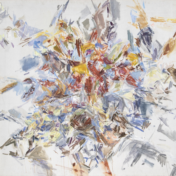
حفل استقبال افتتاح هاسل سميث
خدمات
تقدم هيذر جيمس فأين أرت مجموعه واسعه من الخدمات المستندة إلى العملاء التي تلبي احتياجاتك الخاصة لجمع الفنون. يضم فريق العمليات لدينا معالجين فنيين محترفين وقسما كاملا للمسجلين وفريقا لوجستيا مع خبره واسعه في مجال النقل الفني والتركيب وأداره المجموعات. مع خدمه القفازات البيضاء والرعاية الشخصية ، فريقنا يذهب الميل الإضافي لضمان خدمات فنيه استثنائيه لعملاءنا.


تعرف علينا
الفن المميز
,_new_mexico_tn40147.jpg "GEORGIA O'KEEFFE-Cottonwood Tree (Near Abiquiu), New Mexico")
جورجيا أوكيف
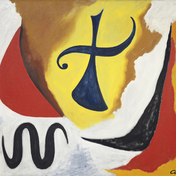
_tn37743.jpg "JOAN MIRO-Tête de femme (déesse)")
جوان ميرو

ألفريد سسيلي
ويليم دي كونينغ
_tn43950.jpg "WINSLOW HOMER-In the Wheatfield (Girl Standing in a Wheat Field)")
وينسلو هومر
واين ثيبود
غيرهارد ريختر
توم ويسلمان
شون سكولي
توم ويسلمان

إيرفينغ نورمان
الاتصال