Palm Desert


Our gallery in Palm Desert is centrally located in the Palm Springs area of California, adjacent to the popular shopping and dining area of El Paseo. Our clientele appreciates our selection of Post War, Modern, and Contemporary art. The gorgeous weather during the winter months draws visitors from all over the world to see our beautiful desert, and stop by our gallery. The mountainous desert landscape outside provides the perfect scenic backdrop to the visual feast that awaits inside.
45188 Portola Avenue
Palm Desert, CA 92260
(760) 346-8926
Hours:
Monday – Saturday 9am to 5pm
Exhibitions

ARCHIVE
Your Heart’s Blood: Intersections of Art and Literature
ARCHIVE
More to Life: Impressionist Dialogues from Monet and Beyond

ARCHIVE
Jewish Modernism Part 2: Figuration from Chagall to Norman
ARCHIVE
Vincent van Gogh and The Great Impressionists of the Grand Boulevard


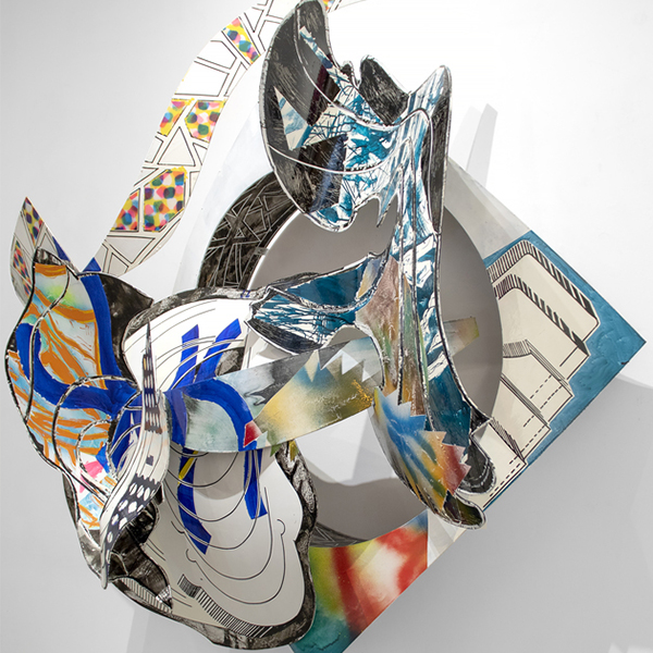
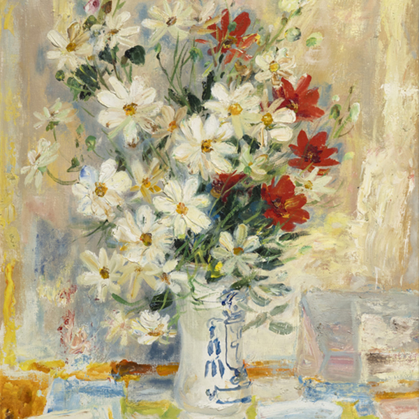
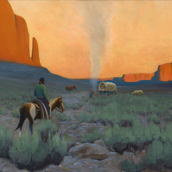
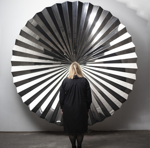
ARTWORK ON VIEW

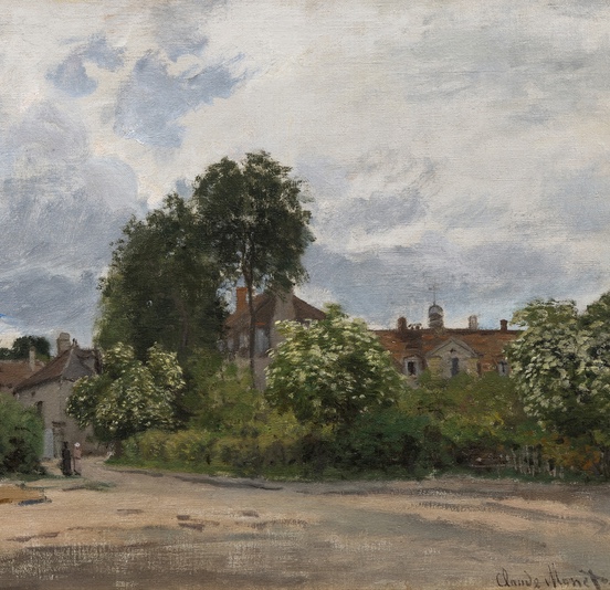
CLAUDE MONET

CLAUDE MONET

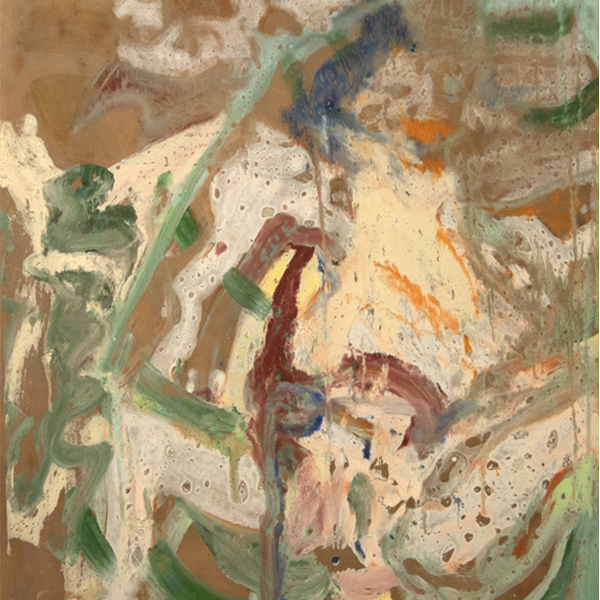
WILLEM DE KOONING

WAYNE THIEBAUD

CHILDE HASSAM

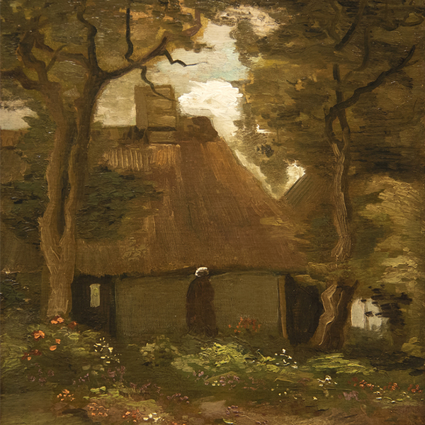
CLAUDE MONET
_tn48131.jpg "PIERRE BONNARD-La robe de chambre rouge (Marthe Bonnard)")
PIERRE BONNARD

CAMILLE PISSARRO

ALBERT BIERSTADT

ALFRED SISLEY

GERHARD RICHTER

GIULIO CESARE PROCACCINI

TOM WESSELMANN

CHILDE HASSAM

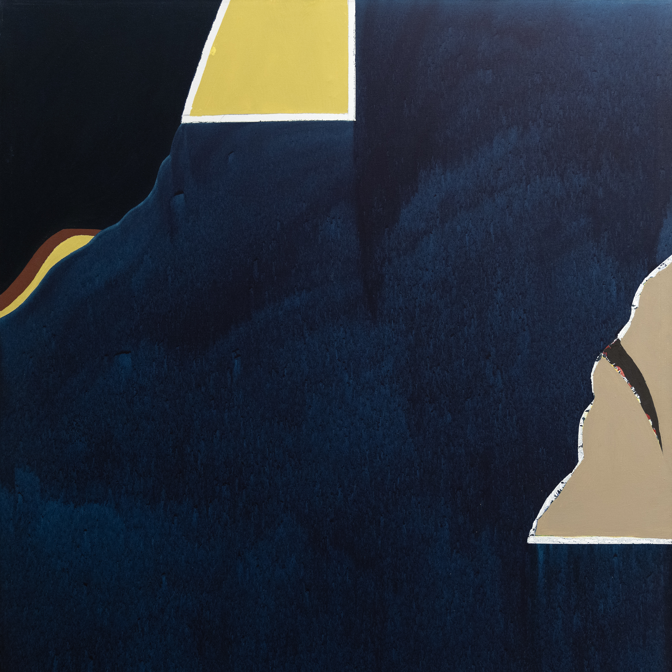
SEAN SCULLY

ALFRED SISLEY

JOHN SINGER SARGENT

TOM WESSELMANN

WAYNE THIEBAUD

PIERRE-AUGUSTE RENOIR

OLGA DE AMARAL

JAMES ROSENQUIST

PAUL SIGNAC

HANS HOFMANN
_tn27843.jpg "ELAINE DE KOONING-Untitled (Totem Pole)")
ELAINE DE KOONING

KENNETH NOLAND

GEORGE INNESS

HERB ALPERT
_tn46214.jpg "HARRY BERTOIA-Untitled (Sounding Sculpture)")
HARRY BERTOIA

MEL RAMOS

CAMILLE PISSARRO
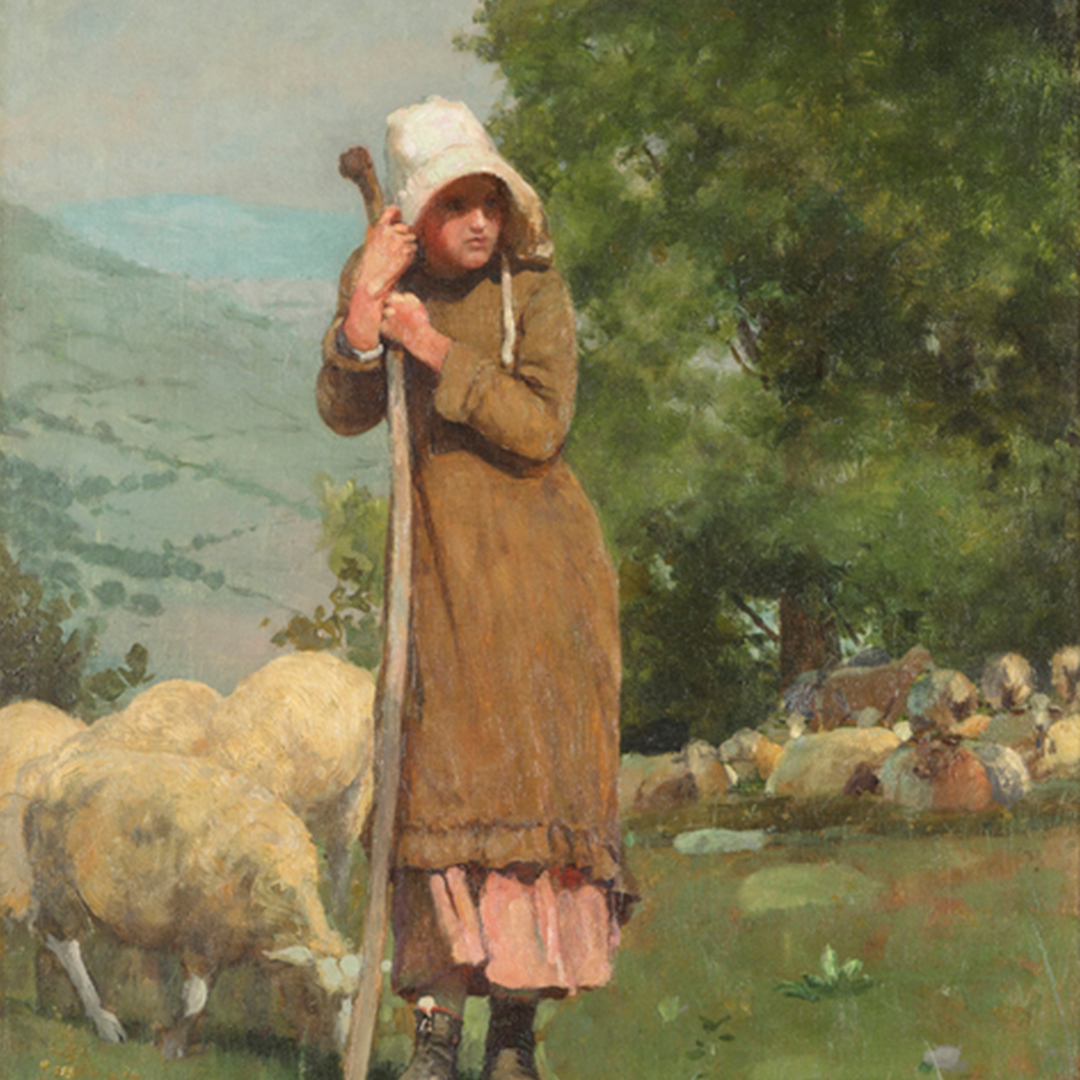
_tn48055.jpg "WINSLOW HOMER-Houghton Farms (Girls Strolling in an Orchard)")
WINSLOW HOMER

JOSEPH KLEITSCH

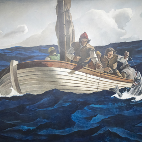
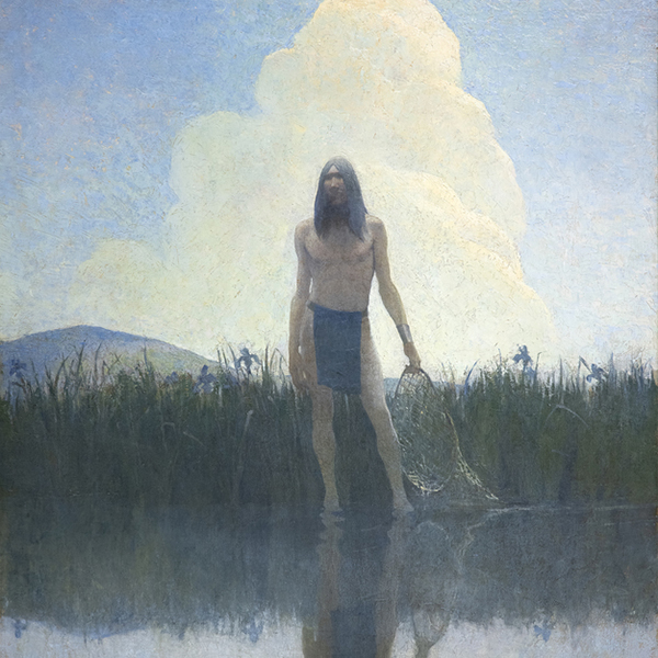
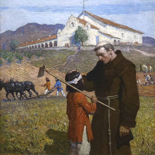
N.C. WYETH

N.C. WYETH
_tn47245.jpg "DAVID TENIERS THE YOUNGER-The Kermesse of Saint George (A Village Festival)")
DAVID TENIERS THE YOUNGER

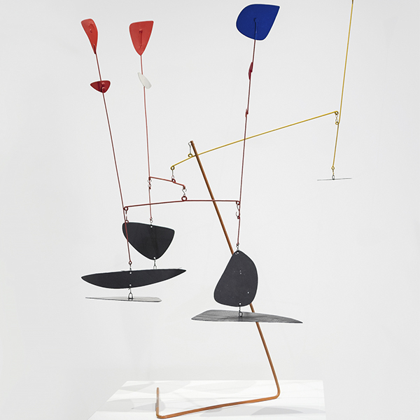
ALEXANDER CALDER

ANDY WARHOL

ANDREW WYETH

CAMILLE PISSARRO

LEE KRASNER

WILLIAM MERRITT CHASE

MAURICE DE VLAMINCK

CHARLES JOSEPH FREDERIC SOULACROIX
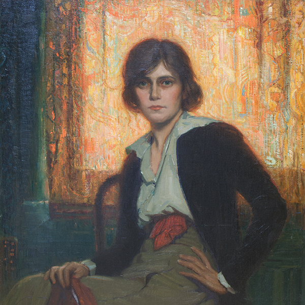
_tn48062.jpg "FRANK WESTON BENSON-Girl in White (Seated Figure)")
FRANK WESTON BENSON

MANUEL NERI

MARIA BLANCHARD

MARIA BLANCHARD

CHINESE

WALEAD BESHTY

MAURICE DE VLAMINCK

JANE PETERSON

DAVID TENIERS THE YOUNGER

PIET MONDRIAN

WILLIAM MERRITT CHASE

ALFRED THOMPSON BRICHER

ALSON CLARK

WILLIAM WENDT

LEON AUGUSTIN LHERMITTE

MAURICE DE VLAMINCK

M. EVELYN MCCORMICK

WILLIAM WENDT

JANE PETERSON

JOHN MARIN

KARL BENJAMIN

EDGAR ALWIN PAYNE
_tn16764.b.jpg "HARRY BERTOIA-Untitled (Suspended Willow)")
HARRY BERTOIA
_tn40803.jpg "JOANNA POUSETTE-DART-Untitled (Red Desert Study)")
JOANNA POUSETTE-DART

N.C. WYETH

JULES CHERET

ROBERT NATKIN

LÉON AUGUSTIN LHERMITTE
_metropolitan_museum_m_tn48271.jpg "FRANK STELLA (AFTER)-Metropolitan Museum M")
FRANK STELLA (AFTER)

HASSEL SMITH

TOM WESSELMANN

JEAN-FRANCOIS RAFFAELLI

TOM WESSELMANN

RUEHL FREDERICK HECKMAN

JEAN BERAUD

ALFRED STEVENS

AI WEIWEI

FELIPE CASTANEDA

EDGAR ALWIN PAYNE

JEAN MANNHEIM

JAMES MCDOUGAL HART

PAUL GRIMM
CONSULTANTS

MONTANA ALEXANDER
Chairman, Global Director
Palm Desert, California
Montana Alexander is a distinguished leader in the international art world, serving as Chairman and Global Director of Heather James. Based at the flagship gallery in Palm Desert, California, Montana oversees the entire company’s operations and drives its global vision. Her 2025 move back to Palm Desert from New York City represents a deliberate step to deepen connections within the thriving desert art scene and to further elevate Heather James’ influence on the West Coast.
Since joining Heather James in 2013, Montana has been instrumental in expanding the gallery’s reach into the global secondary art market, shaping company-wide strategy, and cultivating relationships with an elite roster of collectors—from major members of the ArtNews 200 to emerging art patrons. Her discerning eye and passion for excellence have guided significant acquisitions of works by iconic artists such as Louise Bourgeois, Andy Warhol, Ed Ruscha, Claude Monet, and Mark Bradford.
Montana’s leadership was pivotal in securing the landmark acquisition of the Post-War and Contemporary art collection from the General Electric Company Corporate Art Collection—one of the most significant corporate collections to enter the secondary market. She was also behind critically acclaimed exhibitions like “The Female Gaze,” featuring female surrealists including Frida Kahlo and Leonora Carrington, and “The Paintings of Sir Winston Churchill,” a touring show developed in collaboration with Churchill’s family estate.
Holding a Bachelor of Arts in Art History and Business Management from the University of Connecticut and a postgraduate certificate in Art Business from Sotheby’s Institute in New York, Montana blends academic rigor with hands-on expertise. Her visionary leadership continues to shape Heather James into a dominant force on the global art stage, while her recent move to Palm Desert signals a bold new chapter for the gallery’s growth and influence.

ERIC ARTECHE
Fine Art Consultant
Palm Desert, California
Eric Arteche is a Fine Art Consultant with Heather James Fine Art in Palm Desert, CA, bringing over 10 years of sales experience working with top clients and Fortune 500 companies. Eric’s background includes a Bachelor’s of Arts in Social Science and History from Westmont College and a Master’s of Science in Resilient and Sustainable Communities from Green Mountain College. A constant desire to learn and grow led Eric to the art world, starting in Research and Operations and now partnering directly with clients to find the perfect pieces for their collections. Outside of the gallery, Eric loves to spend time with his family, explore new restaurants, take road trips, and roast his own coffee.
IN THE NEWS
NEWS

Recently Sold Top Works
NEWS

Gibson, Dunn & Crutcher Installations
NEWS

Sell Your Blue Chip Works With Heather James
NEWS

Heather James Fine Art Museum Loans
NEWS

Claude Monet Recently Sold Works
NEWS

The Art Market March 2023
NEWS

Van Gogh loans to the Detroit Institute of Arts
PRESS
Heather James loaned Van Gogh included in “Van Gogh in America” draws crowd
PRESS
Heather James loans major Van Gogh to “Van Gogh in America”
NEWS

Art Market Resilience
NEWS

Art as an Investment
NEWS

Luxury Home Installation
VIDEO

May 2022 Art Auction Season Recap with Jim Carona
PRESS

Curator Chip Tom Helps Inside the Desert Oasis Show House
PRESS

Iconic Life profiles the HJFA curated Desert Oasis Show House
PRESS
Chip Tom Guest Judge
VIDEO

Getting to Know Heather James Fine Art
NEWS

Celebrating 25 Years of Heather James Fine Art
NEWS

Heather James Opens London Consultancy
CATALOGS

Revolutions in Modern Art
CATALOGS

Heather James Fine Art – About Us
VIDEO

Hassel Smith Opening Reception
SERVICES
Heather James Fine Art provides a wide range of client-based services catered to your specific art collecting needs. Our Operations team includes professional art handlers, a full registrar department and logistical team with extensive experience in art transportation, installation, and collection management. With white glove service and personalized care, our team goes the extra mile to ensure exceptional art services for our clients.


GET TO KNOW US
FEATURED ART
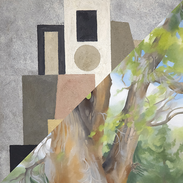
,_new_mexico_tn40147.jpg "GEORGIA O'KEEFFE-Cottonwood Tree (Near Abiquiu), New Mexico")
GEORGIA O'KEEFFE
_tn37743.jpg "JOAN MIRO-Tête de femme (déesse)")
JOAN MIRO

ALFRED SISLEY
WILLEM DE KOONING
_tn43950.jpg "WINSLOW HOMER-In the Wheatfield (Girl Standing in a Wheat Field)")
WINSLOW HOMER
WAYNE THIEBAUD
GERHARD RICHTER
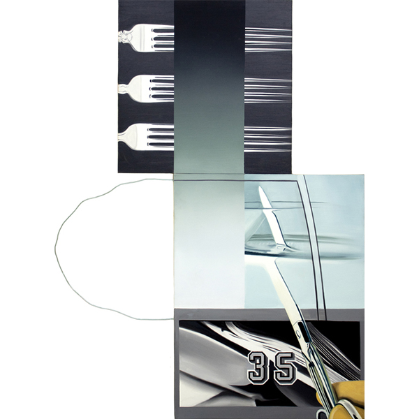
TOM WESSELMANN
SEAN SCULLY
TOM WESSELMANN

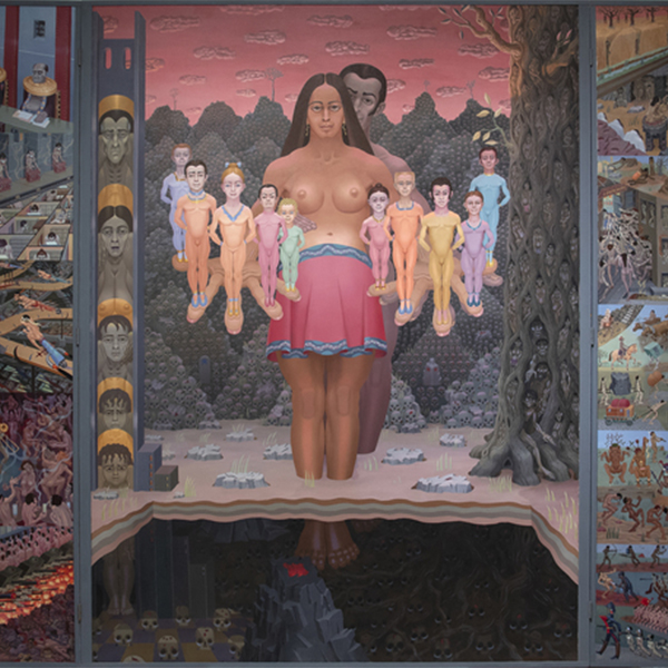
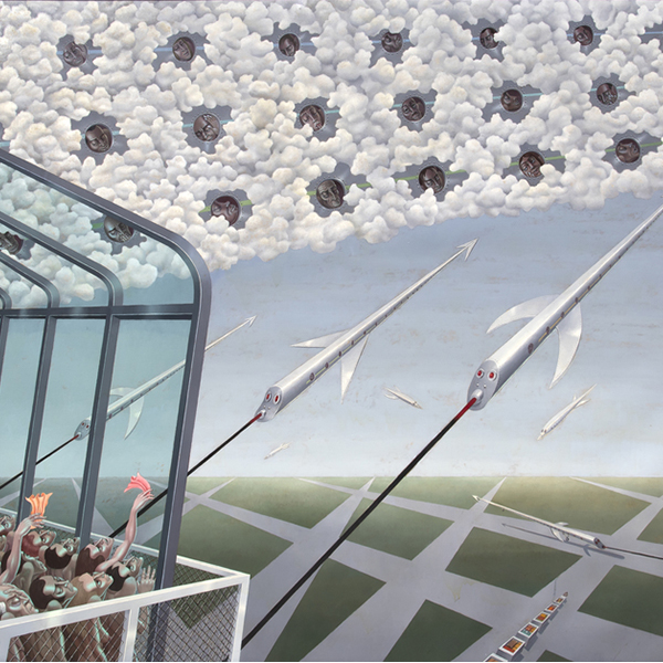
IRVING NORMAN
CONTACT